 If you’re looking for a design agency that really “gets it,” look no further than Murmure. Not only are they willing to experiment, they’ll take an idea right up to the edge and then nudge it a tad more still, just to make sure you’re paying attention. After their “airborne invitation,” you better believe we’re paying attention. (To say nothing of their “heat & color” cards or their electronic-music-festival paraphernalia.)
Now what we appreciate about their work for French architectural agency EXO is their willingness to make grand gestures in very small ways using print. Here was the guiding principle:
“The design of the logo and the visual identity were first imagined through a system which enabled us to play with the graphic sphere as a singular architectural element. This notion of volume lies on principles of perspective which are created by convergence lines. “
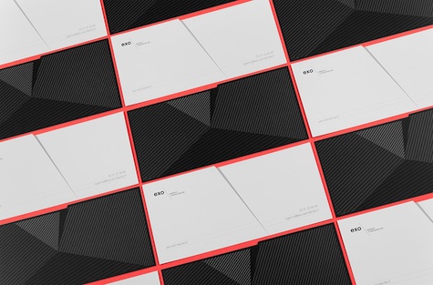
And this is what it looks like in practice. Let’s begin with the business cards – Murmure created personalized cards for each of EXO’s three associates. “Using the the same shape cut from paper, the backs of each card was personalised and the thin embossed lines were asserted by a chosen enamel.”
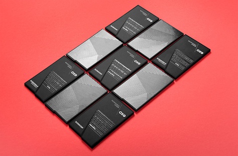
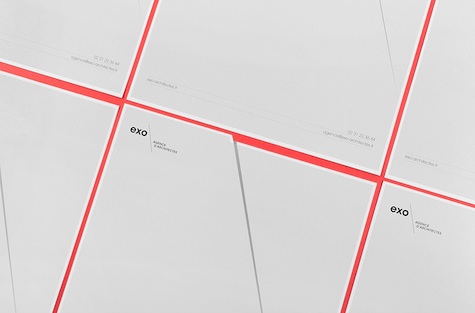
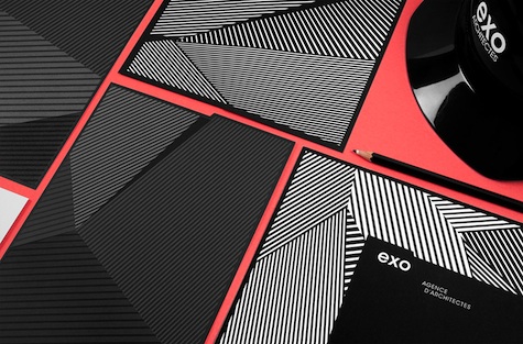
Next, the stationery. “Following the idea of a contrast between the front and back sides of a paper, we used the interplay produced by the two sides on shapes cut from paper: one side for information, with a more sober and elegant graphic design, and another which uses the power and efficiency of the pattern. From business cards to headed letters, compliment slips to envelopes, all ranges follow this principle.”
Finally, here are some of the additional bits and pieces Murmure came up with for the architecture firm, including hard hats and notebooks. Clean, considered, cool.

