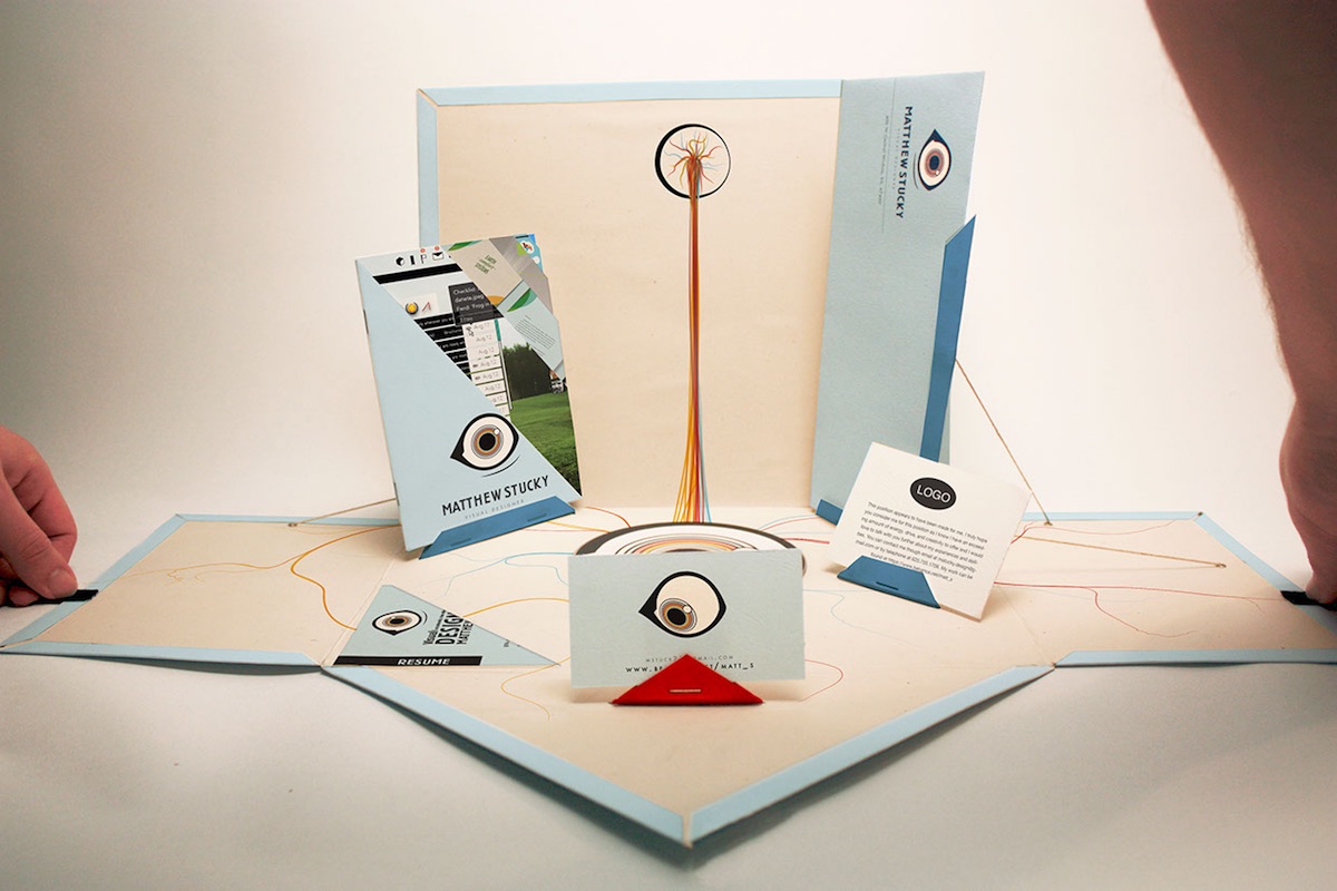
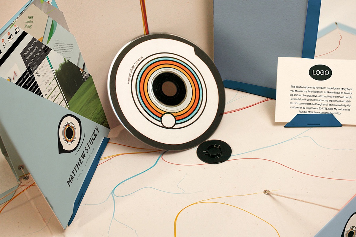
Often the one thing missing from portfolios and other “leave behinds” is a sense of fun, a charge that cannot be leveled against Portland designer Matt Stucky’s marvelous piece. As his stock-in-trade is, of course, attracting eyeballs for his clients’ products and services, he went with an obvious visual theme. How far he ran with it is nothing short of inspiring.
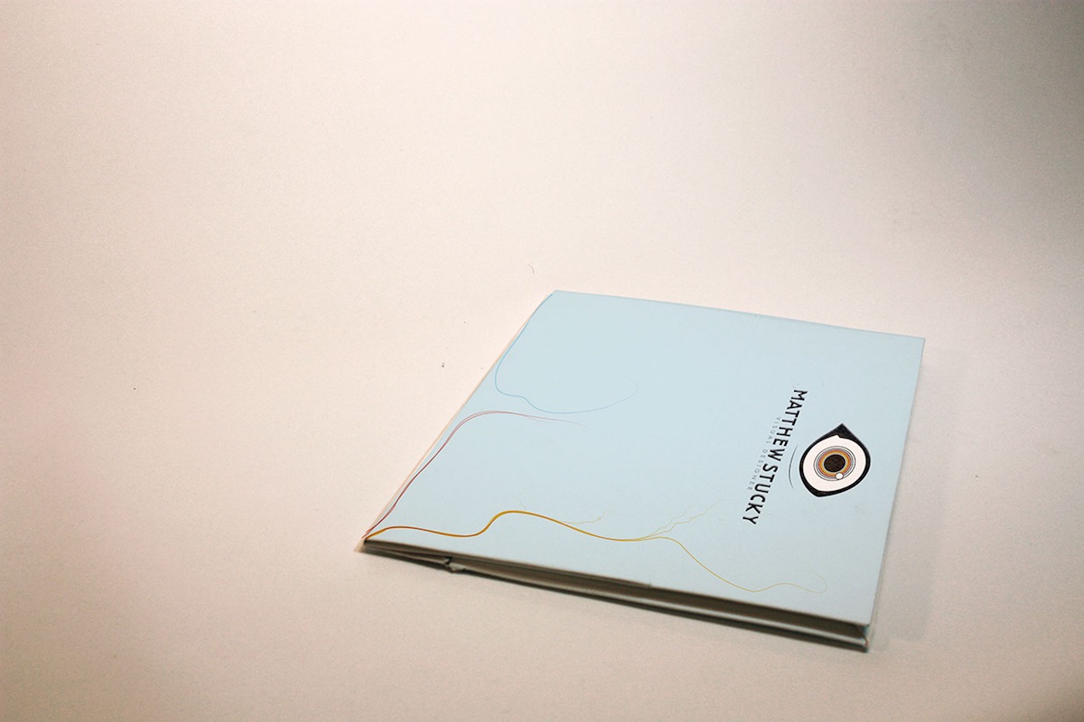
The prominent eyeball graphic on the cover of this portfolio is arresting enough, but once you twig to the fact that the wisps of color are not the result of your toddler getting into the crayons again but rather retinal veins – ho boy!
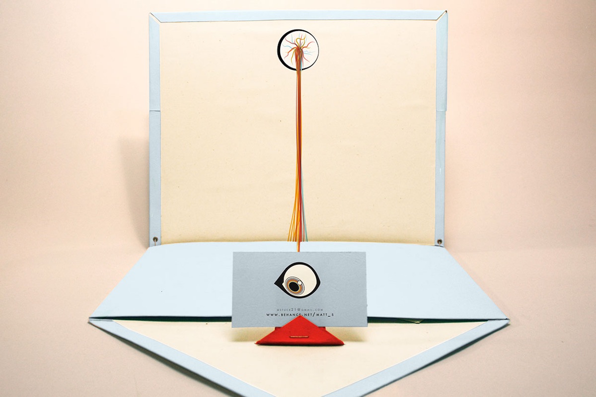
Those veins are so disturbing by this point that the “I see you…” is downright menacing. So much so you might not even notice the fascinating fold of this portfolio at this stage…
Which is a great time to present you with his card.
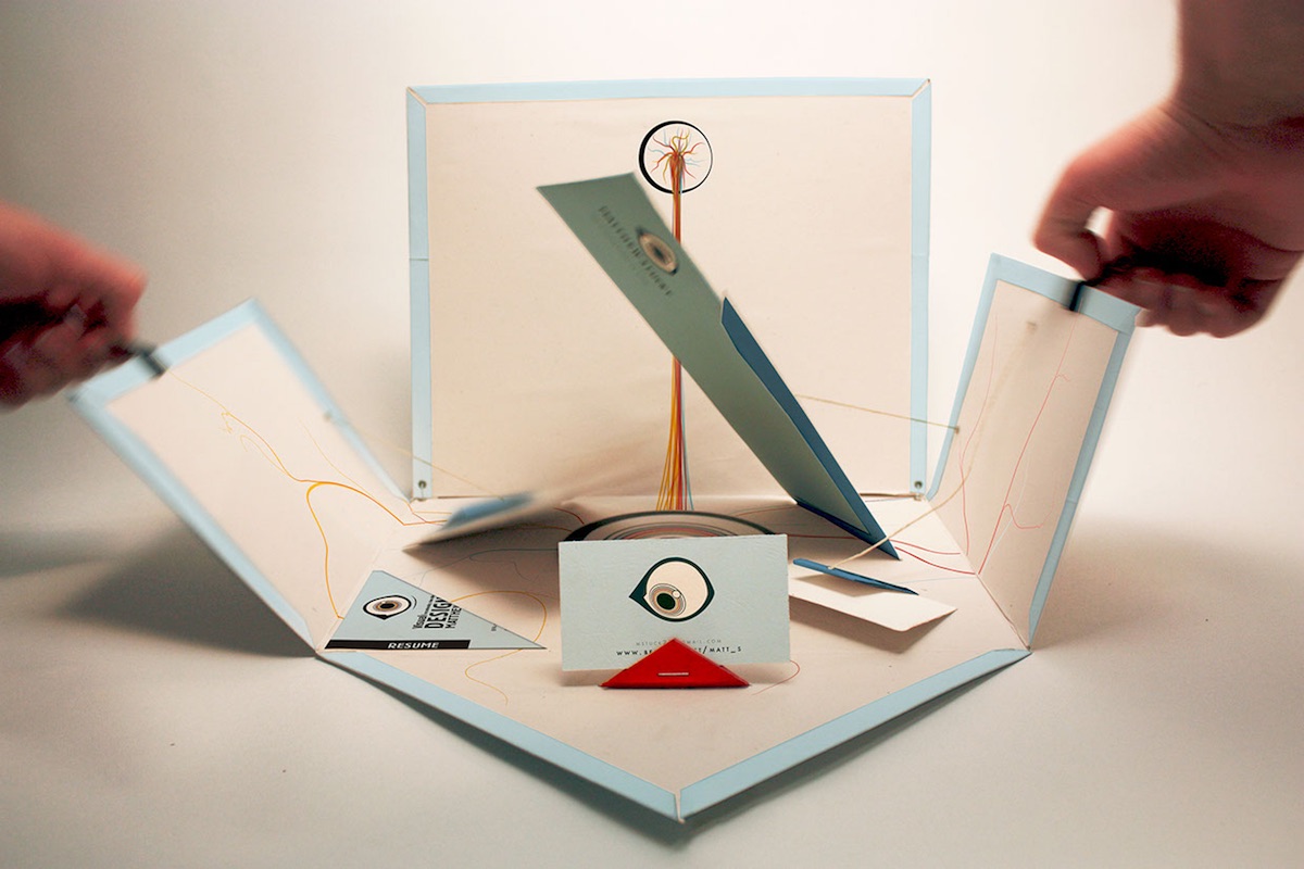
Once this portfolio is fully opened, we get an eye-themed CD ROM (presumably stocked with clips), a résumé on the left as well as other collateral, all neatly presented through an intriguing riff on a star fold. While the string-based mechanism that pops up some of the materials looks like it might not bear up under too many repeated openings, what potential client could possibly ignore such a bold and playful presentation? Note: All painful “eye” puns were surgically removed from this story. (You’re welcome.)
Discover more Cool Designs right here.

