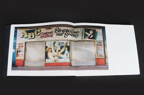
There’s no dearth of such books today, in part because whole cities throughout our country are being allowed to slip into disrepair.
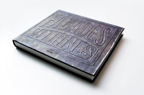
What sets Façades & Vitrines apart is the design of the book, masterminded by Tim Bisschop. Each volume in the 666 volume run features an industrial looking embossed typographic cover, with the whole book bound…in lead.
And the icing on the cake? We’ll let Paul describe that:
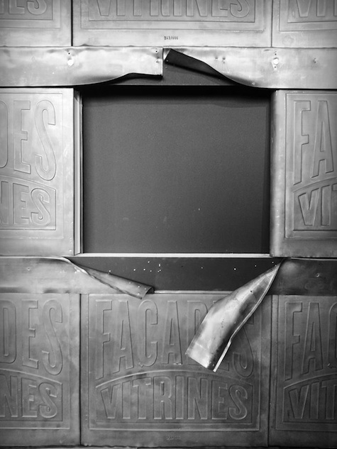
“The books were exhibited in a ‘wall’ at a show in Budafabriek, Kortrijk [Belgium], which required readers to peel back the lead fixtures to get their hands on a copy, resulting in a scene not unlike the locations Stephan photographed.”
Just a brilliant, brilliant design.


