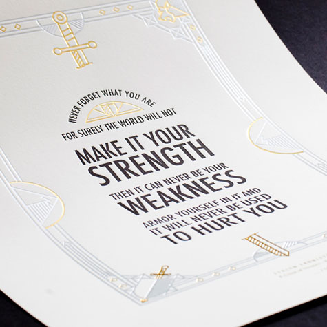
While the prints are certainly handsome in their own right, there were two things we couldn’t help noticing right away.
1. Design. For being a promotional product of the series’ official UK publisher, the prints are astonishingly free of design elements directly related to the series. (There is one possible exception to this: a very abstract take on The Iron Throne on one – at least that’s what we thought it was.) At the very least, as the whole series constantly reminds of us of the sigils each great house is represented by, how hard would it have been to include a wolf, a stag, and so on?
2. Reaction. Whatever minor quibbles we had over design, the prints are still very nice to look at, and would probably be greatly appreciated by its target audience. Yet readers of Creative Review on which the posters first appeared were united by one thing: their absolute horror at the typeface used. It is dismissed as “too modern,” “boring,” “weak,” “bland” and “unfathomably horrid.”
Type nerds: Telling it like it is 😉

