Quotation marks: one of the most misused (and misunderstood) typographic elements in today’s world of digital typography.
Do you use of straight typewriter quotation marks (“dumb” quotes) instead of true typographer’s quotes (“smart” quotes)?
Whether it be for print, the Web, ibooks and tablets, motion graphics, or other media, this type crime should be avoided whenever possible.
Quotation marks
Smart quotes (sometimes called “curly” quotes although they are not always curly) are design-sensitive characters. They consist of an open and a closed version (also referred to as left and right quotes respectively)
“Dumb” quotes are usually simple straight or tapered marks. They are often referred to as primes, or inch and foot marks, which is a function they can be used for unless the typeface has true primes, which are slightly angled.
Misuse of “dumb” quotes is one of the most common – and irritating – of type crimes, which can be spotted anywhere from ads, book covers, magazines and newspapers, to websites and blogs, as well as movie title and even motion graphics.
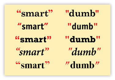
The stylistic differences of both “smart” and “dumb” quotes vary from typeface to typeface.
Apostrophes
The actual glyph for an apostrophe in proper typography is the closed (or right) single quote.
The same rules regarding the use of smart punctuation for quotation marks apply to apostrophes – that is, use them whenever possible, avoiding the typewriter quote, or foot mark, which is a type crime of the highest order.
Don’t make the mistake of overlooking the sly appearance of an open single quote instead of an apostrophe in front of a word or numeral that is a contraction (rock ‘n’ roll instead of rock ’n’ roll) or an abbreviation (the ‘90s instead of the ’90s).
When typed in, they will automatically appear as a single open quote instead of an apostrophe, as software is not yet smart enough to know the difference in usage, so be sure to review for and correct these manually as necessary.

Smart quotes are design-sensitive, compared to the relatively simple design of typewriter quotes and true primes, as shown in this example of Arno Pro – one of the few fonts that contains them all.
Primes
Primes, often referred to as inch and foot marks, are used to represent measurements, with a single prime representing feet and a double prime representing inches.
Unbeknownst to many, true primes are actually tapered, slightly angled marks. Since typewriter keyboards did not have either smart quotes or true primes, simple, straight marks referred to as typewriter quotes were used for both purposes.
While most digital fonts still contain these straight “typewriter” quotes in addition to smart quotes, some of the new OpenType fonts have true primes, either instead of the old-fashioned typewriter quotes, or in addition to them.
When available, true primes should be used for measurements, but typewriter quotes (not smart quotes) have become the accepted practice in digital typography.
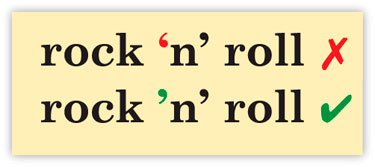
An open single quote instead of an apostrophe in a contraction (which is the correct punctuation) can easily slip into your work, so proofread typeset text carefully.
NOTE: Never use smart quotes for measurements, as this is a type crime as well, and unequivocally wrong. Unfortunately, when smart quotes are turned on in a word-processing program or design software, the software is not smart enough to know not to use them for measurements. So it is up to you, the designer, to proof your document for measurements very carefully, and make the corrections as necessary.
A simple, effective solution
So how do you remedy this confusing and often frustration situation? One way to help avoid committing any of these type crimes is to start with typographically correct copy.
Whether you write the copy, or you get it from an outside source, create a set of guidelines or a style sheet for submitting copy that includes all required typographic conventions.
Distribute the guidelines to all the writers, editors, copy editors, proofreaders, and designers you deal with so that everyone is on the same page, so to speak.
If you (or your contributors) use Microsoft Word, be sure to set the preferences to automatically convert dumb quotes to smart quotes while typing. This is not the default setting in Word as it is in some design software, so it needs to be done manually.
But remember that the software doesn’t know when to use primes for measurements or apostrophes required at the beginning of a word or numeral for contractions, so the copy still needs to be checked carefully for accurate usage and placement of these characters.
Importing copy
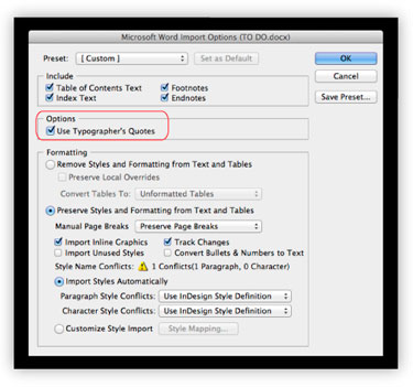
When importing text into InDesign, use the Import Options, which allow for the automatic conversion to typographer’s quotes.
If you are using text that is not typographically correct, importing the text properly can correct and convert dumb quotes to smart quotes automatically.
When importing an entire document, replace the old cut-and-paste method with the text importing feature of most design software (In InDesign it is Place… Com/D), which provides many timesaving formatting options, including the automatic conversion to typographer’s quotes. But once again, remember to check for accurate usage and placement of quotes, apostrophes, and primes.
If need be, you can replace dumb quotes manually, but it is easy to miss some, especially in long copy.
You can also use the “search-and-replace” feature of your software, but it is tedious and problematic, as you are replacing one glyph design – the straight typewriter quote – with two separate designs.
You can start by searching for a combination of a space before a “dumb” quote and replace with an opening “smart” quote, and conversely, search for a “dumb” quote with a space after it, and replace with a closing “smart” quote. If you choose this method, proof your work carefully, as it’s easy for some to be missed, especially if they are not next to a space, such as a closed quote followed by a period.
Dumb things can still happen
If you are using copy (corrections or otherwise) from an email, a PDF, or the Web, either make sure the punctuation is corrected before you copy and paste, (there are utilities such as Tex-Exit Plus that can help with this), by typing it directly in the document with your software preferences adjusted accordingly, or by doing a “search and replace” for any offending dumb quotes after the fact.
I know I sound like a broken record by now, but always proof your work carefully checking for these instances. It really can’t be said enough!
Smart quotes on the Web (and other non-print applications)

The use of “dumb” punctuation on the Web should be avoided whenever possible.
While the use of “smart” quotes and apostrophes (as well as other “smart” punctuation, such as en and em dashes), is the accepted practice for print, they are often noticeably absent on the Web.
This is the result of the Web developers and programmers with not enough typographic knowledge, or by designers who aren’t aware that these practices can, and should be incorporated into websites (including your own blogs!), wherever possible.
The first step to remedy this is to make sure the original copy contains typographically correct punctuation so that you and/or the programmer know which punctuation goes where. (Note that while not a requirement for print, it is smart to add a word space before and after en and em dashes on the Web to allow for more line-break choices.)
In some instances, smart quotes have to be manually coded, while other scenarios allow for the automatic conversion. Unfortunately, there are some environments which do not support the use of smart quotes at all, or make it too tedious to implement on a large scale; these include some content management systems (commonly referred to as CMSs) as well as some email marketing systems, so do your research carefully beforehand.
When preparing and/or submitting copy to the programmer or developer (if it isn’t you), call out the existence of the smart punctuation so they can find the best solution for the site in question.
And always proofread carefully before pushing live.
———-
Copyright 2012 PaperSpecs.

Ilene has written and lectured extensively on type and typographic design to both students and professionals in the field. She formerly was the director of Typeface Development for International Typeface Corporation (ITC) where she developed more than 300 text and display typefaces. Her book, Type Rules! The designer’s guide to professional typography, 3rd edition, has received numerous accolades from the type and design community. She conducts her widely acclaimed Gourmet Typography Workshops internationally.


