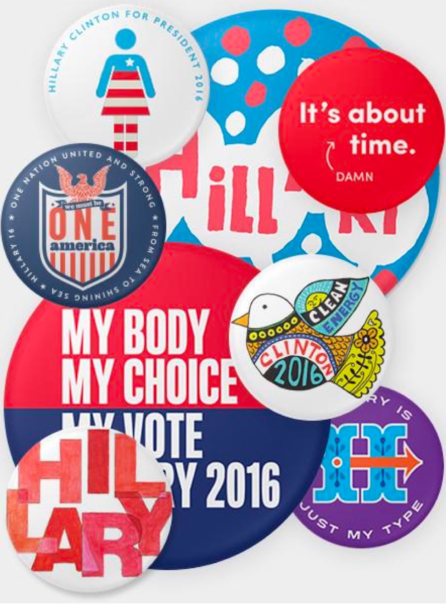
Just as the devil always has the best tunes, the political left often can be relied on to have the best design. With an unusually-high-stakes American presidential election in November, several well-known designers – including Michael Bierut, Paula Scher and Stephen Doyle – lent their skills to Democratic nominee Hillary Clinton’s campaign as part of “The 45 Pin Project.” Oddly, this attempt to feed into the long and storied history of presidential campaign buttons by offering 45 different pins is a disappointingly mixed bag.
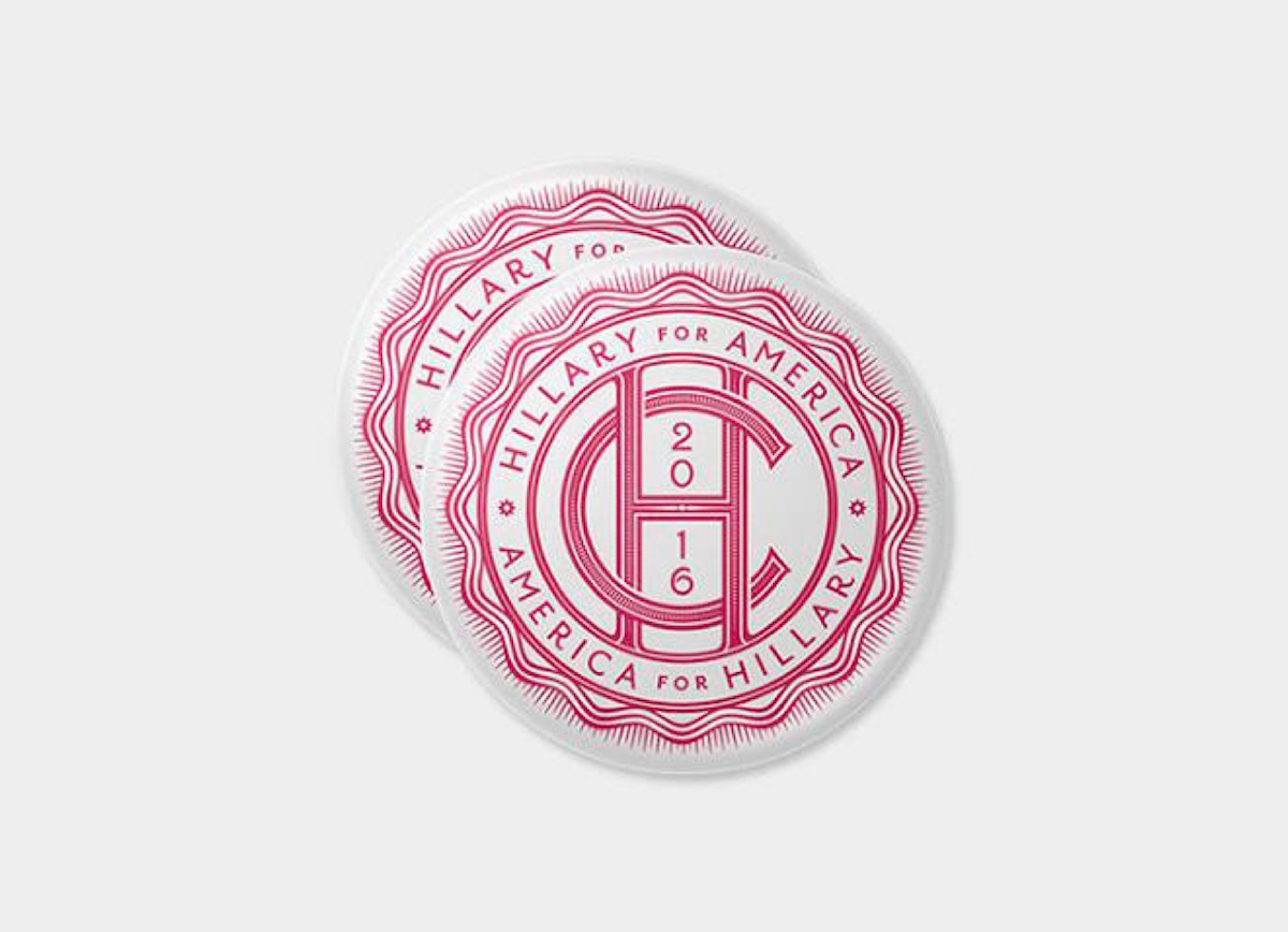
This button from restaurant identity/food packaging phenom Louise Fili is a simple-yet-elegant contribution, one of the collection’s strongest, playing off of Fili’s prowess with typography. Indeed, this may be the secret to a good campaign button right here: encourage the designer to apply their trademark style to the project. Sounds like common sense, right? Well…
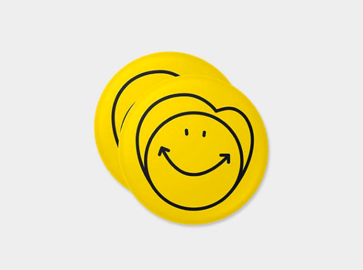
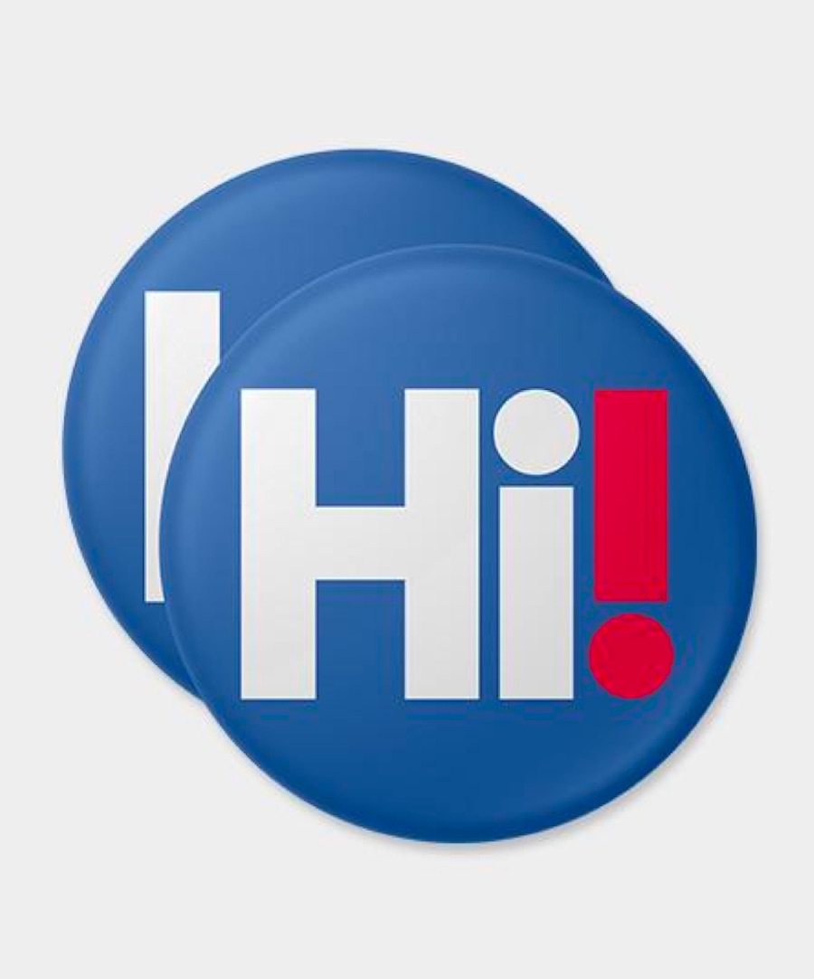
Cute, possibly, but this Hillary Clinton button by Joe Marianek and Dinah Fried of Small Stuff hardly says “take the first female presidential candidate seriously,” much less “she’s all that stands between us and Mordor” – essentially the Democratic party line this year. (The candidate’s name would’ve been nice, too.)
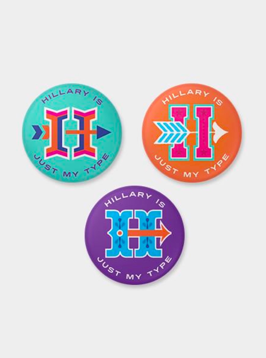
This trio from Gail Anderson at Anderson Newton Design has fun with typography without losing sight of the candidate. (They even manage to do something interesting with the still-awkward arrow motif in the official logo.)
The rest of the buttons don’t work for a wide variety of reasons:
- Right message/poor design
- Nice design/wrong message
- Slapped together while watching “Game of Thrones”
- Still don’t believe a woman’s running for president
- Someone got a button maker for their birthday
- WTF?
- Seriously WTF?
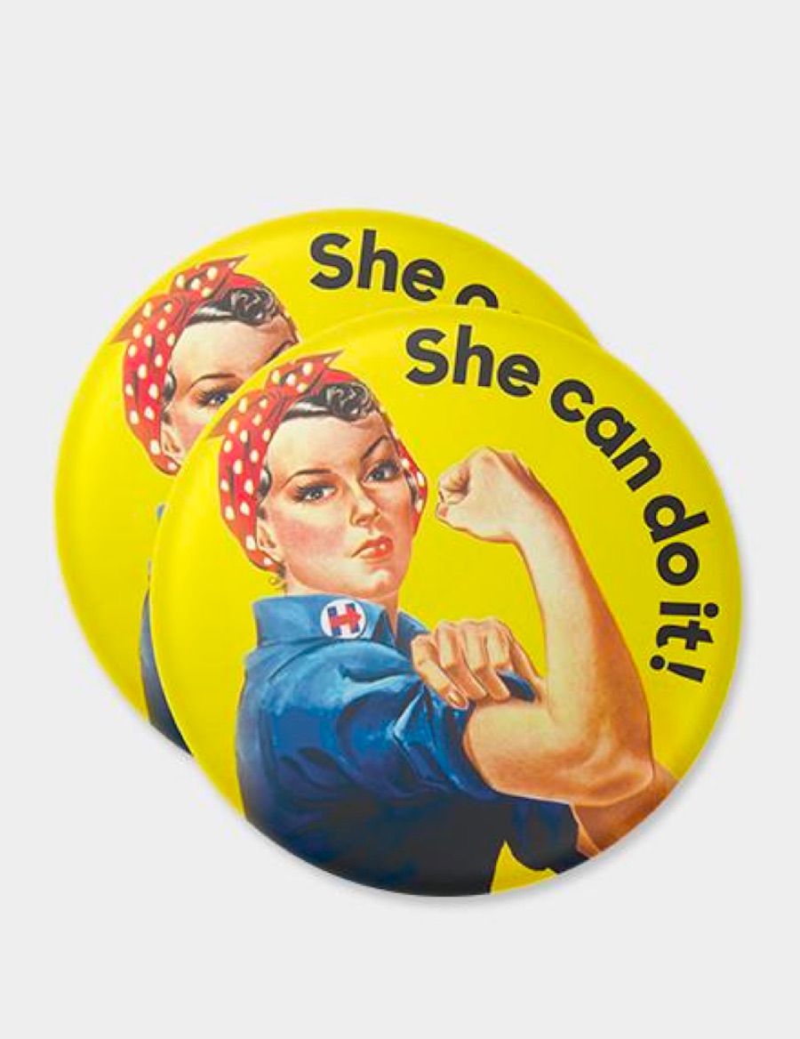
Not surprisingly, the strongest Hillary Clinton button in the project is a direct swipe from J. Howard Miller’s WWII “Rosie the Riveter” propaganda poster. It quickly and viscerally gets across not only the campaign’s message of gender equality, but it’s also an unbeatable piece of illustration and design by any measure. (It also hints at some pretty disturbing – but no less effective – parallels between the present campaign and the war years.)
Still, it’s hardly fair to compare designs that were presumably produced on the fly and donated to the Hillary Clinton campaign with poster art that was commissioned by Westinghouse Electric back in the 1940s to tamp down labor-management strife in the factories during wartime. Then again, maybe that’s the point. With so much at stake, and so many millions of dollars blown on presidential campaigns every cycle, isn’t good design, you know, worth paying for?
Discover more Cool Designs right here.





Wish this wasn’t posted. Design is o.k., but, this is too controversial at this time. Seeing this posted feels like Paper Specs is a slanted group. Or at least show something from the other side, if political design is going to be apart of these posts. Please.
Apologies if we offended you, Trish – it certainly wasn’t our intention. For the most part we try to keep politics out of our posts. However when you have big name designers donating designs to a political cause, it is, for better or worse, design news. If a “slant” is demonstrated in the piece itself, we hope you will agree it is toward poor, and poorly paid, design work. As far as showing something from the other side, we did share other posts regarding the Trump/Pence logo debacle back when that broke, and didn’t think there was much more that we could add – it was pretty universally reviled. (And from a design point of view, didn’t boast any big names as far as we know.) For those who missed the brouhaha over that one, this will give you some idea of what took place: http://www.politico.com/story/2016/07/trump-vp-pick-mike-spence-logo-225612