 Ever since Stranger and Stranger Founder Kevin Shaw’s excellent PaperSpecs webinar “Designing Spirited Labels” (you can catch an instant replay here), we’ve payed close attention to wine label design. We’ve been amazed at the art, finishing and printing techniques used in this thriving industry. But recently, we were even more amazed by a very different type of wine label story.
Apparently French Champagne powerhouse Veuve Clicquot has sued Ciro Picariello, a tiny Italian maker of sparkling wines, because the smaller company’s orange label for its Brut Contadino was deemed to be too close in color to Veuve Clicquot’s trademark yellow label. Wait – what?
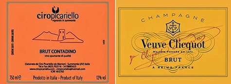
The problem is that the beverage giant’s trademarked color – Pantone 137C – is more of a yellow-orange that just happens to look yellow when printed. Apparently Veuve Clicquot has taken advantage of this odd trick-of-the-eye to threaten legal action against other alcohol makers for their use of orange labels.
Creatives doubtless appreciate companies’ desires to prevent consumer-confusion between their own products and those of competitors. But when the crux of your case hangs on the relative nearness of CMYK percentages that aren’t noticeable to the naked eye, is the only solution to add an attorney to your production team?


