It seems that no one – beyond art magazines, obviously – uses illustration anymore. (Check out February’s Creative Review magazine, which is devoted to illustration.)
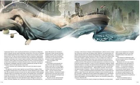
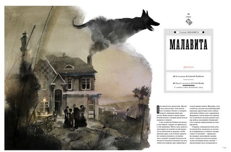
And the wonderful thing about not using a tool for so long (a good half-century in this case) is that when you do eventually bring it out of mothballs, the effect is stunning. We came across the following Russian magazine illustrations on Pinterest (thanks, Ana Carmo!), and couldn’t stop looking at them:
Perhaps what we like best about these spreads is that you can actually see the designer working hand in hand with the illustrator for maximum effect.
And to get a sense of what things used to be like with book and magazine illustration, checkout Today’s Inspiration.


