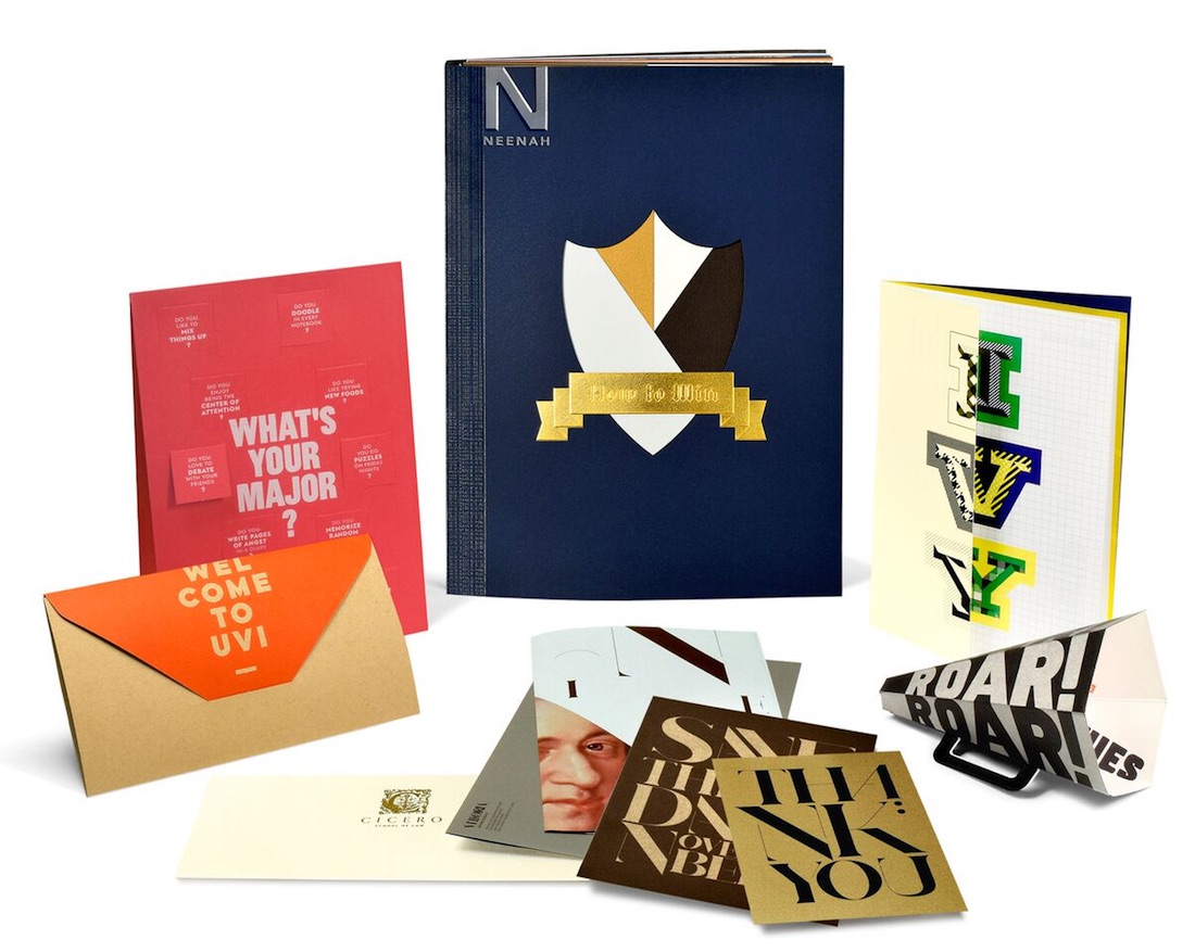
Competition isn’t fierce only for people applying to the college or university of their choice, it’s pretty darn cutthroat for the institutions themselves. So much so, there are designers working throughout the year trying to come up with new ways to make client schools stand out in the teeming groves of academe. With characteristic charm and enthusiasm, Neenah Paper has outdone itself yet again with its brand new promo, “How to Win,” which provides inspiring examples of dimensional and other items that go far beyond the done-to-death college brochure.
“In higher education, rising above the competition means…developing marketing materials that resonate with a variety of age groups, from high school students through generations of alumni, and donors,” said Neenah Senior Brand Manager Kathy Kemps in a release accompanying the publication of “How to Win.” This flags up an interesting challenge in higher education today – increasingly any marketing push has to take into account the more mature student going back to school to retrain or further their present qualifications.
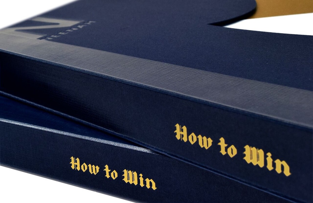
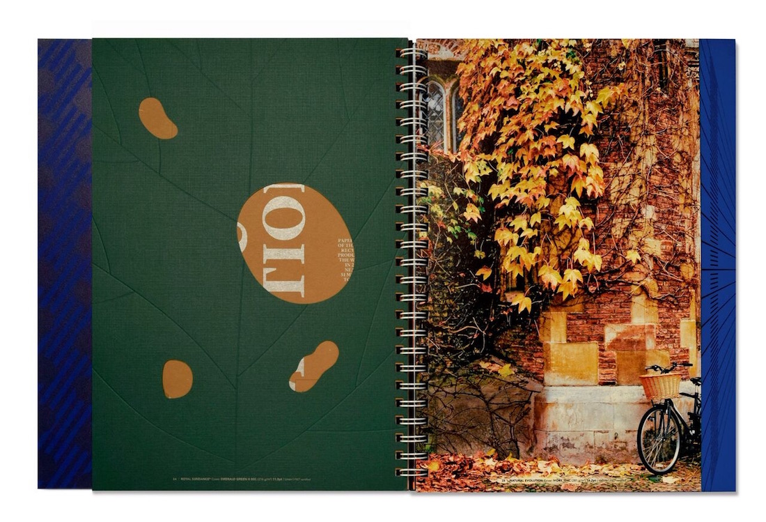
We felt a big ol’ smile cross our face upon first clapping eyes on this hefty Wire-O bound book as it looks just like the yearbooks of yore. Of course this yearbook is filled with large French folds that hold several pull-out samples, including 13 Neenah papers from Classic Crest and Astrobrights to Environment and Stardream.
PRO members, ready to head back to school? Request your copy of the brand new “How to Win” promo from Neenah right now! (Not a member? Why not start your 7-day-free-trial membership today?)






What fonts are used in this booklet?
I’m afraid we haven’t any information on the fonts used for these pieces; sorry that we couldn’t be of more help on this.
Is there any info as to what color ink was used on page 26?
I’m afraid that might be tough to track down as this promo is from way back in 2016. Sorry we couldn’t be of more help on this.