When packaging is really swinging for the cheap seats, it thoroughly makes us rethink the item being packaged and our relationship to it. This week, we send our glucose levels into the stratosphere to frolic amongst the superheroes, discover that the fault is not in our stars but in our scent, and enjoy the street art of Poland in a highly unusual way. (Previous Cool Packaging of the Week can be found right here.)
‘Superhero Day’ Krispy Kreme Packaging
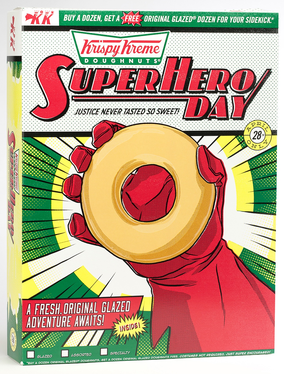
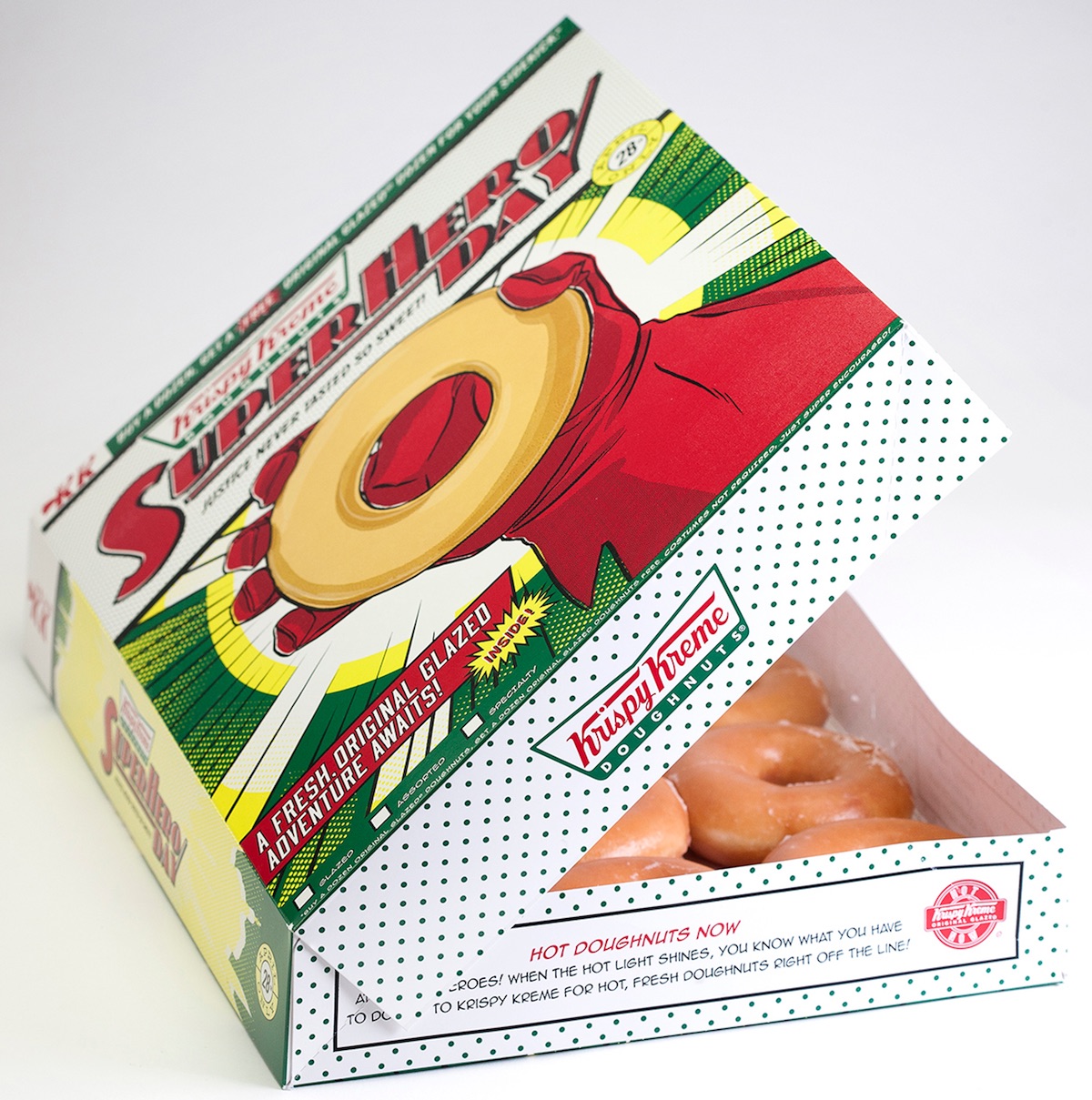
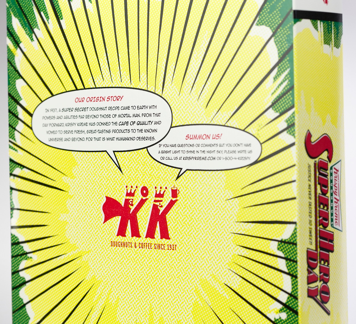
If the words above leave you sputtering “Holy confusion, Batman!” you’re not alone. Printed to celebrate “National Superhero Day” (who knew?), this box is the first time Krispy Kreme has gone outside of its normal brand identity. Designed by creative agency Baldwin & Raleigh, the package is printed sideways to open comic-book style, with copy that taunts you with the prospect of getting an additional dozen doughnuts free for your “sidekick.” Which of you is the sidekick? Good luck having THAT conversation…
Horoscope-inspired Scent Packaging
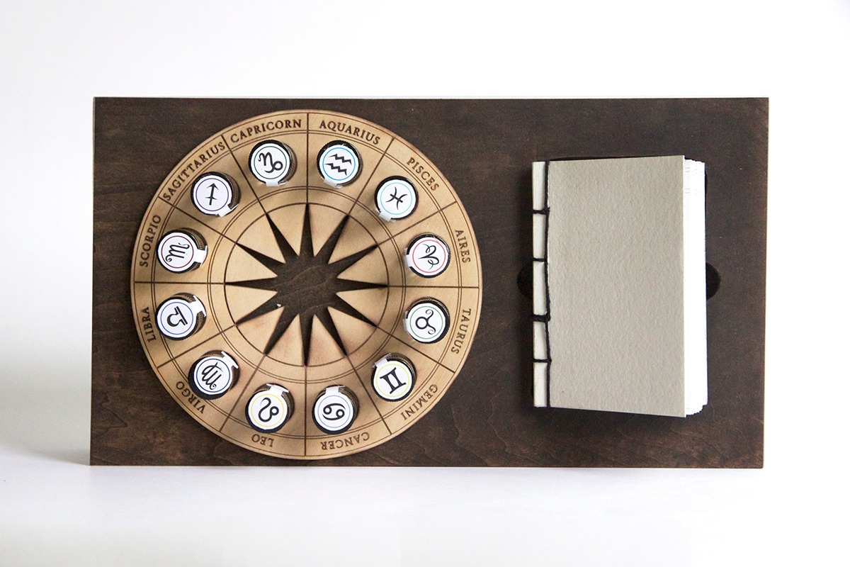
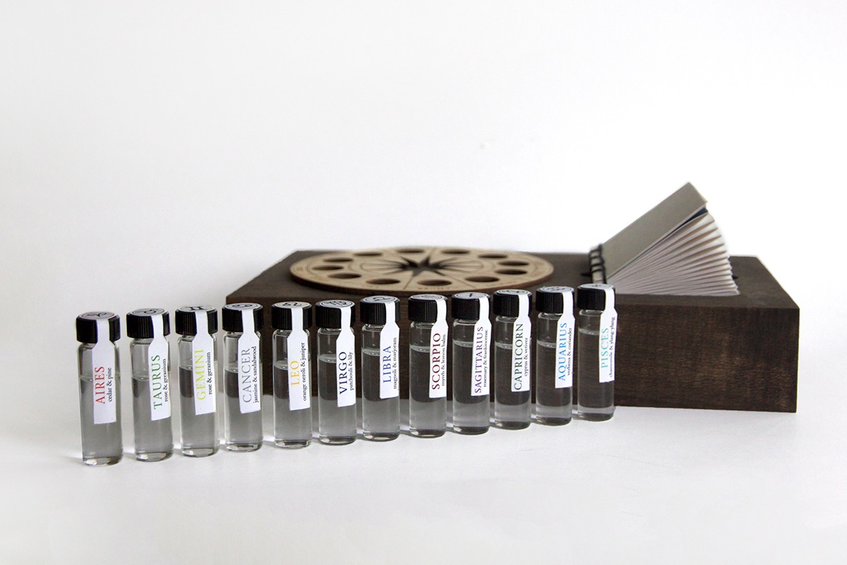
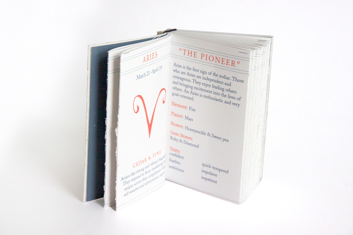
Art student Antonia Orol-Berlinger has crafted an intriguing fleet of perfumes, each based on a zodiac sign. While the vials for the individual scents are pretty simple, she’s arranged them in a fascinating wooden base alongside a hand-stitched guide to both the star signs and the scents themselves.
Graffiti Book Packaging
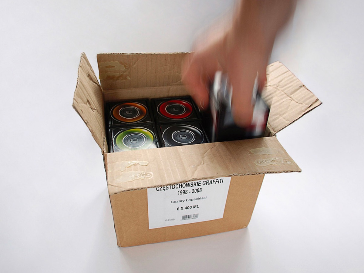
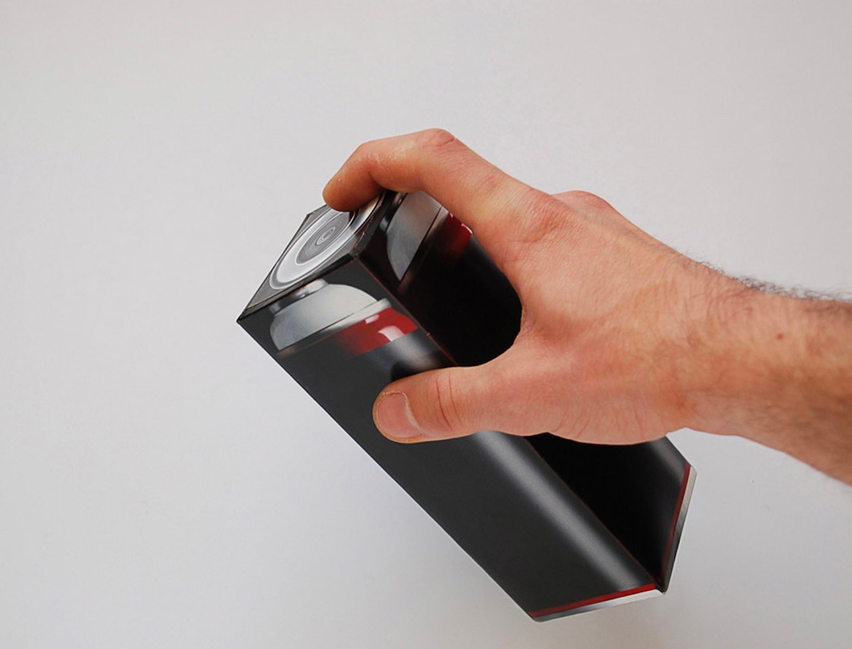
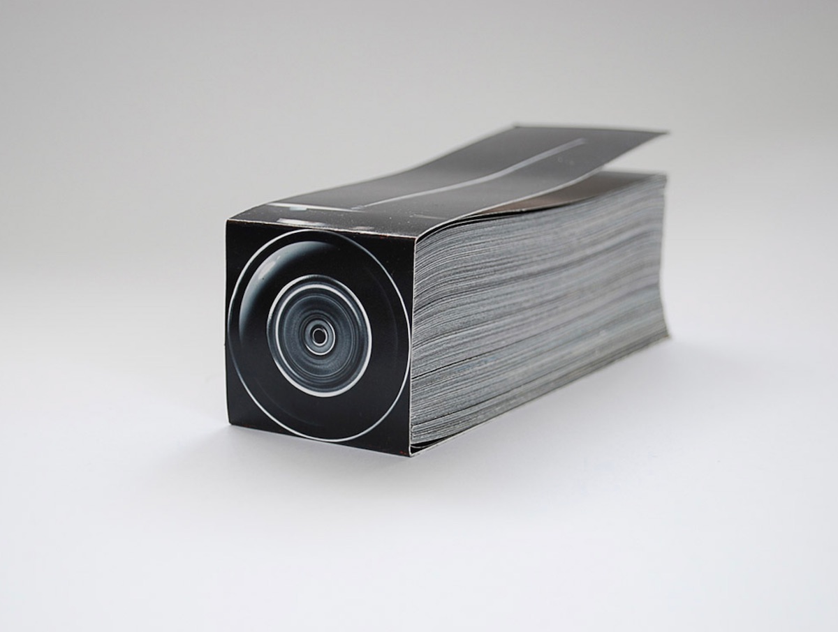
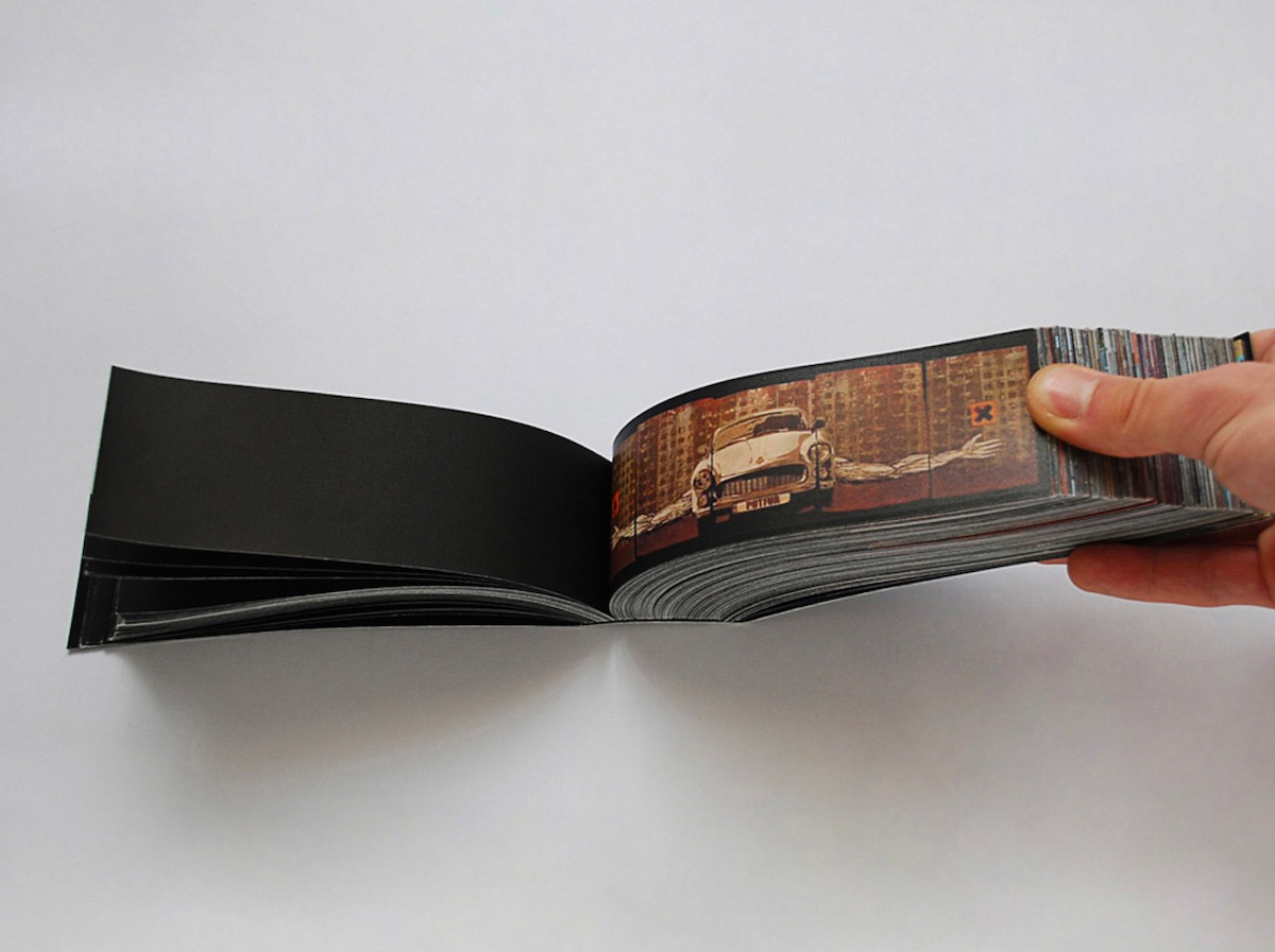
Street art may be the last art form (mostly) uncorrupted by commerce and incapable of being ignored, inspiring fans and practitioners all over the world. This study of Polish graffiti features 6 swatch decks, each containing 940 pages. Each deck comes in a box printed to resemble a spray-paint can, with the bound edge of the deck resembling the top of said can. Completing the effect is the way the “cans” are packed in a plain brown cardboard box, just the way spray paint comes. (Though you’ll forfeit some street cred as a graffiti artist if your paint cans aren’t stolen, so….)

