 When you have a brand as recognizable as Sony’s PlayStation, you’d think marketing would require little more than rolling out your latest game console at Best Buys around the country, and then tutting into local TV reporters’ microphones over the ensuing violent stampedes.
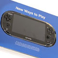
Yet, gaming is a fiercely competitive industry. Current wisdom suggests that Priority No. 1 is to get your system into the hot little hands of the gaming press, and spare no expense doing it. Sony did that for the launch of its handheld PlayStation Vita, but allowed the UK’s Fluid Design and Tuckey Print to go a little crazy with the crafting 1,600 copies of its 52-page paper media kit.
[youtube=https://www.youtube.com/watch?v=LPrWQTHQ944]
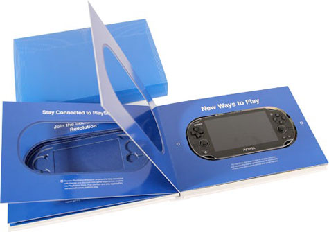
First off, four-color printing was applied to either side of 350gsm Phoenix Xenon for the cover, which was finished with spot UV and a 2D emboss, and matte laminated. The main body used 24 pages of 150gsm Heaven 42 paper folded to 6.1” x 8.3”, printed in four colors. Each page contains a large oblong cutout mimicking the shape of the Vita. Art from different Vita games is printed around each cutout. (Check out the video above around the 5:30 mark for a better understanding of this feature.)
A variation of this booklet was used to package the test versions of the Vita itself, which were sent to reviewers. The Vita fit snuggly inside the cutout.
In addition to translucent inserts and a central four-page, 170gsm Phoenix Xenon insert, the booklet featured a disc held by a 360gsm Curious Cosmic Blue with metallic foil on the inside, clear foil without.

As Fluid Design’s Paul Whitaker told Print Week: “What makes the press kit so unique is the incredible array of print finishes and papers that we’ve used to create the final press kit; its range of tactile finishes playing on the many differing features of the PlayStation Vita itself, and the tactile finish of its back panel.”
Lest you think that gamers have nothing but contempt for print today, a German-language video of the media kit’s unboxing prompted comments such as these on the PSVitaForum.com:
Alucard: “This should have been the official box. I would pay more for this box.”
Aetherhole: “That looks sick! I love the simplistic outer packaging.” [Editor’s note: “sick” means good amongst “these kids today”… and best not to ruminate too long on the screen name “Aetherhole.”]


