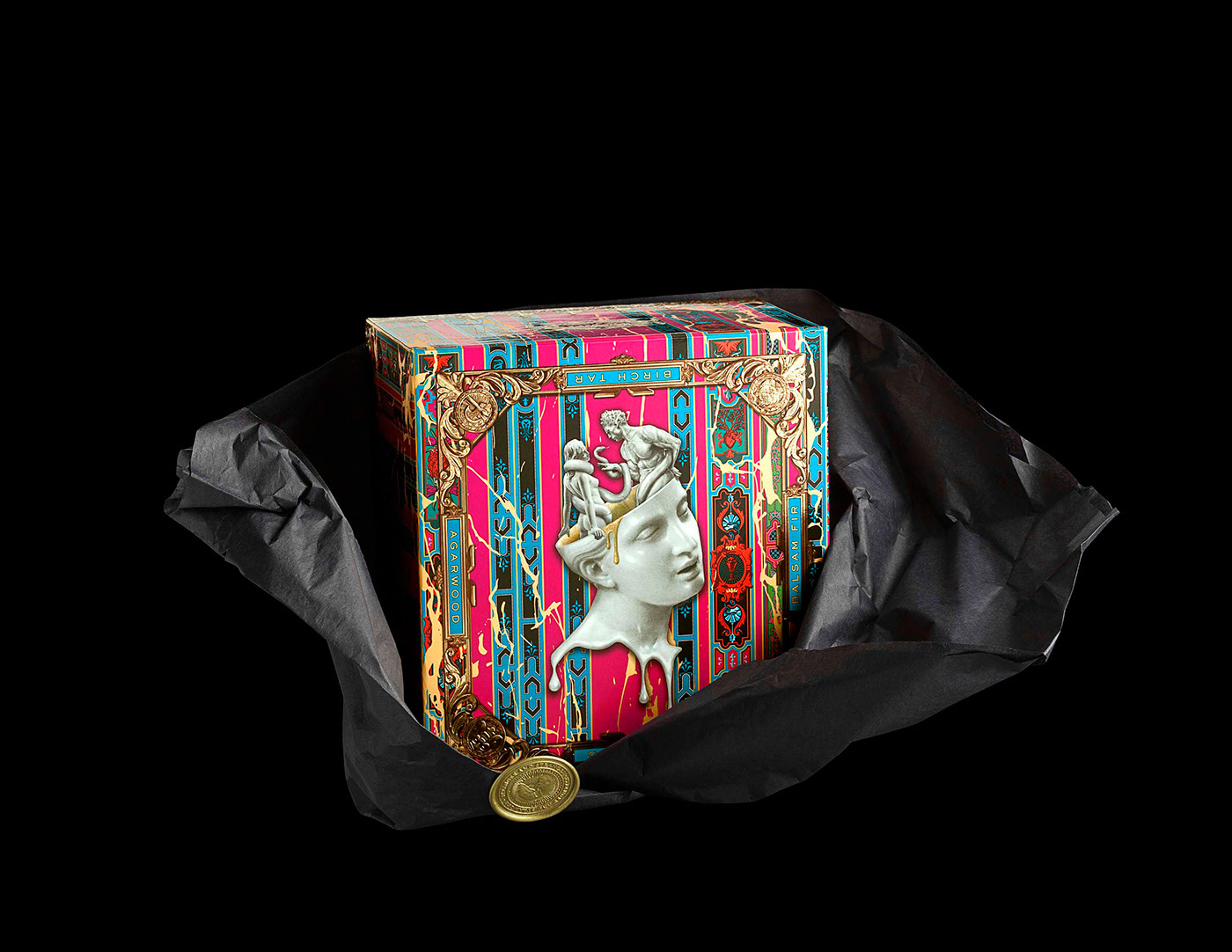
During the last week of 2015 as many were quietly waiting out the time-off clock, a few paper designs surfaced that we just couldn’t let slip by unappreciated. This week we ooh and ahh over two expressions of the holiday season with vastly different budgets but a comparable love of print, and a handmade artwork that will completely change the way you view paper cups. (Previous Cool Designs of the Week can be found here.)
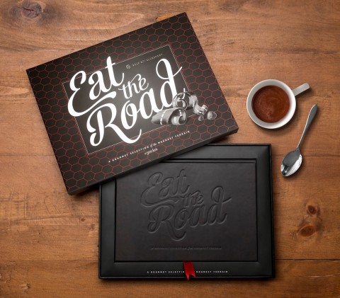
Stranger & Stranger Holiday Gift Design
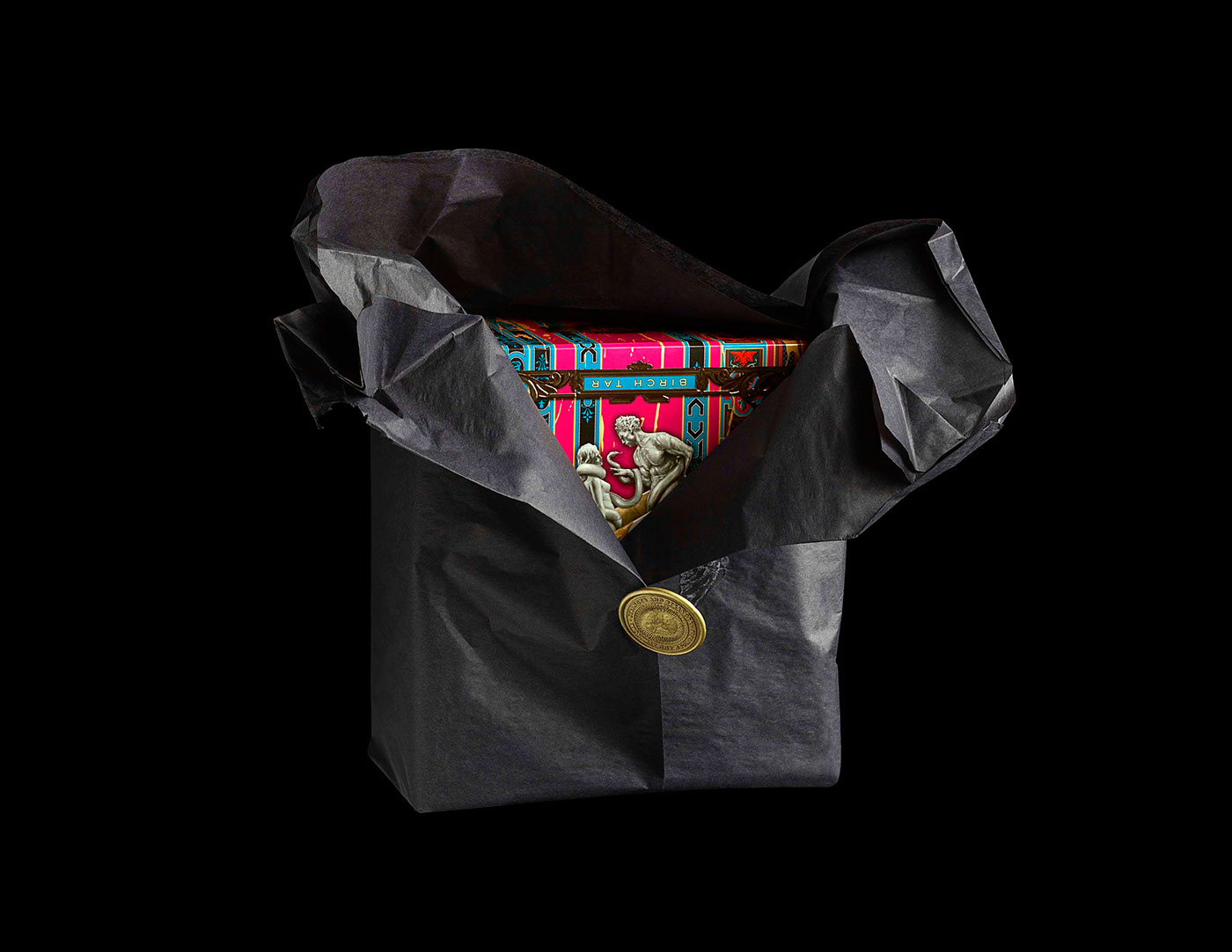
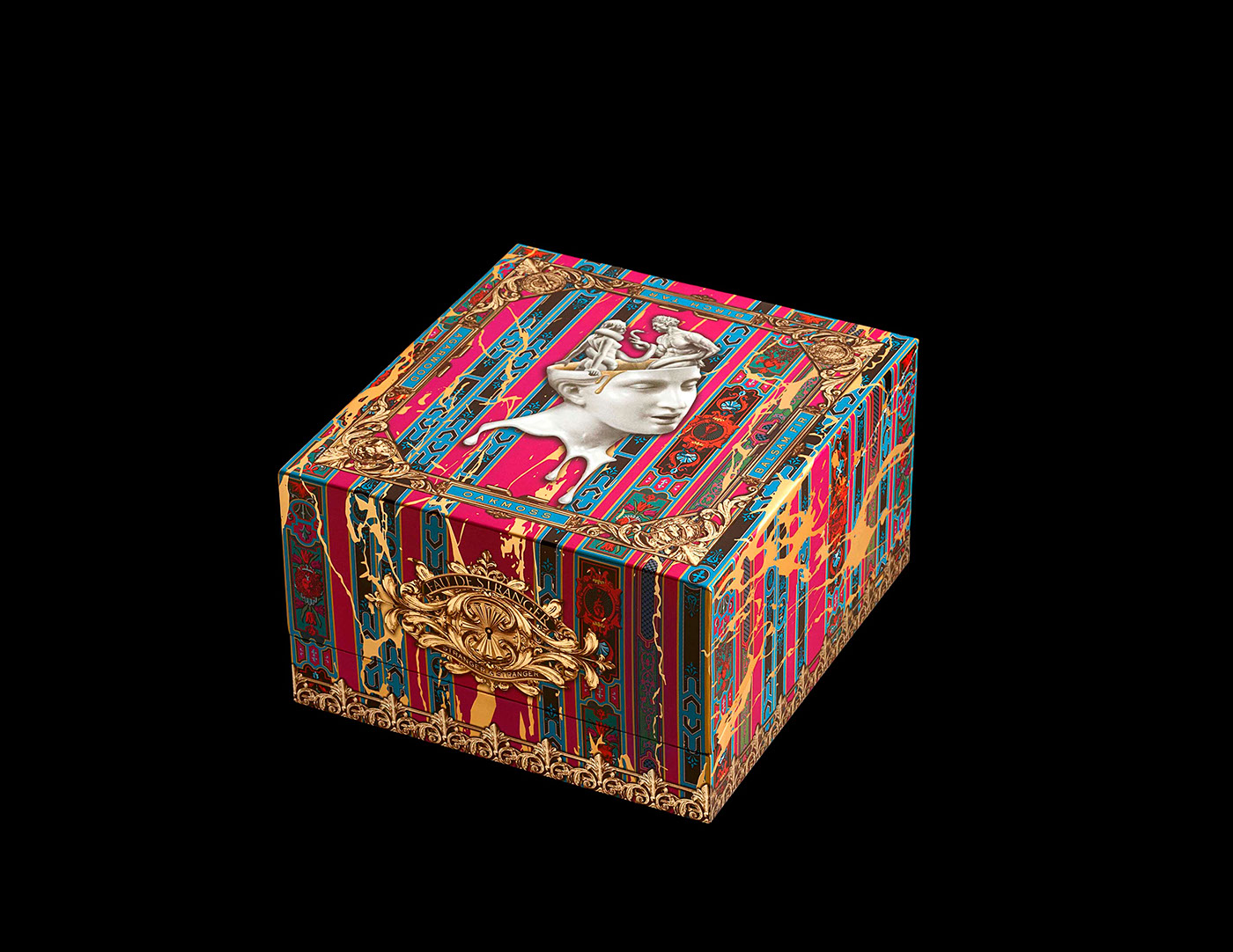
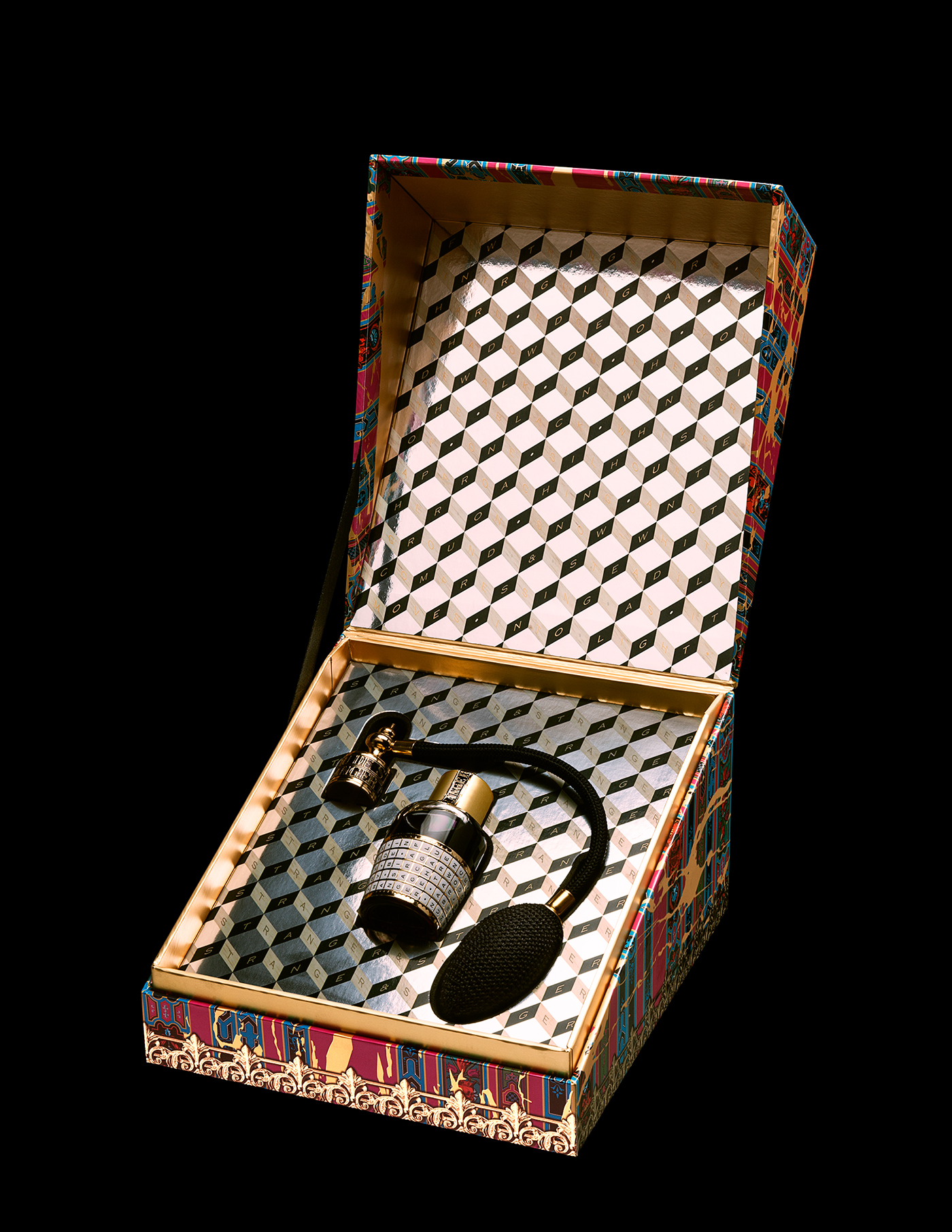
Is it really necessary at this point to sing the praises of wine & spirit label designers Stranger & Stranger? Oh well, yes, OK, they are THE first and last name in making firewater bottles look pretty, and that wicked design sense transfers nicely to pretty much everything they turn their hands to. Dig the packaging on “Eau de Stranger,” a holiday gift for those special clients. Carrying the tagline “pour homme, pour femme, pour room freshener,” this perfume atomizer – wait, stop, can we TALK ABOUT this bottle for a second? I mean look at this thing! OK, OK, enough about the bottle, this is PAPERSpecs after all. Fortunately, there is plenty to go on about in reference to the packaging, too. From those M.C. Escher-like interior papers to the exquisite artwork on the outside, this piece could put substantial numbers of museum holdings to shame.
BurdgeCooper Holiday Card Design
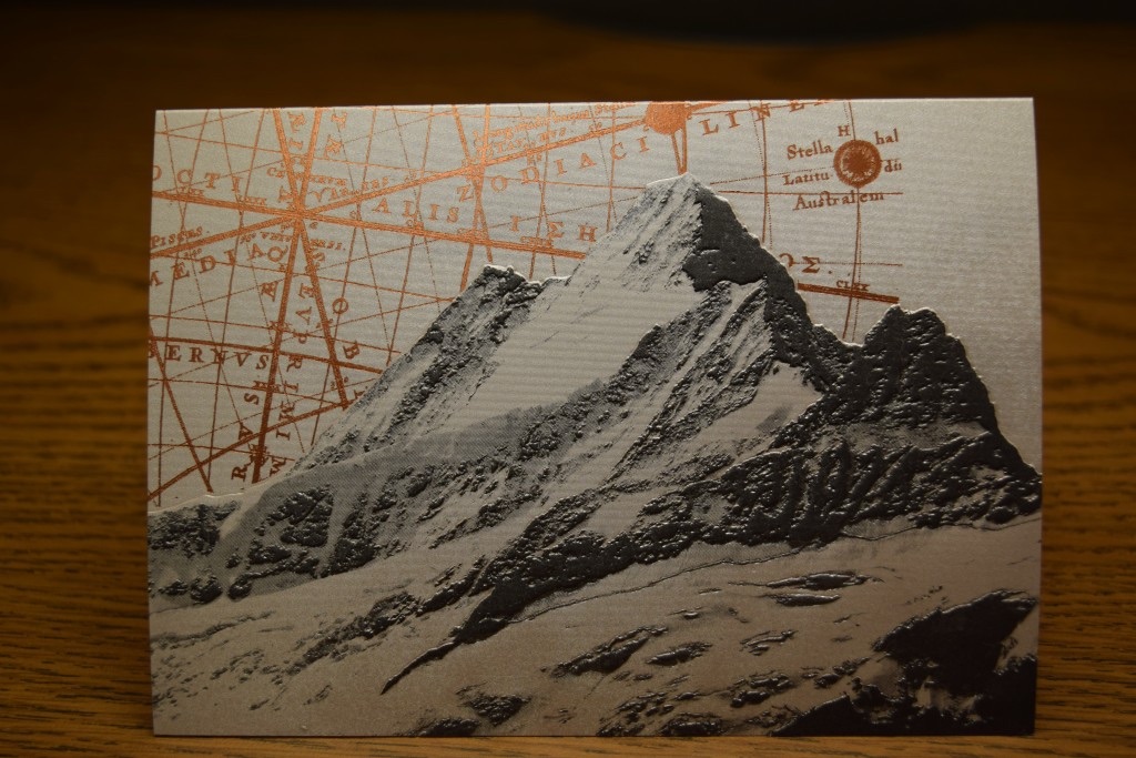
As Theodore Sturgeon famously held, 90% of everything is crap. Sadly, that goes for holiday cards, too. Fortunately, there are still some companies that get it right. In December BurdgeCooper put its ink where its mouth is, demonstrating its excellent print quality with this humdinger that combines a mountain motif litho’d and embossed on Gmund Brilliance 310 lb. Treasury Composition stock, combined with a copper metallic foil backdrop that simultaneously celebrates getting lost AND knowing where you are. Sooo much better than yet another rendering of Christmas ornaments and wreaths. Great, great job.
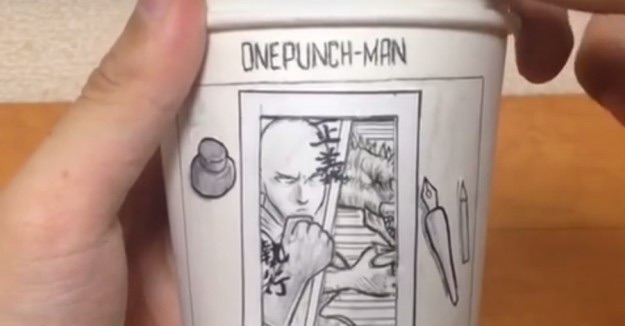
‘One-Punch Man’ Paper Cup Design
Japan has often been the crucible in which craftsmanship meets bonkers imagination. Whatever materials are at hand, you can always rest assured that they are used in ways you couldn’t begin to predict. Take artist Shin Shinrashinge, who used the Japanese webcomic “One-Punch Man” as inspiration for this paper cup cartoon showing the eponymous hero battling a monster. You’re really going to want to watch the video – this isn’t just a few lines drawn on the morning’s cup o’ joe. Now imagine what this artist could do with a budget…

