It often feels as though we have so many projects going at once, we seldom have a chance to sit down and actually think out a better way to do what we’re doing. This week we take a look at a couple of designs that do just that, including an online eyeglass retailer with a touch of class, and a conference that finally found an excellent use for attendee badges. (Previous Cool Designs of the Week can be found right here.)
Bailey Nelson Prescription Design
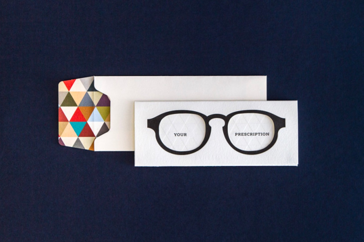
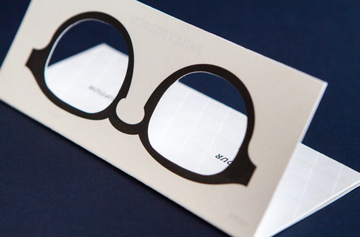
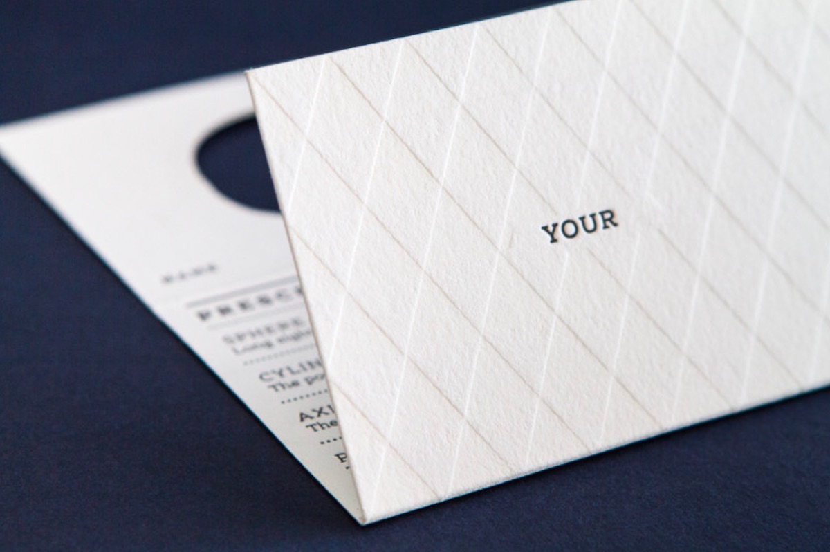
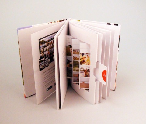
Australian eyeglass retailer Bailey Nelson prides itself on regarding “extras” (such as anti-glare coating) as essentials, and offering locally designed glasses that are made by hand. With such an emphasis on quality, they couldn’t very well give you a simple printout of your prescription to keep for your records. The piece The Distillery came up with is a great example of adding texture to what is essentially an online-only experience.
f8 Conference Badge Design
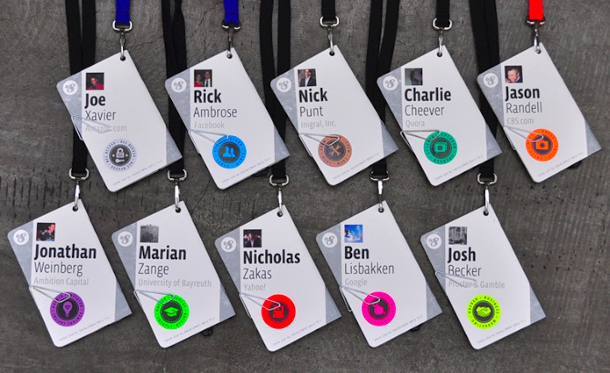
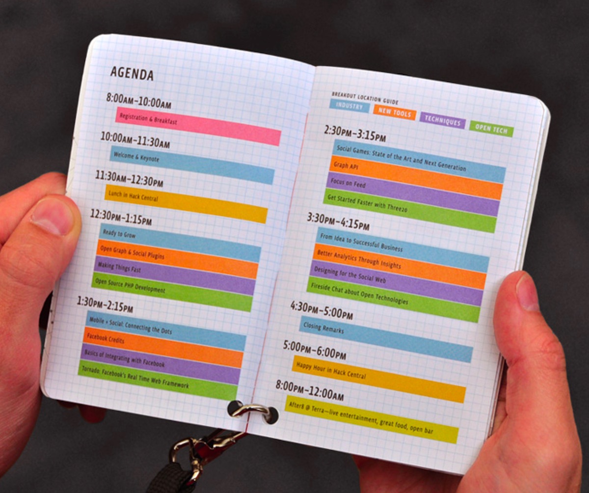
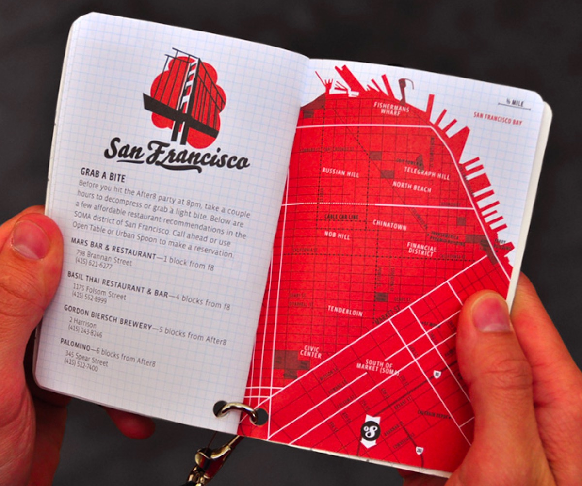
Conferences today seem to have no problem with making attendee badges that look slick and stylish (we still have beautiful dreams about the ones from the Brand New Conference), but they’re seldom what you’d call functional. Though these badges from the f8 Facebook developers conference are six years old now (!) and may not be the most beautiful things imaginable, they do something that we still wish other conference badges would do – give you easy access to the info you need as an attendee. Not only do these carry a complete schedule of events, you also get easy access to a map of the venue, a guide to places where you can get a quick bite to eat, and more. And as Fonts In Use observed at the time: “The designers drilled a hole in the corner of the booklet so it could be easily opened and flipped through while still attached to a lanyard. The serendipitous side-effect was that the badges hung at a novel angle, allowing a bit of extra space for larger type and longer names without feeling cramped.”
Glider and Packaging Design
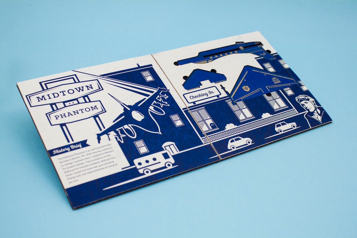
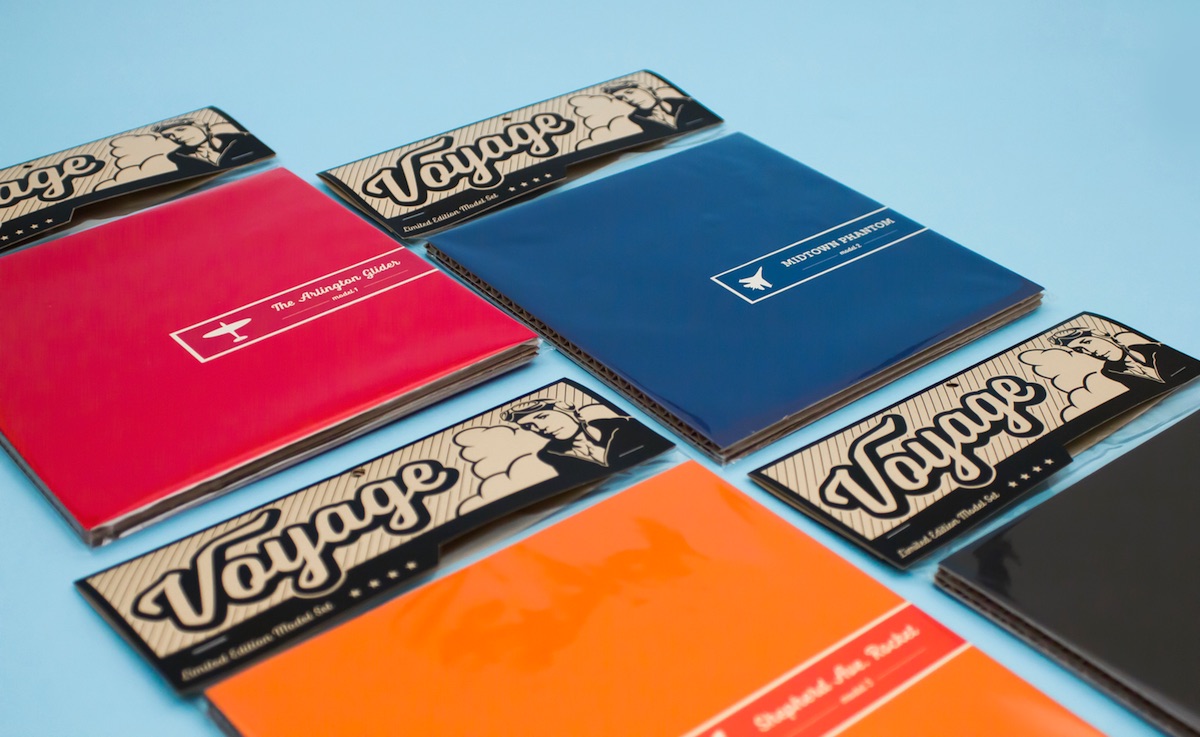
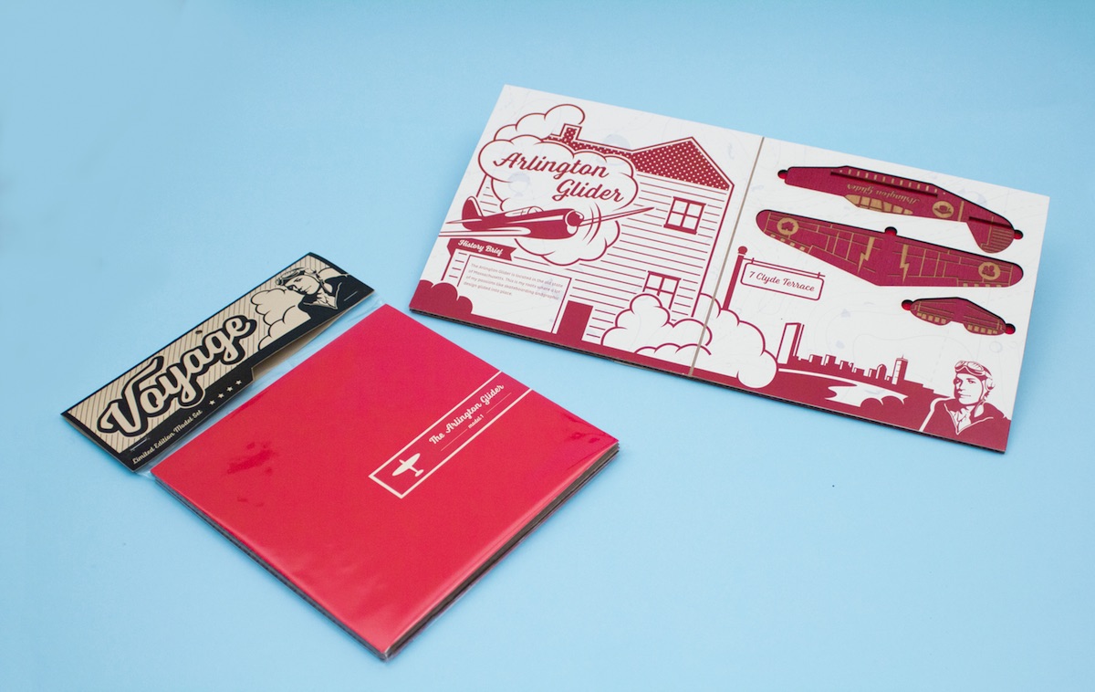
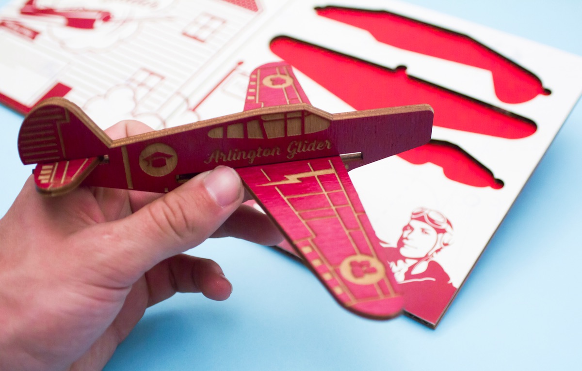
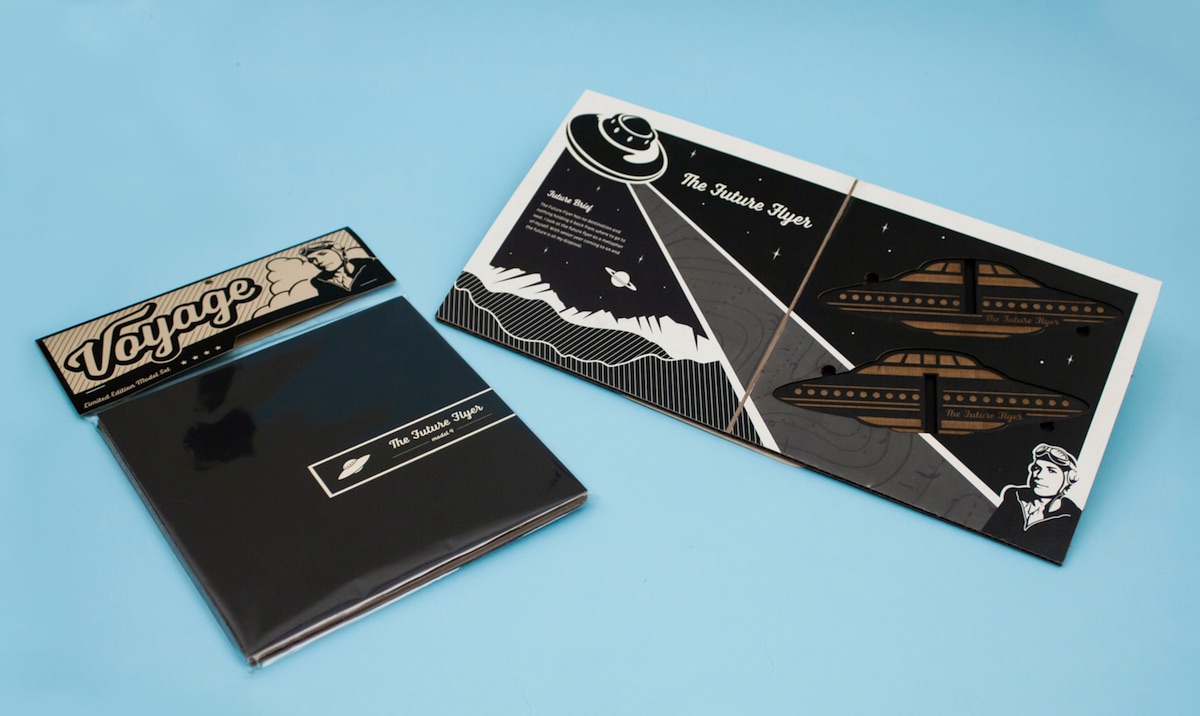
Well that’s quite enough of the useful stuff for now. We next turn our attention to something we don’t see too often: a product and its packaging that feel far greater than the sum of their parts. Designer Christopher Caldwell drew on a childhood love of building model airplanes to create a concept for a series of wooden gliders. While the toys are certainly eye-catching, it is the cardboard packaging and its nostalgic illustrations that really make these something special. (Many more photos can be found here.)

