The more digital our lives become, the greater our hunger for brilliantly designed print books. This week we discover a tome about a British bank that goes lovingly against the grain, another that just might be the largest and most opulent ever devised by a financial institution, and a doctoral thesis that is unquestionably a work of art. (Previous Cool Designs of the Week can be found right here.)
‘How to Grow a Branch’ Book Design
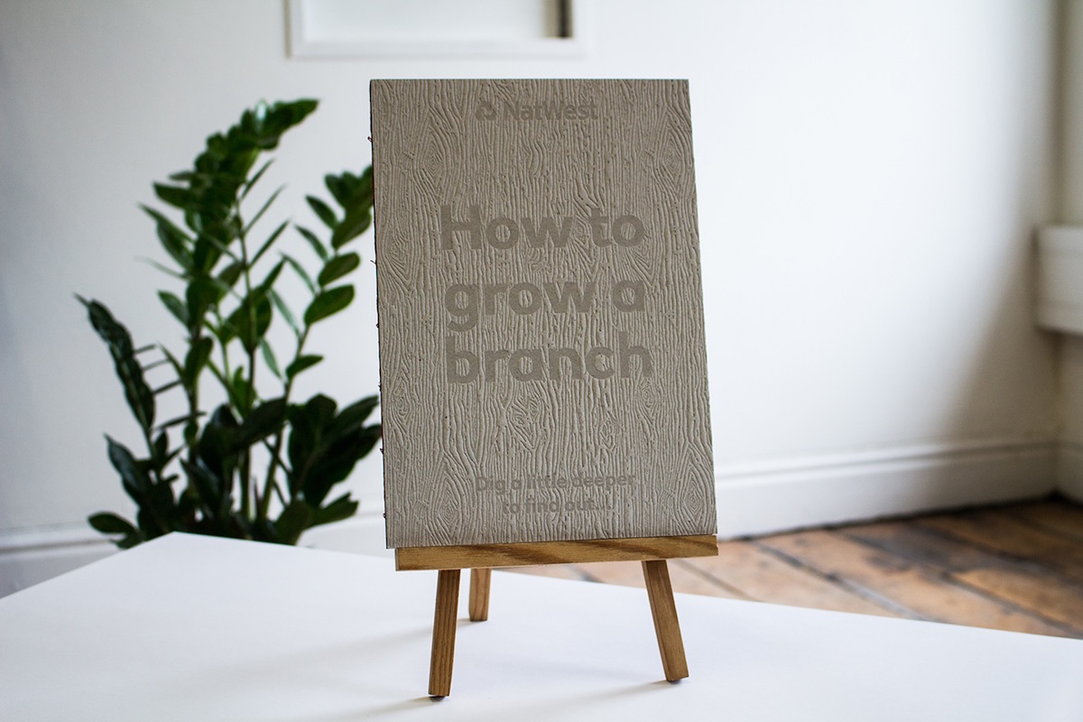
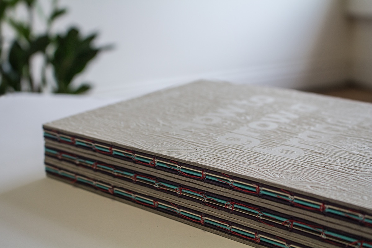
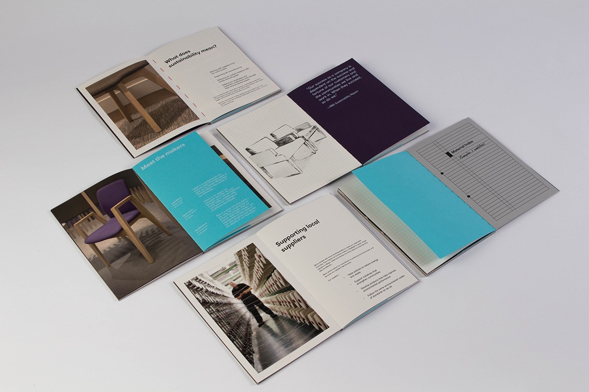
For reasons best known to itself, Britain’s NatWest bank wanted “a ‘boasting book’ that could answer any questions the customer might have about the branch design – from the chair they’re sitting on, to the table in front of them.” Passport Design Bureau took them at their word, producing a “technical sketchbook” piece featuring different eco-friendly GF Smith paper stocks and sizes, material swatches, and custom hand-drawn ink illustrations throughout. They had us at that touch-tastic cover and hand-sewn binding.
‘The Honors’ Book Design
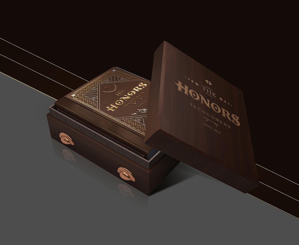
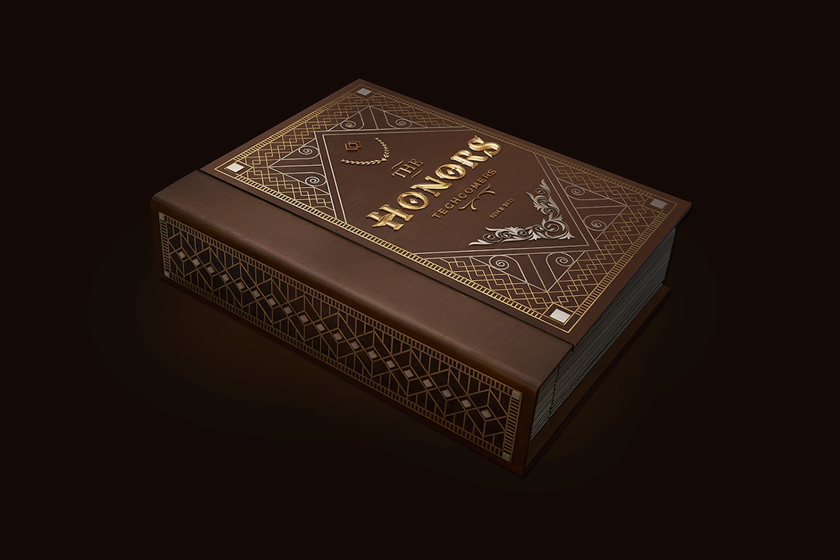
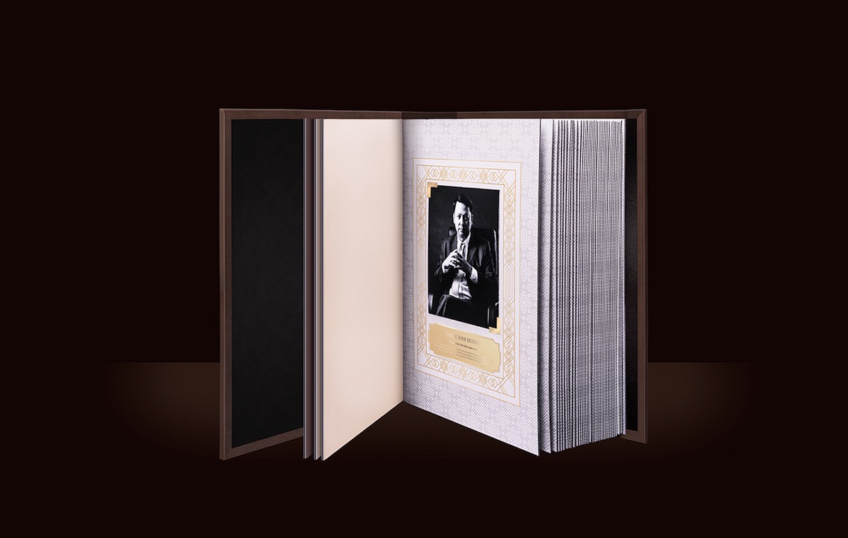
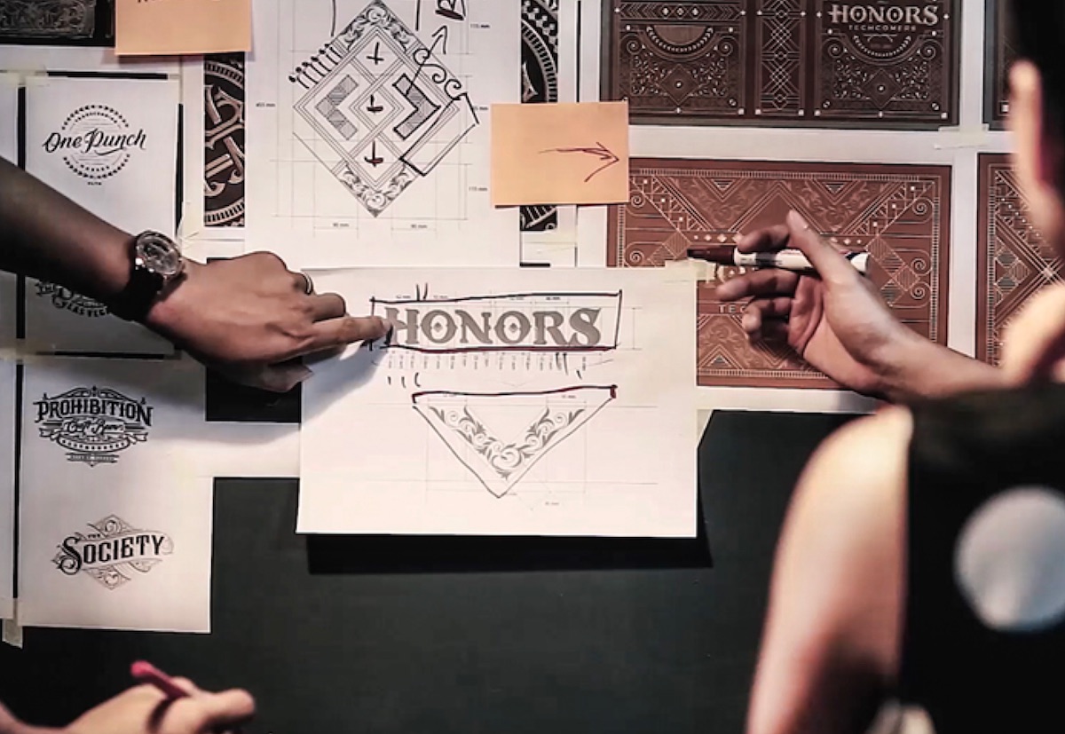
For most of us, employer appreciation will never extend far beyond a modest meal at even more modest restaurant around the corner. High flyers at Vietnam’s Techcombank, however, receive their own page in a giant book whose opulence and dimensions bring to mind the “Who Gets In” book on a podium by the Pearly Gates. Gold ink, silver ink, silver foil and a hand-sketched typeface – so far, so impressive. Now throw in real gold, silver, bronze and rubies and whoo boy – you have a tome that dazzles…AND weighs more than 176 lbs.!
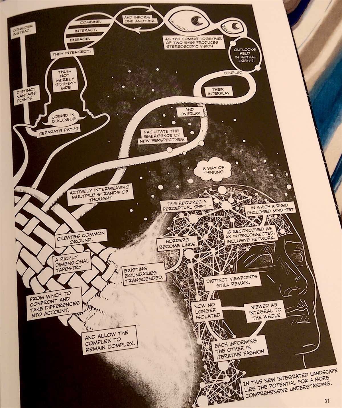
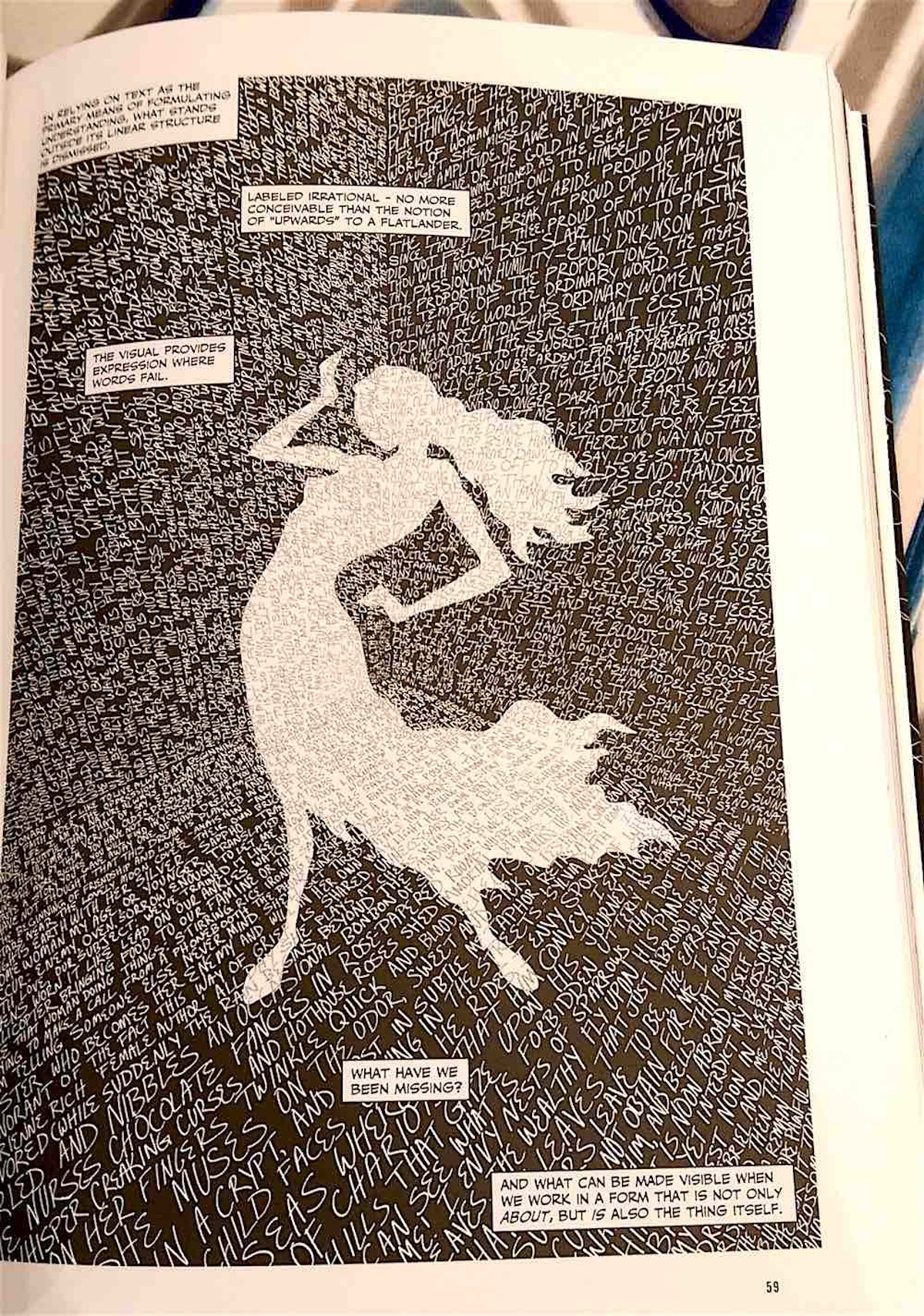
‘Unflattening’ Book Design
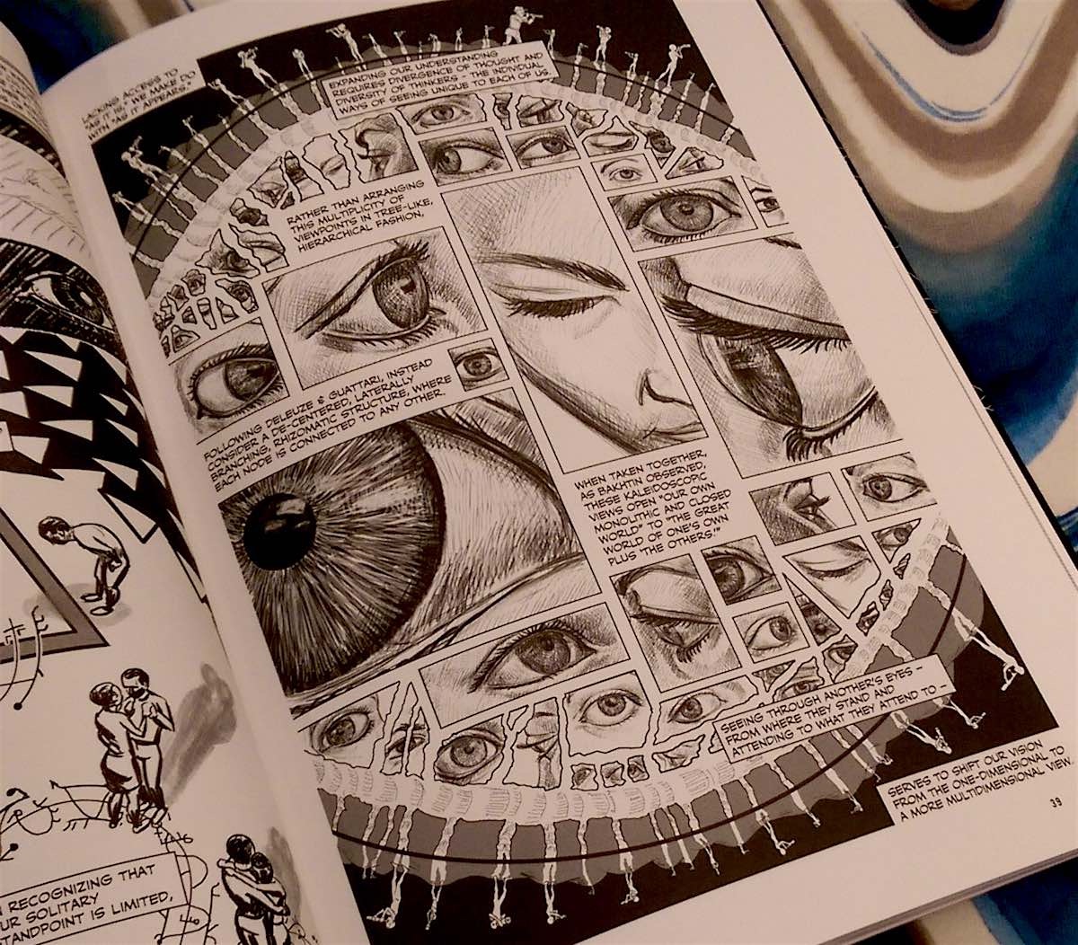
Dissertations are notoriously fusty, tedious affairs, seldom read by anyone beyond the academics tasked with reviewing them – which is why Nick Soutanes’ doctoral thesis, “Unflattening,” is such a marvel. At the risk of oversimplifying things, the book argues for the superiority of comics and graphic novels over text alone when it comes to explaining the world around us. While the concept is nothing new, we’ve never seen such an imaginative, convincing argument put forth in black and white, particularly at this point in the evolution of language. With a significant chunk of the world’s population communicating daily with photos and videos as much as text, the very fate of the written word as the primary means of communication is a matter of some doubt – “Unflattening” only seems to underscore that point.

