How do you successfully design the essence of a company or institution into brochures, business cards and the like? This week, we take a look at some grand approaches to this challenge from different parts of the world. We catch some exquisite down time at a luxury villa in China, see stars over pieces celebrating a Hungarian observatory, and slip into the ol’ tux to experience Russia’s Bolshoi theater. (Previous Cool Designs of the Week can be found here.)
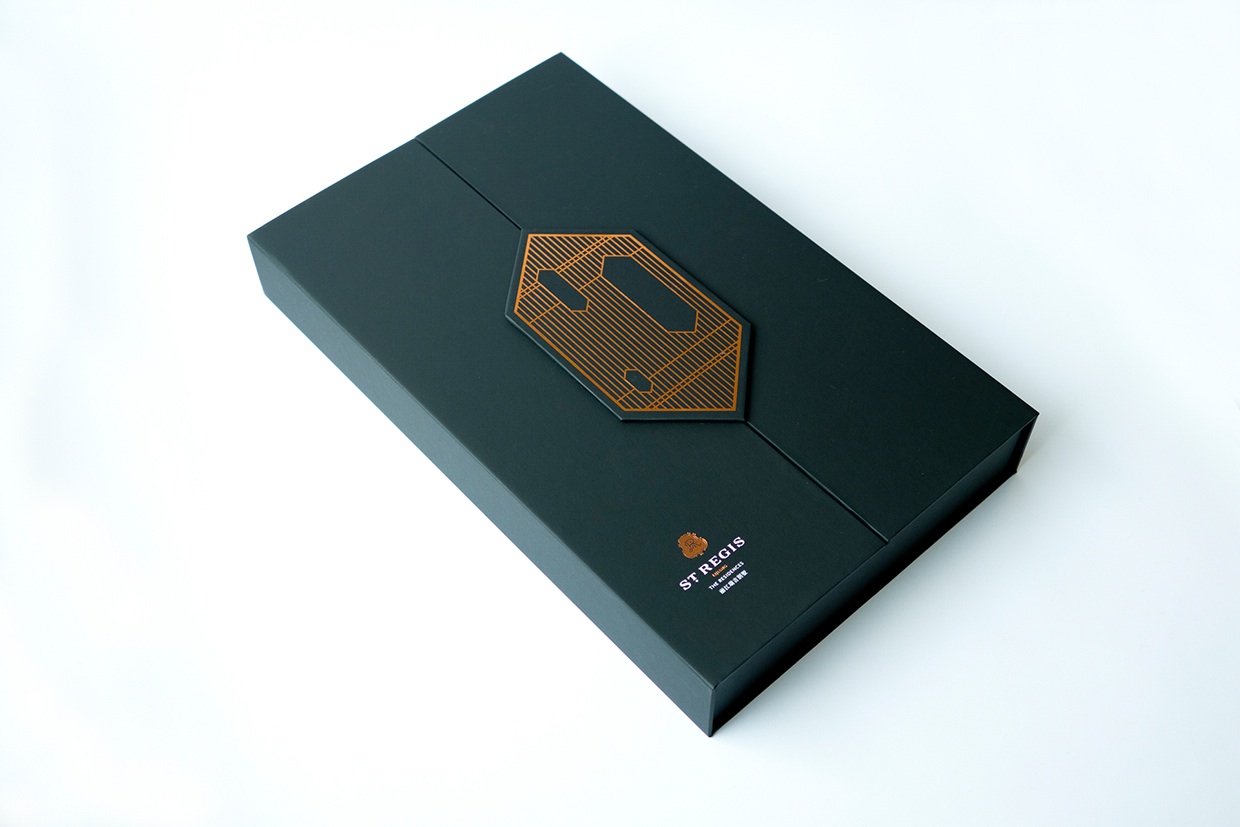
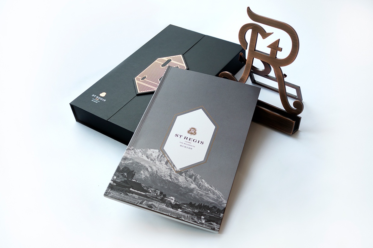
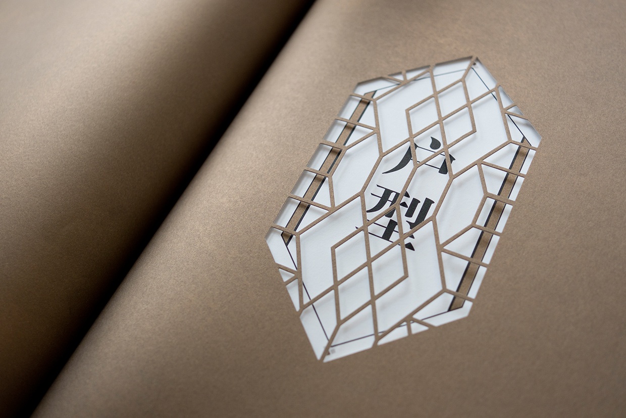
St. Regis Lijiang Collateral Design
Hong Kong’s Fokfolio pulled out all the stops when it came time to market the uber-posh St. Regis Hotel in China. Among the pieces: five pamphlets, a brochure and stand, a fold-out poster and signage. Check out the details on these pieces alone:
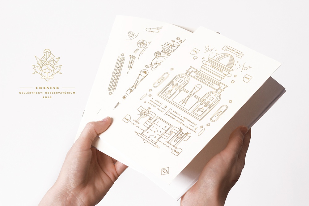
Uraniae Observatory Materials Design
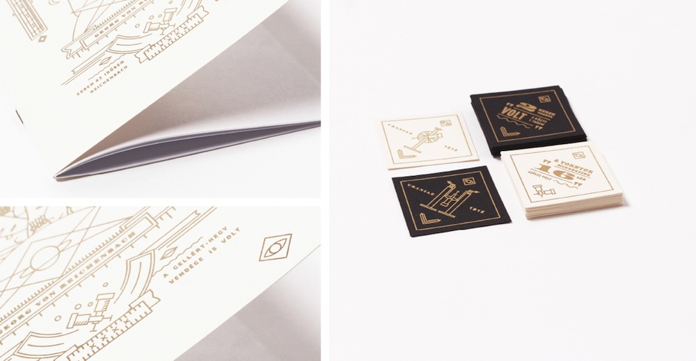
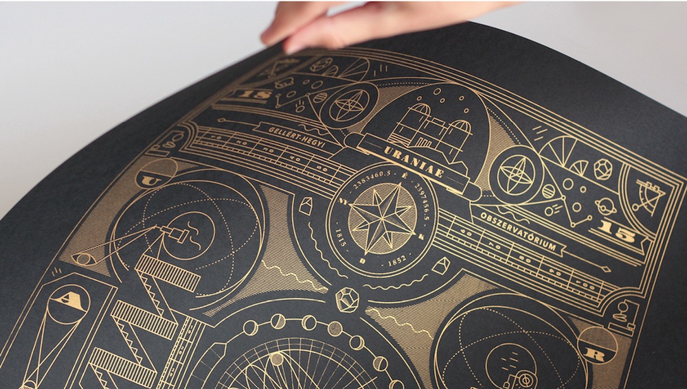
Celebrating the legacy of an observatory that studied the Budapest sky for only 37 years in the 19th century, these pieces crafted by Hungarian designer Hajnalka Illés include postcards, stickers, business cards, a booklet, and most drool-worthy of all: a gorgeous silk-screened poster.
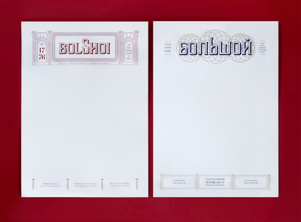
Bolshoi Theater Collateral Design
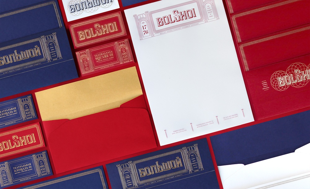
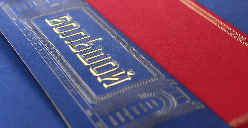
Dynasties are nothing new in the political and acting arenas, but seem somewhat rarer in the design and graphic art worlds: the Cantrell brothers are the exceptions that prove the rule. Kevin Cantrell has been delighting us for years with his divine typographic prints. Now we discover that his brother Tyson is no slouch in this department, either. His sumptuous materials for Russia’s renowned Bolshoi theater – a student project – cleverly use type that conveys the brand in both Russian and English, keeping any confusion resulting from the use of the cyrillic alphabet to a minimum.

