As wed as we are to print perfection, we do occasionally get the wandering eye for non-paper examples of delectable design. This week we go exploring with a map that changes with the weather, spin some vinyl that’s as beautiful as it is (un)melodic, and discover what might just be the most beautiful wine bottles in the world. (Previous Cool Designs of the Week can be found here.)
Bath C° Thermo Color Map Design
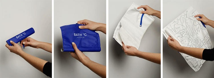
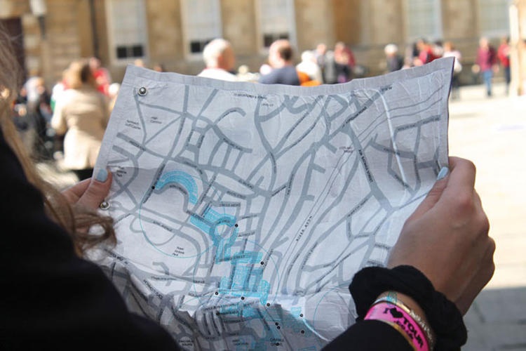
Nothing bleeds the fun and excitement from travel quite like a digital map. Yet traditional maps don’t necessarily have to lack interactivity, either. British designer Camilla Hempleman’s Bath C° Thermo Color Map shows you different places to go in Bath, England, based on the weather, using thermochromic ink printed on a waterproof Tyvek fabric. If it’s raining, indoor attractions such as museums are highlighted; if it’s hot, you see rivers and lakes; and if the climate becomes more suitable for strolling, appropriate locations come to the fore. And it all rolls up for easy carrying!
German Army Record and Packaging Design
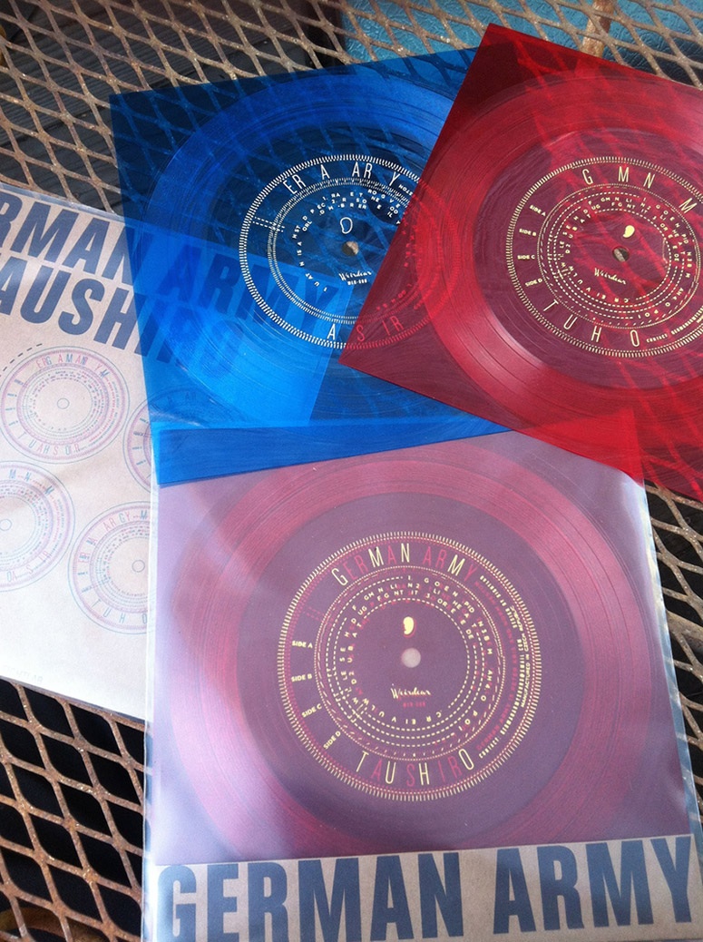
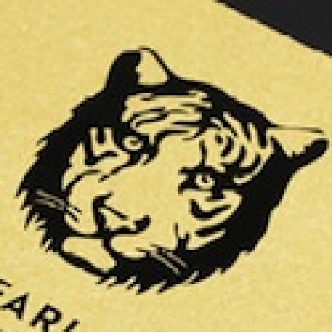
The perseverance of vinyl records is well known, but fewer realize that flexi discs, too, continue to live on thanks to the passions of boutique labels like Weird Ear Records. Sightlab Media Research got together with printer Pirates Press to create this intriguing hot-stamped flexi disc for German Army’s “Taushiro” release. This excerpt from UnderConsideration is a tad lengthy, but well worth a read to understand the full impact of this stunning project. The package is:
“…like a decoder ring, each disc only has a scattering of the letters that make up the whole. When the records are held together, the album title and track listing can only be read at certain angles – line up the bracket on disc A with the SIDE C marking on disc B, and the track names of side C resolve, while the other track and album information is disordered. Small hashmarks around the text move and shift when lit with a strobe while the record is played. The colors change depending on which disc is on ‘top’ – place the blue disc on top, the yellow print on the red record below comes through green, against the white print of the blue disc.”
[youtube=https://www.youtube.com/watch?t=60&v=m4-bL53nx-4]
Chinese Wine Bottle Design
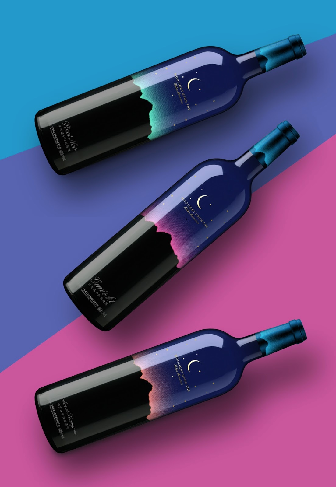
Setting out to propose that something is “the most beautiful wine bottle in the world” is like touching off a diatribe about “the most annoying reality TV star” – you’re a fool unto yourself for even attempting this line of discussion. But “fool” is just another word for “dreamer,” and this bottle for China’s Moonlight Upon the Helan Mountain gets our vote for that “most beautiful” accolade. Here is how the designers explained it:
“When we design this label, we hope to show mood of the moon climb up the Helan Mountains. It’s simple but intriguing. The upper part of the deep blue is the sky, the Golden Crescent and star hanging above it. The bottom half of the black is the shape of the Helan mountain. The middle is a halo, color changes with different grape varieties…”
We could very easily finish out the remainder of our days simply gazing lovingly at this collection of bottles. Pull up a rocking chair alongside our own and we’ll bask in its singular beauty together.

