Some 2,000 years on, paper can still be counted on to surprise, even as it inspires. This week we present “Paper Tales of the Unexpected,” in which we encounter a different approach to the “adult coloring book” craze, admire Google Canada’s unique take on pushing YouTube ads, and catch something nasty from the post (our grandmother was right!). (Previous Cool Designs of the Week can be found here.)
‘Scratch Night View’ Design
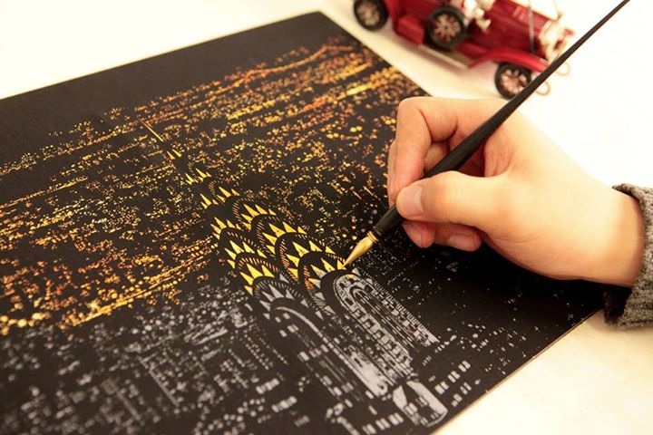
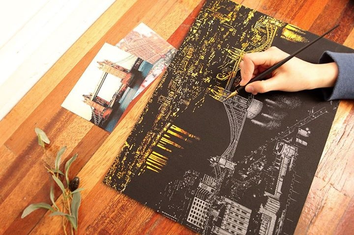
In the last couple of years, a cottage industry has sprung up to supply adults with coloring books of their very own, ostensibly to help relieve the stress and strain of modern life. South Korea has taken a slightly different approach to this new craze with “Scratch Night View,” special boards that can be scratched in such a way to reveal the beauty beneath. While it eliminates your ability to be creative in your color choice, the result is hard to argue with: stunning! (Images from Lago Design.)
Google Canada YouTube Pulse Campaign Design
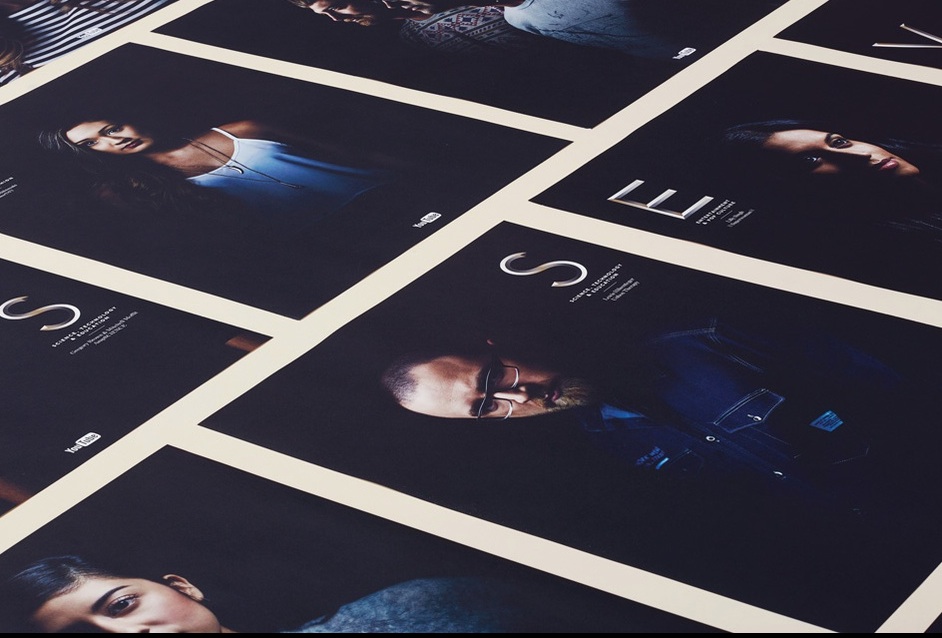
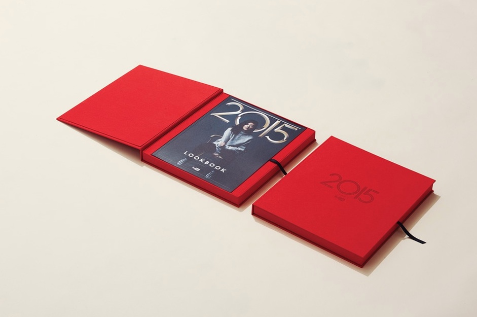
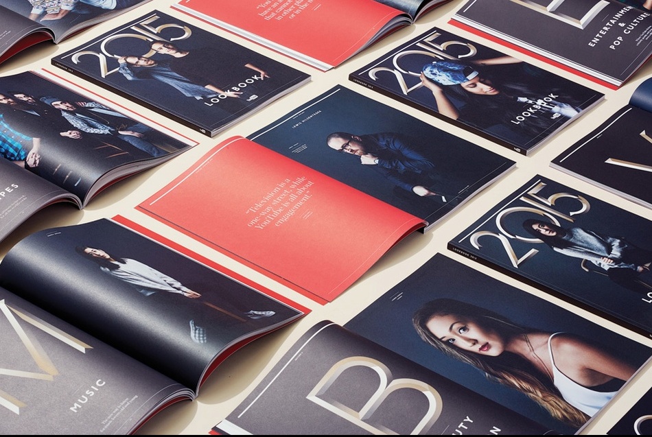
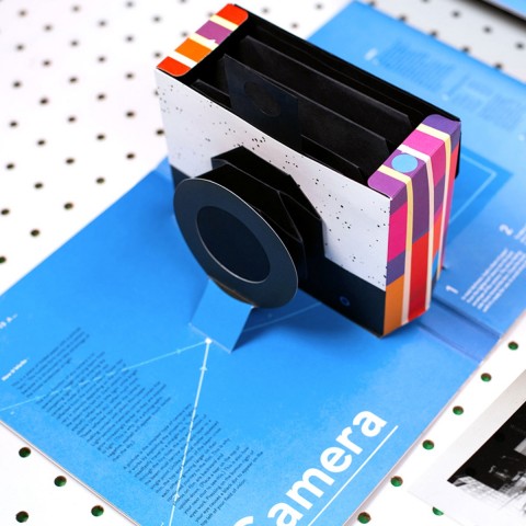
Despite being librarians to the Internet, Google has been known to embrace print when trying to capture people’s attentions. Their Canadian arm had Underline Studio come up with this cool package that highlights some of YouTube’s top creators in a clean, classy way, the better to convince media buyers that the streaming video site is a serious option for their ad dollars.
Vaccination Reminder Design
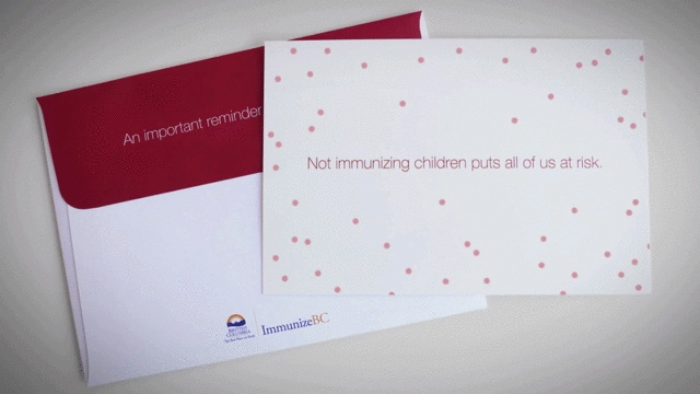
In a simple-but-clever project, Rethink Vancouver helped spread ImmunizeBC’s message to parents with a real (kinda) viral ad. Printed with UV-sensitive ink, this mailer suddenly breaks out in a red rash when removed from its envelope and exposed to light. “Not immunizing children puts all of us at risk,” it says – a message the parent in question can take to heart after rushing to the basin for a quick scrub down.
[youtube=http://www.youtube.com/watch?v=qXTCI-FSIEI]

