Ebooks may be gaining ground in the publishing world, but as the following examples prove, simply cannot compete with print when it comes to engaging multiple senses at once. This week, we get sucked into the vortex of a book series design that won’t let us go, get a nice buzz off a tactilely stimulating wine & spirit label swatchbook, and discover the children’s book-and-record package is all grow’d up. (Previous Cool Designs of the Week can be found here.)
‘Ring’ Series Book Design
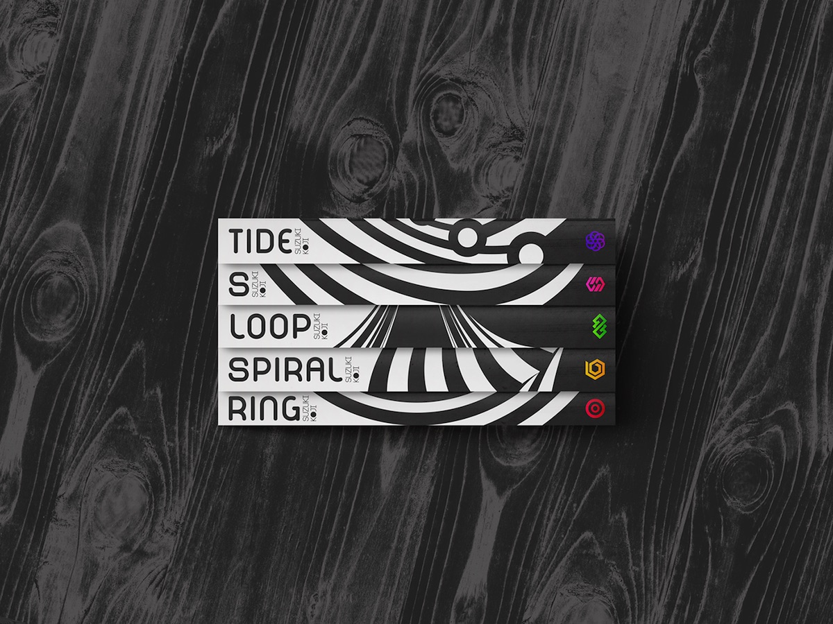
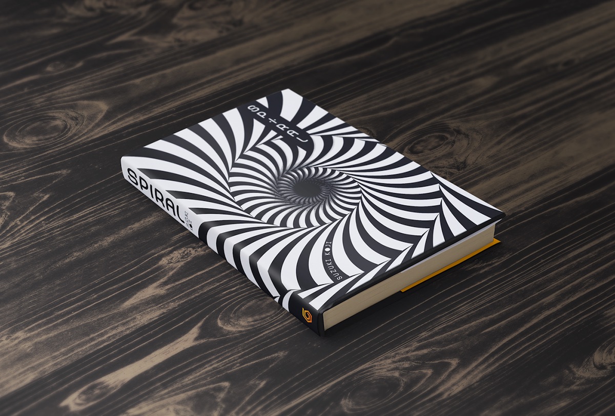
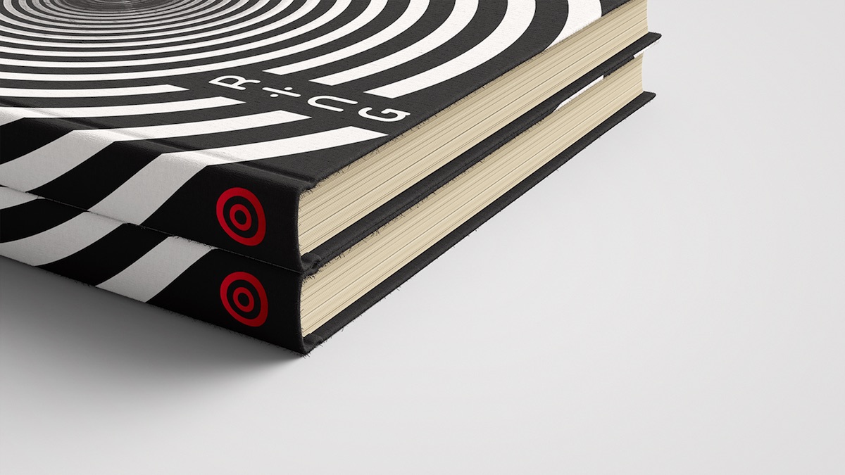
Koi Suzuki’s “Ring” series of novels are clever, creepy contemplations on terror and technology, inspiring a series of Japanese horror films and two American remakes. While the English translations of the series feature appealing, colorful covers designed by Chip Kidd, they fail to capture the sense of vertiginous paranoia that the stories themselves inspire. As a school assignment that ultimately became a passion project, Vietnamese designer “Hutoheta’s” reimagining of the “Ring” books improves on the originals by reducing the themes that the titles represent – “Ring,” “Spiral,” “Loop,” “S.” and “Tide” – to their design basics. The addition of a foil-stamped icon for each book is particularly effective, especially once you’ve read each book and understand what each symbol subtly alludes to. (And anyone who only knows the story from the films about “a videotape that kills people” are strongly encouraged to read the complete series, which pretty much turns that original concept on its head.)
Wine & Spirits Swatchbook Design
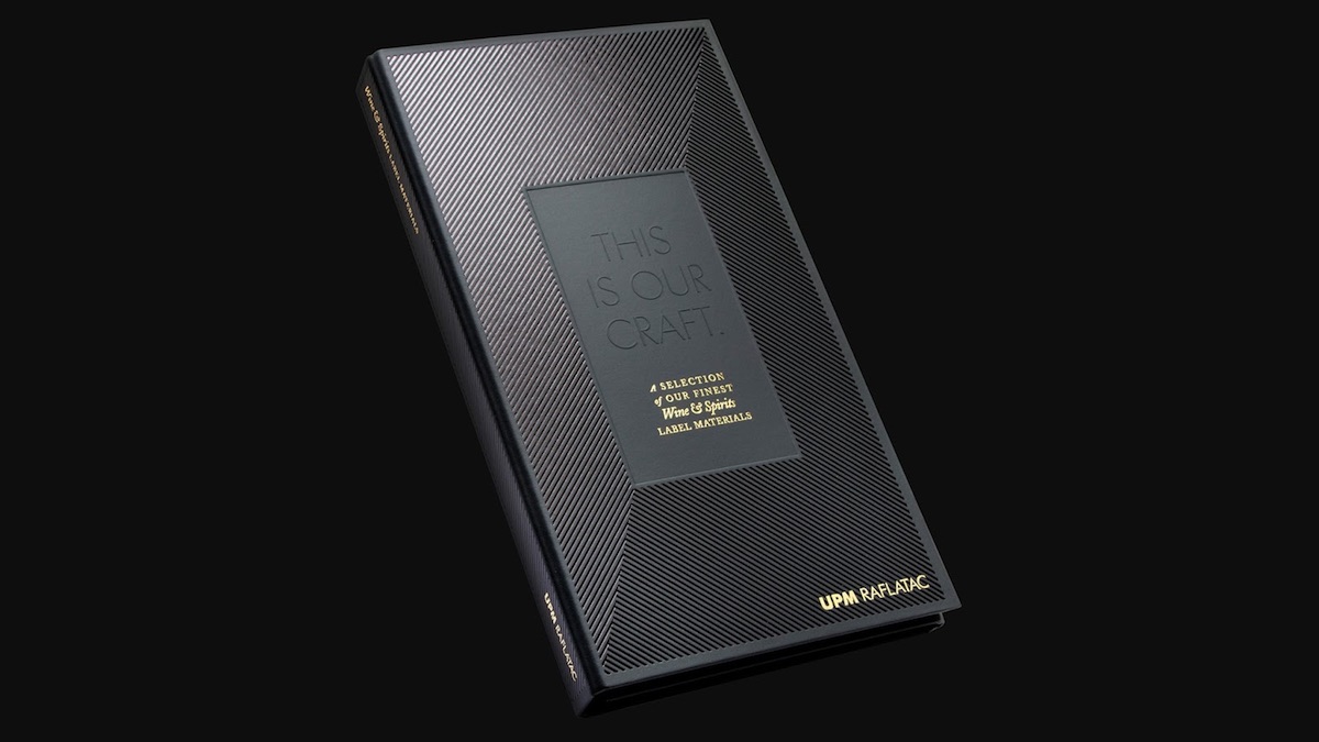
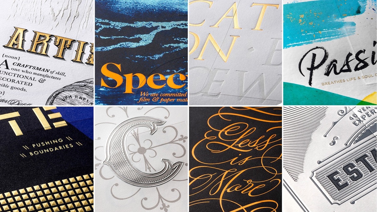
If you want to see the best illustration and design work in our society today, you need go no further than your nearest well-stocked hooch merchant. So naturally when we see the words “wine & spirits” and “swatchbook” in close proximity, our stoney hearts start a-pounding. Studio Parr’s showcase volume for UPM Raflatac’s self-adhesive alcohol-industry labels is not only gorgeous, it gives you a crash course in what can be done with coated and uncoated stock in this competitive environment.
Experience Design Book
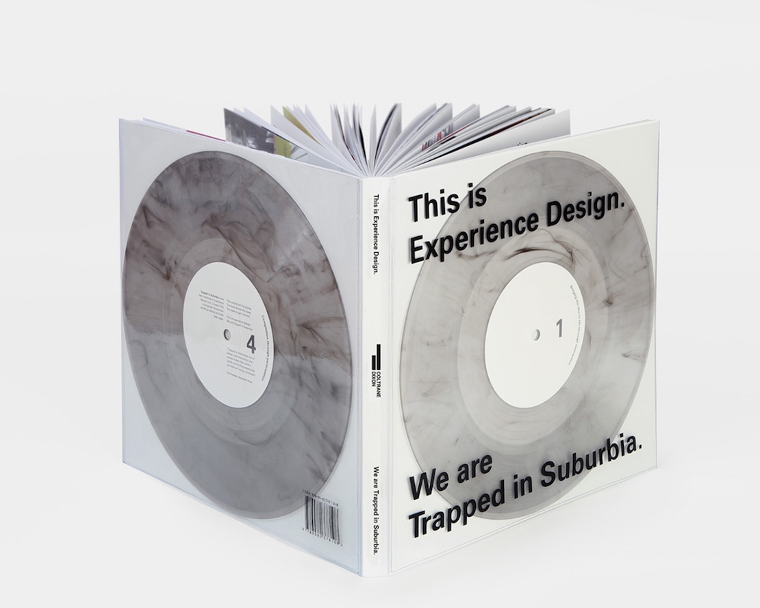
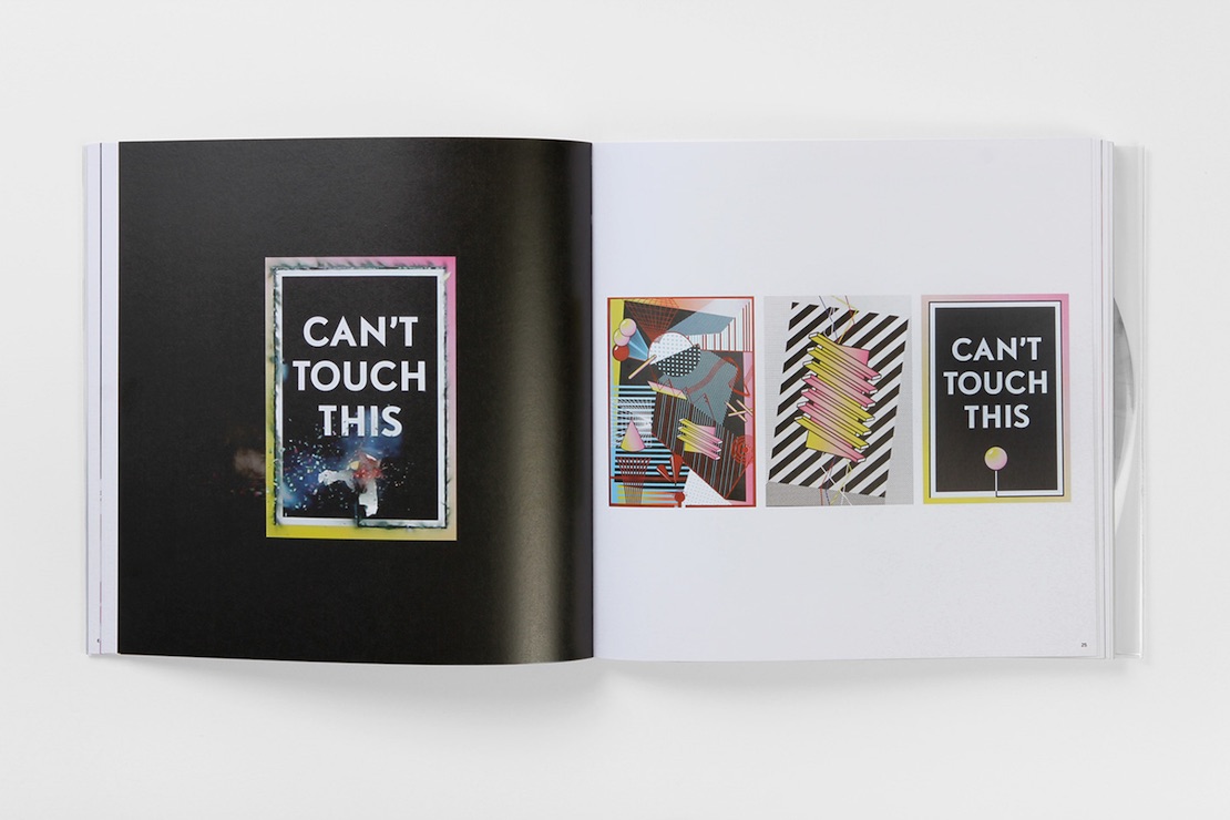
When your design studio is known for such things as posters that explode, people come to expect the unexpected from you. That poster is just one of the creations from Dutch company Trapped in Suburbia featured in their lookbook “This is Experience Design” – unusual because, in addition to large images of their work, the book comes with two 10″ nearly-transparent vinyl albums that, when played, tell you about the projects featured in this volume.

