We kick off the new year in design appreciation with a look at the art of selling the sizzle rather than the steak: packaging! This week, we give the workaday lipgloss tube a bit of oomph, raise a glass to a simple-yet-elegant résumé for a wine distributor position, and adore a student’s repackaging of a recent Oscar-winning movie. (Previous Cool Designs of the Week can be found here.)
Pucker up for Some Packaging Panache
German paper engineer/designer Peter Dahmen is equal parts humble showman and inspired tinkerer, as witness this elegant concept for lipgloss packaging for Maison LACK by DLW. Ever the master of presentation, Peter starts off with a beautifully embossed cover, an intricate wing motif hinting at what we’re in for. Opening the top unfurls two grand wings and even raises the tube for effect. (We had the distinct pleasure of catching up with Peter at last year’s GraphExpo, where he gave us a peek at another bit of packaging magic.)
Paper for Wings: Sirio Pearl by Fedrigoni
Laminated by Soft Touch Derprosa
Varnish by Scodix,
Digitally cut and creased on a Highcon Euclid II+
Wine Bottle Résumé Design
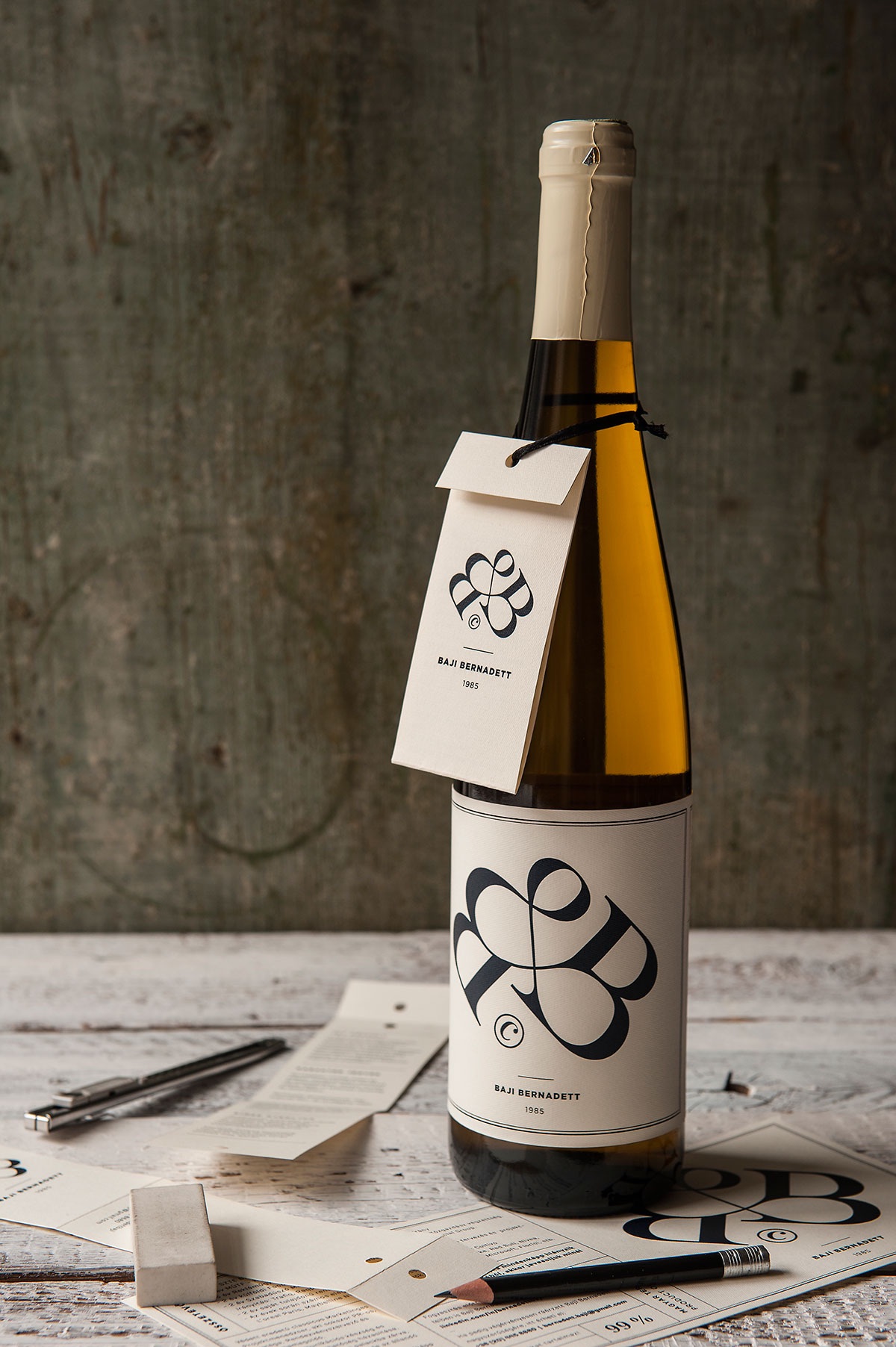
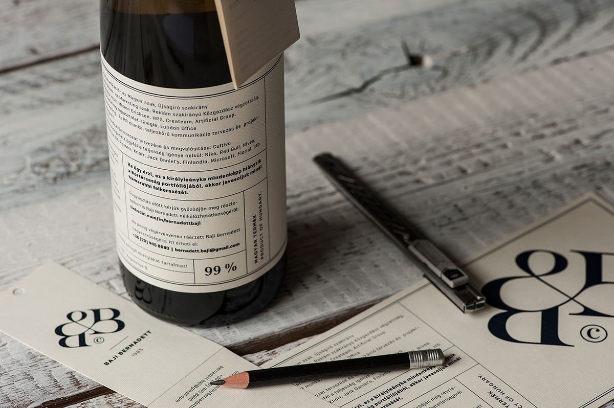
When Bernadett Baji wanted to apply for a marketing position with a wine distribution company, she turned to friend and designer Miklós Kiss, who transformed her CV into a wine bottle résumé. From the simple hangtag containing her contact details to a custom monogram, the project is a wonderful example of how a clear vision, and fidelity to that vision, can accomplish more than any number of fancy colors and finishing techniques. (And yes, she got the job 🙂 )
‘The Grand Budapest Hotel’ Packaging Concept Design
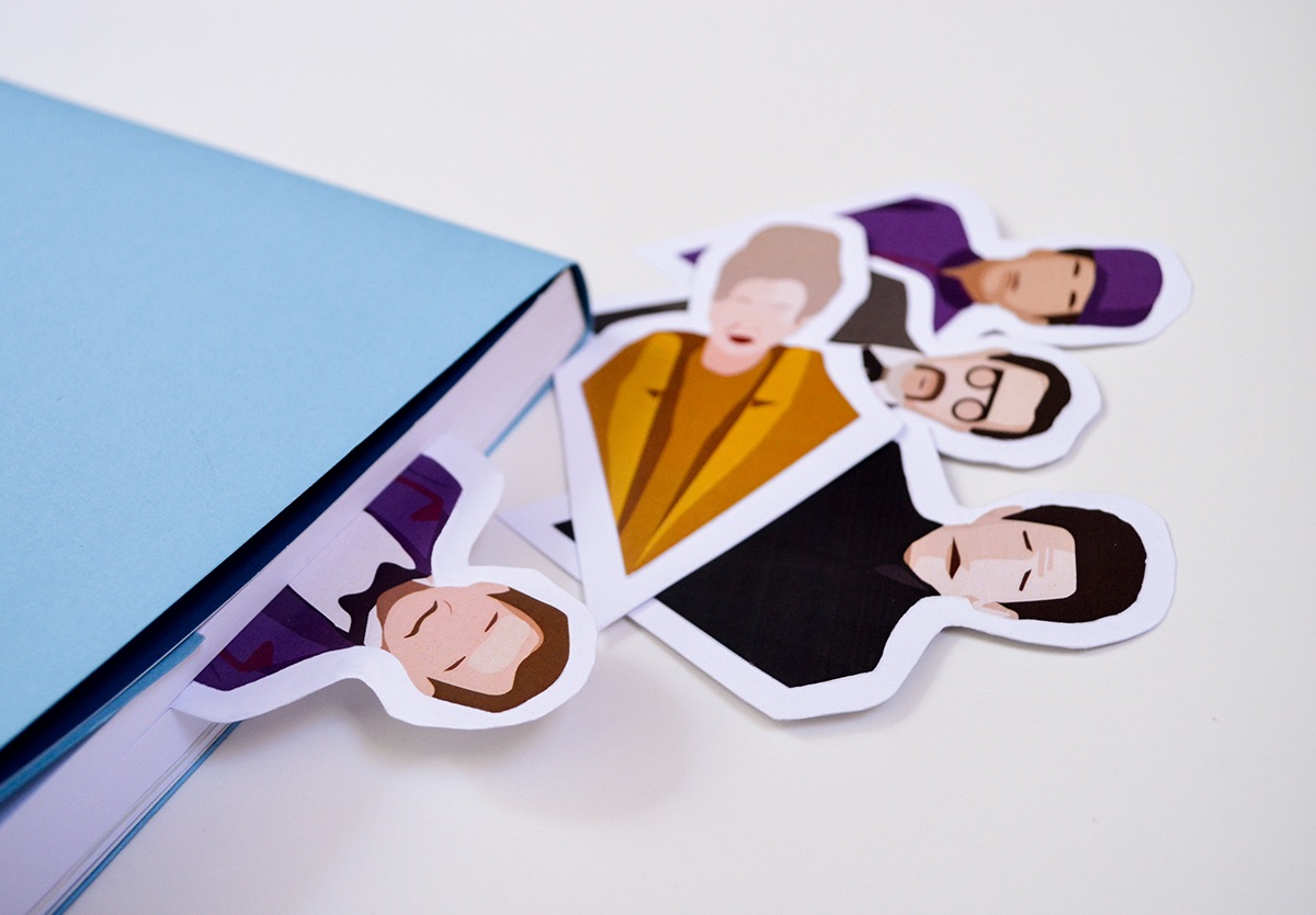
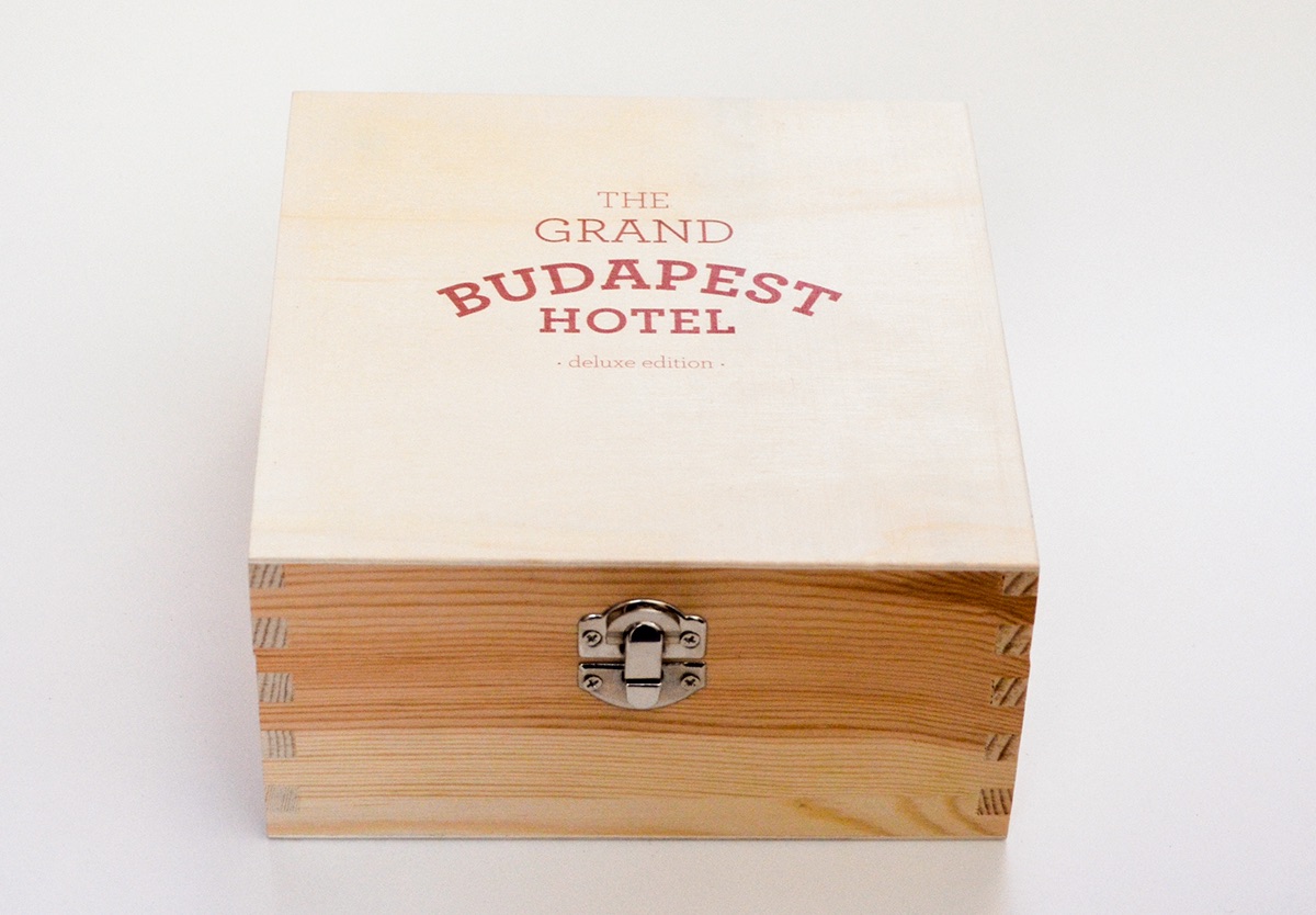
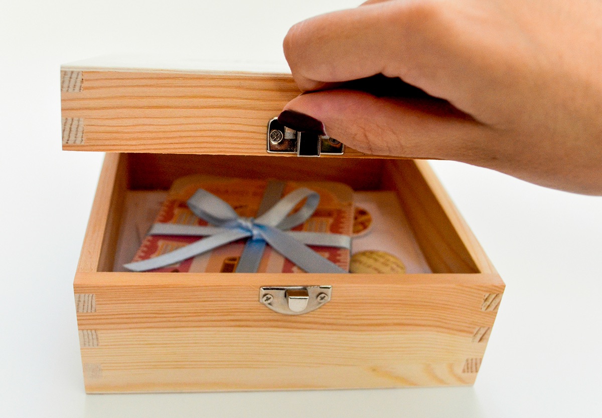
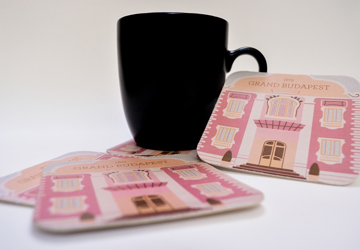
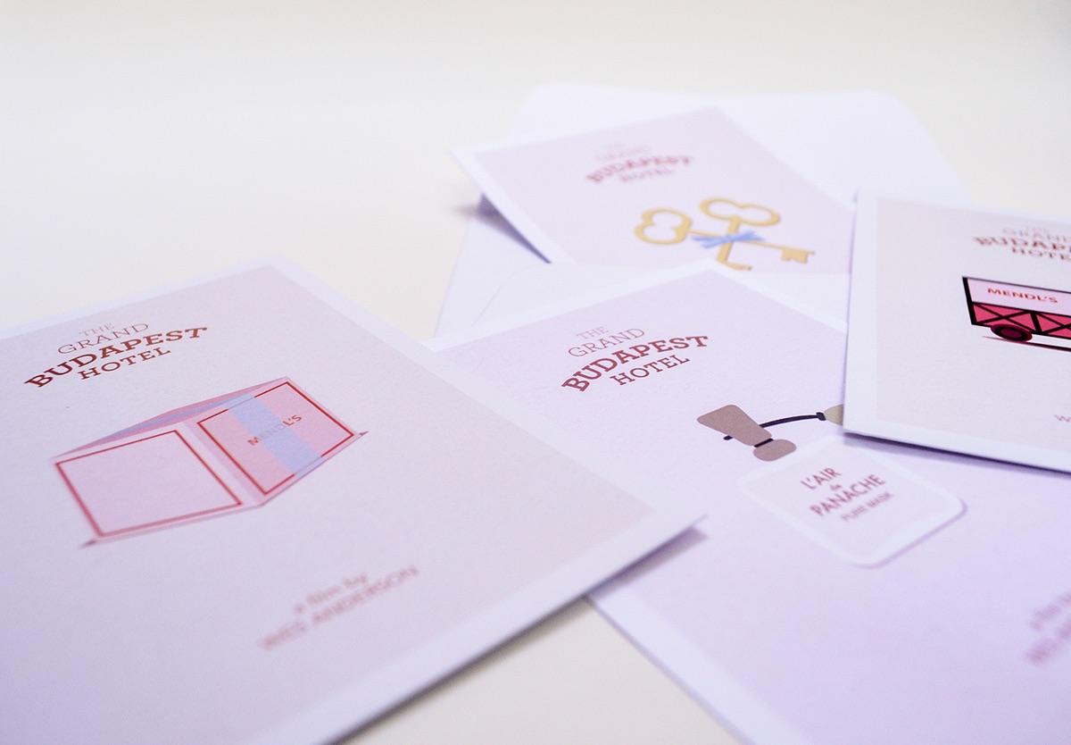
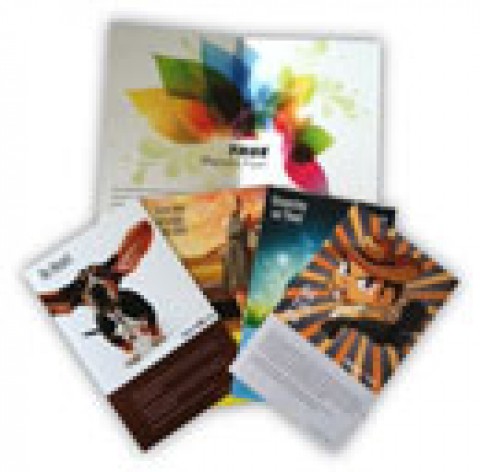
We’ve observed before that the work of director Wes Anderson seems custom made to appeal to designers, with “The Grand Budapest Hotel” perhaps being his masterpiece to date. Greek design student Konstantina Vatavali was certainly inspired by the film, so much so she created this concept packaging for a “deluxe edition” as a school project. Open this wooden box (which itself wouldn’t be out of place in the elegant hotel) to discover not only a small booklet and DVD package, but cleverly designed bookmarks in the likenesses of the main characters, a calendar, postcards, pinback buttons, and coasters depicting the facade of the titular establishment, all wrapped up just so in ribbon. Perhaps the greatest compliment that can be paid? It comes close to evoking the same “nostalgia for a place you’ve never been” that the film does.

