We have a little bit of everything this week as we finally see the first issue of a magazine that’s been a long time in coming, rediscover the classics with Penguin, and fall in love with an unusual depiction of Facebook’s key demographics. (You can find previous Cool Designs of the Week right here.)
Walter Magazine Design
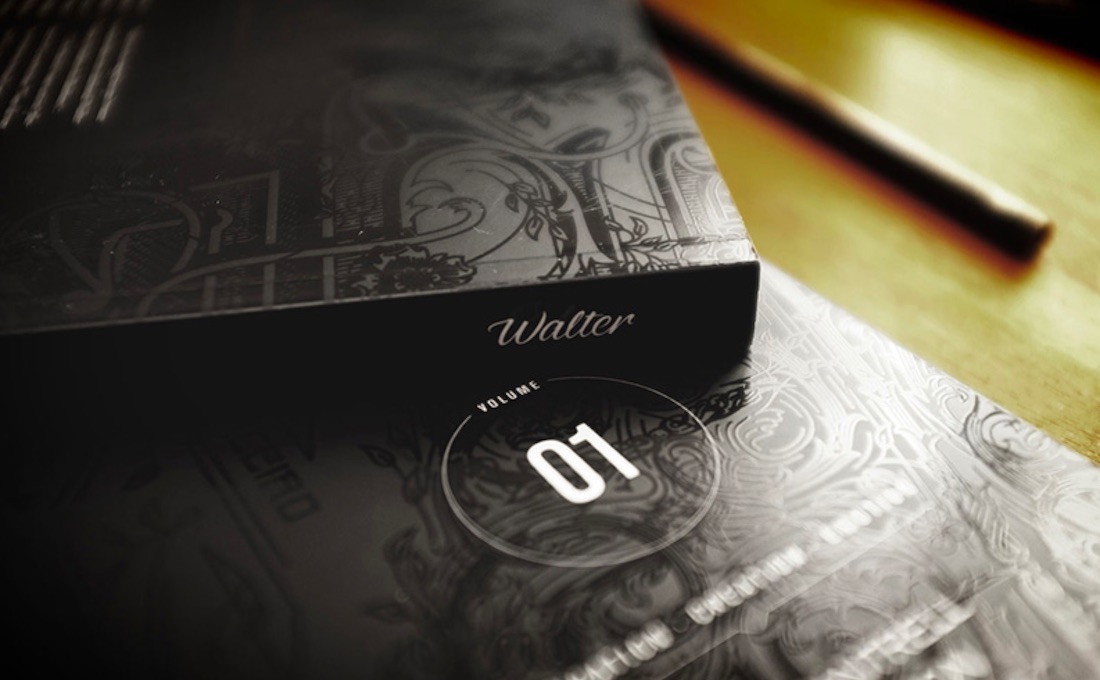
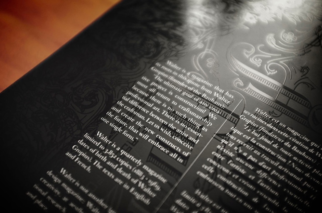
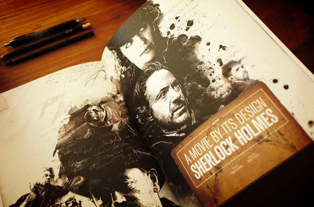
When we found out last year that one of our favorite designer/artists, Fabien Barral (aka MR CUP), was putting a magazine together, we geeked out in anticipation. And now that the first issue of Walter magazine (names after Bauhaus school founder Walter Gropius) is finally out we can definitely say it more than lives up to expectation. The cover of this 180-pager alone is worth the price of admission ($28), and that’s before you’ve even seen the features on type-artist Kevin Cantrell, coffee and more. Check out UnderConsideration’s brief writeup for many images from Walter No. 1.
Pocket Penguins Book Design
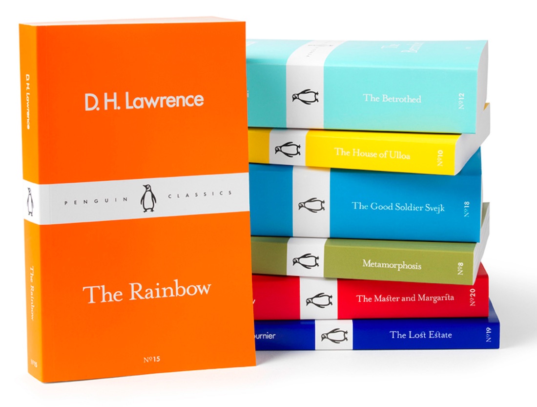
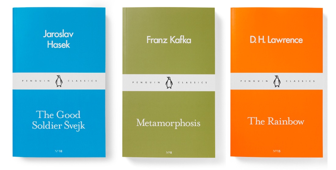
Despite an admirable showing in sales – about 20% of book sales – ebooks still can’t really hold a candle to their print cousins when it comes to providing audiences with a good relaxing read. And for decades Penguin has been tinkering with new ways to make those print editions ever more companionable. Following up on last year’s “Little Black Classics” series in which it published 80 lesser-known mini-books in the UK for about $1 each (having sold more than 2 million!), it’s printing 20 new titles in its brand new Pocket Penguins line. They are an excellent example of doing more with less.
That’s because each volume is color coordinated, Creative Review reports, with “a palette that differentiates each book by the original language in which it was published: olive green for German; red for Russian; dark blue for French, orange for English, and so on.” None of your traditional oil-painting covers on these paperbacks – you get title, author, number in the series, and a minimal “Penguin Classics” band. Perhaps it’s simply years of exposure to Pantone swatchbooks talking, but this line looks bright, alive and inviting.
Facebook Marketing Insights Card Deck Design
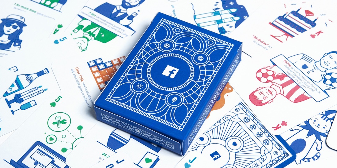
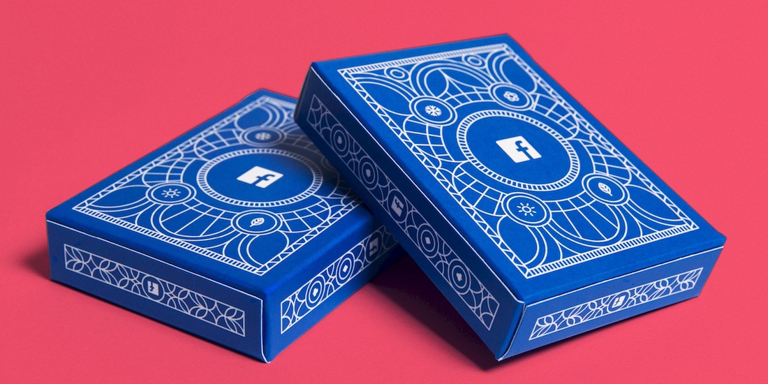
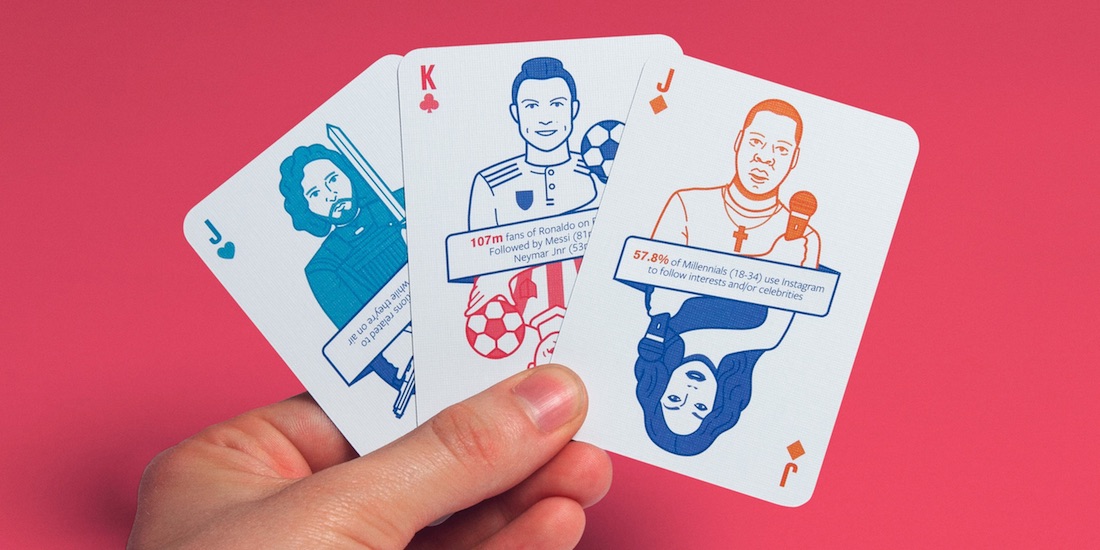
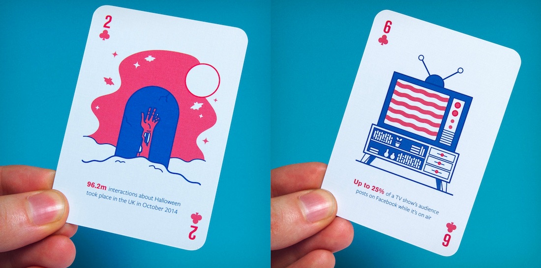
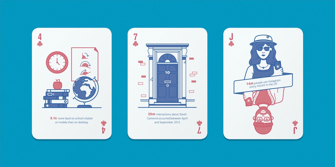
Facebook knows more about you than you realize, and it’s an inveterate gossip, particularly when trying to drum up ad sales. Asked to develop playing cards to tout some of its marketing insights to European, Middle Eastern and African markets, London design studio Human After All came up with a deck that not only managed to use text and illustrations to highlight 2015’s insights, but customized them. Not only did this mean that each agency received a personalized deck, but also country-specific packs were created for France, Italy and Spain, complete with alternative insights and illustrations. (More than 1,000 decks were created in all.)

