[Editor’s note: Like a dog with his favorite chew toy, we’re going to be using QR codes over and over until someone discovers the perfect combination of code placement, come on, and engaging online content. Yet these 2D blocks continue to be some of the most unattractive design elements around – no matter where you put them, they seem to leave a horrible little hole in your design. Yet as Gerko de Roo points out, there’s no reason that you can’t inject a little fun and imagination into those blocks.]
QR codes offer a good bridge between the real world and the digital world of the Internet. Scanning a URL-based QR code avoids typing errors, and even deep linking in your website becomes easier. Where and when the QR code has been scanned can also easily be determined by using a landing or forwarding page that makes use of a tool like Google Analytics.
At first glance, all QR codes look the same, thus a standard one by itself is not linked to your company or brand. Enhancing the QR code, such as with colors and graphics, is a good way to make it more personal. But how do you change the code’s visual appearance and still keep a working, scannable code?

There are limits when using this type of QR code enhancement. The graphical changes could introduce too many errors for the algorithm to repair. In order to avoid making the code useless, the graphic to be placed in the code will have to be relatively small.
Fortunately, there is a way to integrate a graphic and not stress over the error correction.
The total size of the message part and the error-correction part are fixed within the QR code specification. Mostly the message part is not completely filled with actual data – it also contains “padding” to get the required message length.
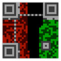
This picture illustrates a typical V3 QR code:
- The gray section is to identify a code.
- The green section is the message area used.
- The black section is the unused (padded) message area.
- The red is the error correction information.
When the content is a URL, preferably shortened by online engines such as Bitly, about half of the message is used. The unused part of the message is padded with a fixed filler pattern.

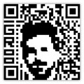
Using mathematics, parts of this unused area can be swapped with an equal part of the error correction. This enables various shapes of graphics to be integrated. If there is still enough contrast between the light and the dark elements, colors or grayscales can be introduced for the graphical enhancement.
The result of this process can be seen in the QR codes displayed in this article.
………..
