The challenge of jettisoning outdated elements without accidentally removing some of the creative DNA that’s allowed the publication to survive over the years is as exhilarating as it is jitter-inducing.
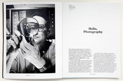
In February, the 60-year-old photography magazine Aperture reinvented itself with issue #210, thanks to London design firm A2/SW/HK. While we’ve become accustomed to a certain boilerplate declaration that accompanies any redesign today (mumble mumble new media mumble online competition), Aperture has the additional challenges of a) not being aimed at social-media addicts, and b) being in the business of highlighting photography, which has been completely devalued by the Internet age.
The editor’s note in the first newly designed issue says as much, crediting A2/SW/HK with creating a publication that can “continue to assert itself as an object, through its tactile presence, dynamic typography, and high-quality reproductions—all housed in an elegant design geared toward both reading and viewing.”
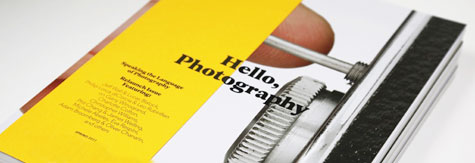
The cover alone shows a new dedication to images over words, with the nameplate dramatically smaller than on previous issues. Each quarterly magazine now boasts roughly 50% more pages, while the whole magazine has been reformatted to a larger trim size.
The main portion of Aperture has been divided into two sections: “Words” (substantial articles) and “Pictures” (photo series and projects with minimal introductory text). The former deals with the more philosophical elements of photography, the latter demonstrates what all the fuss is about.
The goal of all of this? “In a time when photography is abundant on digital platforms,” declares the editor’s note, “images in print–ink on paper–continue to offer a uniquely actual experience.” In other words, put that in your iPad and smoke it.

