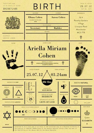
In Icon magazine’s “Rethink” issue, East London’s IWANT design studio gave us a little taste of what a birth certificate could look like if a municipality ever deigned to consider its design. As the designers put it, their version “paints a bigger picture of a person and when they were born.”
Though there are a few bits of information here that you don’t normally find on birth certificates – astrological sign, name etymology and moon cycle – what makes this a winner is the balance between easily understood icons, and hand and foot prints. And of course the document’s printing is crucial:
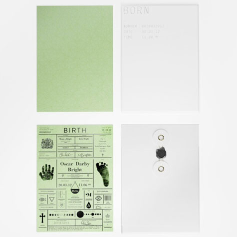
“The information is in black foil blocked onto watermarked heavyweight [card stock]. The card comes in four colors, each representing the season of birth. They are subtle and muted to retain an archival feel… . The certificate is then housed in a heavy, gloss, white envelope with the baby’s basic information embossed on the front.” And to top it off…a wax seal. Perfection.

