 By Aaron Berman
We at PaperSpecs are lifelong connoisseurs of books, and we’ve seen some humdingers. But I think it was somewhere around the third day of owning S. by JJ Abrams and Doug Dorst that I actually found myself sniffing the pages. It was then I realized that this volume wasn’t just unusual, it was messing with me.
This behavior will seem a little less eccentric once you understand the conceit behind the novel, as well as the Herculean amount of thought and planning that went into its crafting.
The number of tiny production details involved may strike the design professional in you as bordering on the nightmarish, but we think the creative in you will appreciate how all of these details came together to push the boundaries of what a book project can be.
In order to capture the sheer complexity of the project, we’ve divided this report on the making of S. into two installments. (The second will appear in the Jan. 8, 2014 newsletter.)
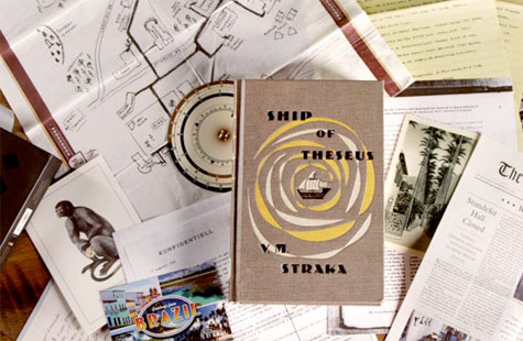
A book within a book
Here’s the jacket copy for S. (…well, if it had a jacket–we’ll get to that later):
“A young woman picks up a book left behind by a stranger. Inside it are his margin notes, which reveal a reader entranced by the story and by its mysterious author. She responds with notes of her own, leaving the book for the stranger, and so begins an unlikely conversation that plunges them both into the unknown. The Book: Ship of Theseus, the final novel by a prolific but enigmatic writer named V.M. Straka, in which a man with no past is shanghaied onto a strange ship with a monstrous crew and launched onto a disorienting and perilous journey.”
What this amounts to is a 472-page, 6.5” x 9.7” hardcover book that looks like it dates back to the ‘50s. Open it to the first page and you see a red “Book for Loan” stamp; look on the inside back cover and, yep, sure enough: a bunch of library checkout stamps. This is a library book? Check the spine – a library sticker: 813.54 STR 1949. (For those who haven’t memorized the Dewey decimal system, that’s the American fiction section.)
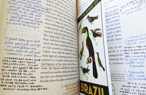
Throughout the book, dense handwriting in several different colors of ink and at least two different hands fills the margins, all commenting on the book’s main text. And there’s more. So much more.
Penmanship lesson from hell
S. co-creator JJ Abrams is a busy guy. He’s co-creator of the TV series Lost and Fringe, and director of the forthcoming flick Star Wars Episode VII. Still, he had this concept for a book that was more than a book, so he got together with writer Doug Dorst, and the project landed at Hachette Book Group, where it remained for about a year. Finally, Hachette brought the project to Melcher Media to manage the design and manufacturing process.
In February 2013, Melcher editor Lauren Nathan and her team received a Word file containing the entire text of the main book; by July it would hit the presses for an October release. In that file, all of the “handwriting” comments were inserted using Word’s “Track Changes” feature, to show exactly where they needed to go.

“That all took layers of adjusting in Photoshop to do it in the various pen colors and in pencil,” says Kepple. “But with the process of doing it on tracing paper and scanning it, when we placed it in InDesign, the colors all changed. The purple ink looked too blue, the orange got too red at times, and the pencil just didn’t look enough like pencil anymore. So we’d have to do layer adjustments to adjust the colors to look like they were supposed to look.”
Further complicating things, the handwriting had to be anchored to specific parts of the base text, which meant:
- Determining how large the margins had to be to accommodate the notations
- Working with various trim sizes until they found one that would work
- Keeping the whole volume roughly the size of a hardback novel (meaning initial thoughts of making it an 8”-x-10” book were quickly scuttled).
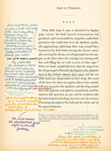
Says Nathan, “The files were massive by the time we finished, there were so many different layers of handwriting and color adjustments on top of each other.”
Even after they handed the files over to the press people, those handwritten comments were a nightmare, says Kurt Andrews, vice president of production and operations at Melcher. “Believe it or not, the hardest part of all that – even in this day and age of everything being electronic and direct to plate – was registration. Don’t look at it too carefully because in some places we had to let some things go. And there were some places where we had to make some calls while we were on press; hopefully we made them right. If something was slightly out of register, maybe it would look like a pen was fading or something like that.”
You CAN tell a book by its cover
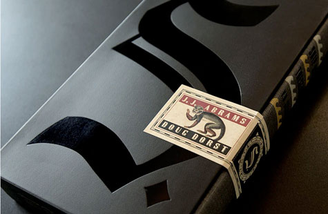
Get three pages into S. and one thing will already be clear: this novel is meant to make you feel off kilter. Even the title is off: The book you bought is called S. by Abrams and Dorst, but slide it out of the cardboard slipcase and the front cover of the volume itself reads Ship of Theseus by the fictional VM Straka.
It’s cover is a cloth cover you’ve seen a thousand times if you’re a frequent visitor to old book shops. And the deception begins right there: it’s printed on Arlin, essentially imitation cloth. The cover was white, with the texture of an old book Kepple scanned printed on top of it, “picking up the different inconsistencies in the weave of the cloth,” he explains.
“So the actual cover has a texture, but what you’re seeing there is really printed, so it completes the illusion. But that actually made it really difficult to print because if the size and scale of the printed texture didn’t line up properly with the actual texture of the book, it would cause an undesirable moiré effect. Getting the color correct was also a real challenge on the Arlin—it tended to look too washed out. Finally we had to give a printout of what we wanted to the separator and they did whatever they needed to do to match it.”
Next up: What could make this job even harder? How about adding nearly 24 pieces of ephemera between specific pages? Read Part 2 here.
………

He is the author of “Soap! The Inside Story of the Sitcom that Broke all the Rules,” a five-year project that darn near finished him. (Whether it darn near matte finished him or gloss finished him he will not say.)

