We seldom feature packaging or design “concepts” because it always feels a bit like cheating somehow – “Here’s this fantastic piece, too bad it doesn’t exist.” But maybe that’s an unfair attitude. After all, with technology being what it is, the gap between concept and production is shrinking every day. More importantly in this case, how could you not share such a fantastic beverage package, even if it isn’t currently in mass production?
First, we should probably figure out what “soju” is exactly, something the designers are quick to explain: It is a “Korean beverage, grain distillate strength from 20 to 45%, usually used in its pure form, but in recent years it has increasingly become an ingredient for cocktails.” The brand name of this particular beverage translates to “pleasant evening.”
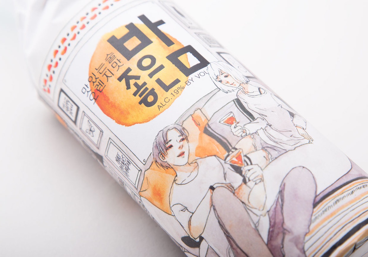
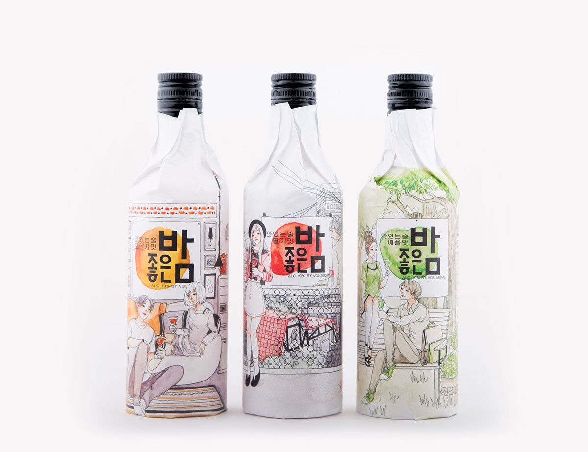
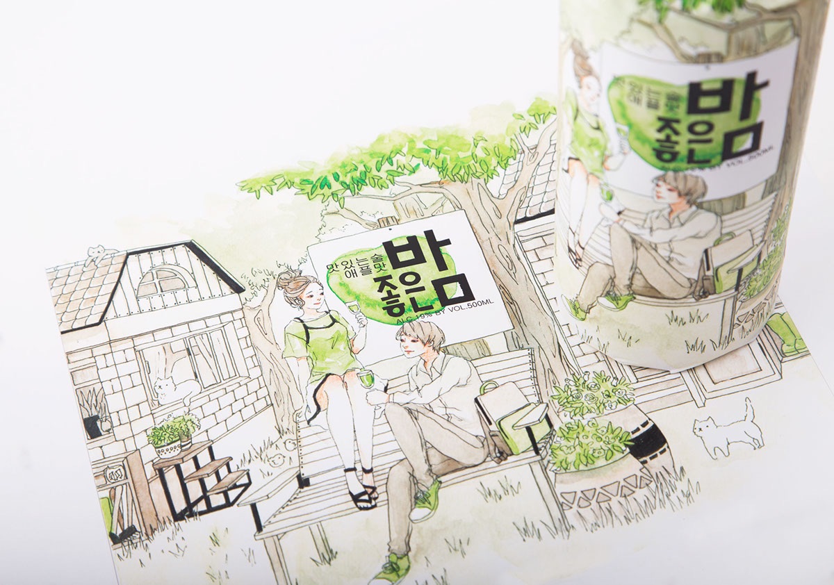
The packaging inspiration here is the use of a paper bag as the main design element, charmingly illustrated with one of three watercolor scenes.
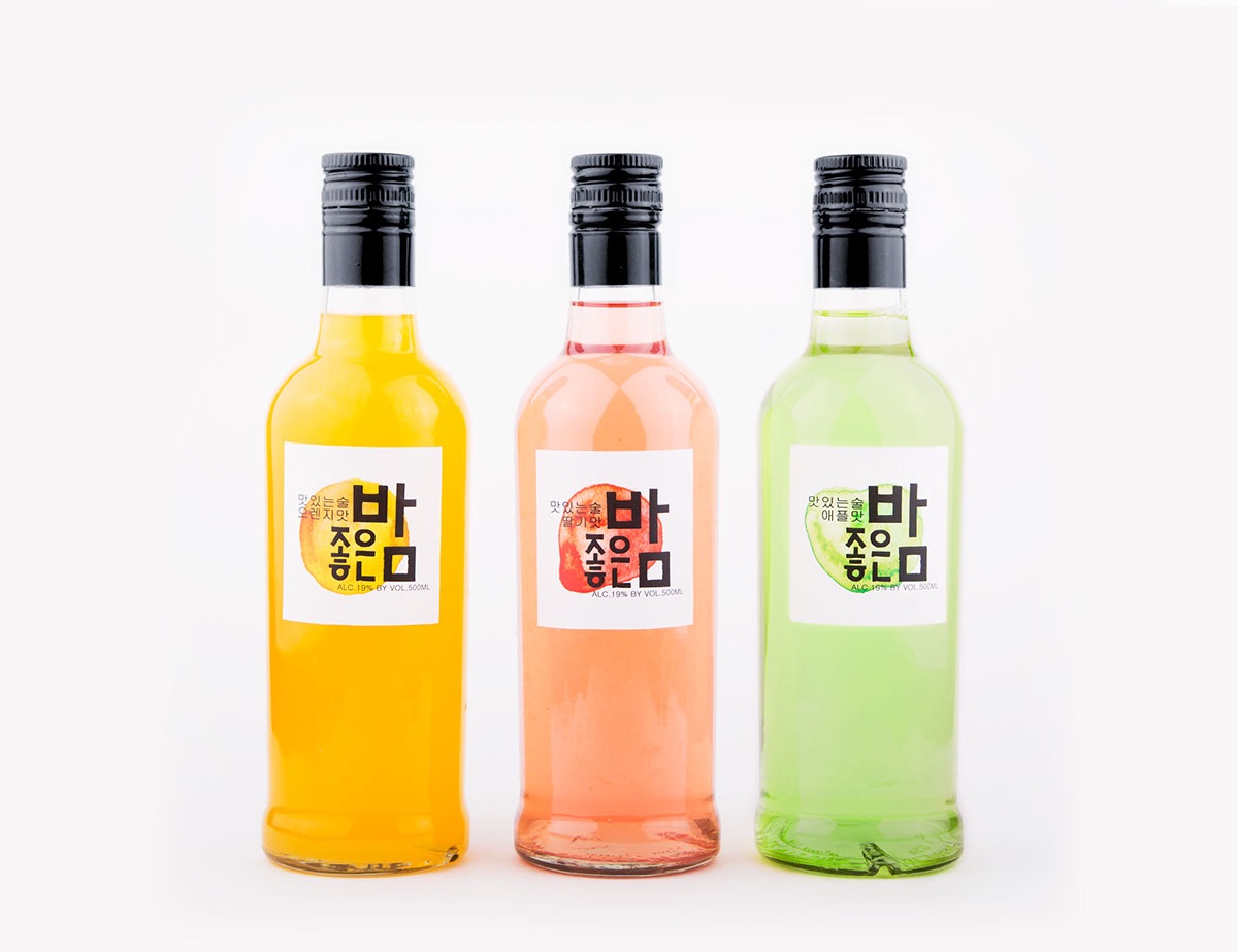
Once the bag is removed, you’re left with a very minimalist label that reflects the main design element from its particular bag. Nothing fancy here and honestly there’s nothing wrong with that. It allows the nectar inside to be the showpiece here. Best of all, when we’ve drained the bottle completely, we can slide it back into its bag once more and display it proudly on our desk or shelf.
Discover more Cool Packaging right here!

