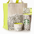
Starting Nov. 13, Starbucks will sell a line of tote bags, coffee cups and gift cards that does away with snowflakes and Christmas trees in favor of a sort of brown, green, silver and yellow hodge-podge of pixels more likely to bring about blindness than holiday cheer.
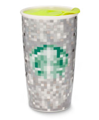
“You’ve got this pixelation of grays, whites and silver that’s modern and digitized,” Samie Barr, Starbucks’ vice president of category brand management, told FastCoDesign.com optimistically.
And hence the sympathy when we start wondering if the Fifth Avenue design world has somehow managed to convince Starbucks that bitmapping is “modern.”
What do YOU think of this design?

