 By Sabine Lenz
Her collages tell a story, usually the story of a life or a special event. Every photo, every drawing has a special meaning.
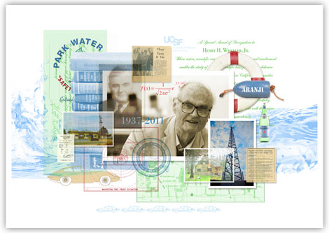
In this case, it was the story of a retiring CEO – his love for sailing … his extensive philanthropic endeavors … his passion for science, economics and math books (his desk is always overflowing). He insisted every office should be well stocked with Pellegrino so his employees would drink enough good quality water.
The more you look, the more you see
Park Water Company asked illustrator Laura Tarrish to create one of her famous collages for its retiring CEO. After many conversations with employees of the company, a picture of the person who was to be honored formed – a picture that Tarrish translated into a beautiful collage.
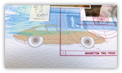
Every time you look at the collage, you discover something new – a small formula here, the image of an idyllic house with a large garden there, the illustration of an old Jaguar (the honoree was an avid collector).
From one-off art to invitations
While the originally commissioned piece was still in the works, the company asked Tarrish to create some spin offs of her artwork: smaller pieces for an invitation to the reception and the call for stories for a memory book.
As pleased as one would be with a happy client, now the challenge became one of production. You see, Tarrish prints the final artwork on her own 10-year-old desktop printer. Fine for smaller scale prints, but for large format prints to frame Tarrish had to rely on some outside help.
Let me explain.
The artist
Laura Tarrish always had a knack for collecting things. With a degree in visual design from University of California, Berkley and a background in graphic design, she finally transitioned into collage-based illustrations with a client list every bit as eclectic as her subject matter.
The Boston Globe, Travel & Leisure, Apple Computer, Isabelle Allende – they all have entrusted their stories – dare I say their life stories – into Laura’s hands.
Tarrish started out assembling collages manually with the help of color copiers. These days, her imagery (photos, drawings, type) are painstakingly combined, sized and positioned just so with the help of Photoshop. The final pieces that Tarrish outputs on her desktop printer are archival inkjet prints that can be virtually any size up to 13” x 44”.
The tactile experience
Just holding one of these prints tells you that they are special. Yes, there is the actual artwork, but Tarrish’s quest for perfection does not end with the collage.
Being well aware of the importance of the first impression, her aim is to instill a sense of importance, a special tactile feeling into each masterfully done piece.
Constantly on the quest for an even better paper, her current favorite is a 260 gsm Epson Velvet Fine Art. Emulating the feeling of watercolor paper, it’s perfect for her frameable pieces and folded cards. The stock makes quite an impression.
Perfectionism at work. No surprise there.
What did come as a surprise to me though is that Tarrish outputs the final prints on her Epson Stylus Photo 2200. A more than 10-year-old desktop printer that shows an amazingly fine dot, holds astonishing detail, and provides wonderful depth of color.
“This old printer surpasses most of the digital presses I have worked with,” exclaims Tarrish. Why mess with perfection.
Matching papers across processes
When there is a need for prints in a larger format than her trusty Epson produces, Tarrish uses Pushdot Studio, a local printer that has specialized in exhibition quality printing and is every bit as perfectionistic as she is.
Pushdot went through several rounds of paper testing and color matching to ensure that pieces printed in the larger formats match those of the smaller ones as closely as possible. The same whiteness of the sheet as well as texture are vitally important.
“I provide them with the actual artwork in electronic form,” Tarrish explains, “as well as a strip of the full size artwork and a small print of the whole piece so they can match the colors perfectly.”
Tarrish also makes a point of going to press checks so any color shifts in the images can be adjusted – even in these small press runs.
The folks at Park Water Company were so happy with the final piece that they asked for more high-end prints – one for each office and a smaller size for each family member of the honoree. That’s what I call a happy client and follow-up business! 😉
———-
If you’re a PaperSpecs Pro member, you’ll receive special pricing on the necklace until June 15, 2012. Please log in for details.
———-
Seeing designers worldwide struggle to stay current with new papers and paper trends inspired Sabine Lenz to create PaperSpecs, an independent and comprehensive Web-based paper selection tool and weekly e-newsletter. Growing up in Germany, she started her design career in Frankfurt, before moving on to Australia and the United States. Lenz worked on design projects ranging from corporate identities to major road shows and product launches. From start-ups to Fortune 500 companies, her list of clients included Oracle, Sun Microsystems, Deutsche Bank, IBM and KPMG. Lenz is a noted speaker and author on paper issues and educational topics related to the paper industry.
Copyright 2012 PaperSpecs.com.

