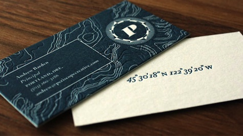
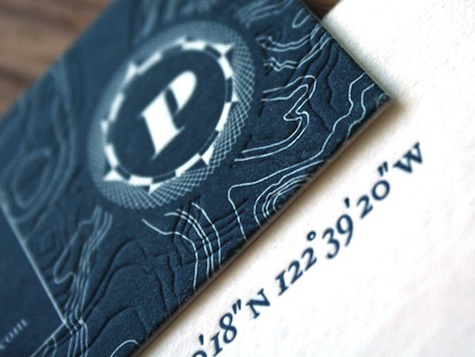
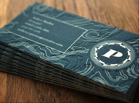
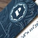
 When your client’s name is Periscope Creative, you know you have some pretty rich visuals upon which to draw if you choose to go the nautical route. And designer Darrin Crescenzi went all out when it came to the Portland Web design firm’s letterpress-printed business cards. Drawing on the owner’s “coastal roots,” Crescenzi opted for a navy blue front, with the company’s map coordinates printed on the white back.
On the front, as CardObserver, well, observes:
“A topographical map of mountainous land has been used as the main background and then this is overlaid with a blind printed impression of an undersea topography, giving the card an interesting texture which complements but does not compete with the design overall.”
The overall effect is of a card that you’re more likely to hold on to precisely because it’s such a joy to pick up and handle every so often. And in an ostensibly ephemeral business such as Web design, that can only be a boon.
