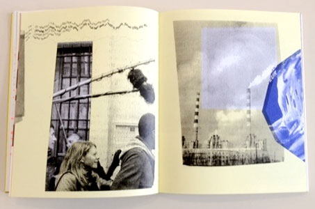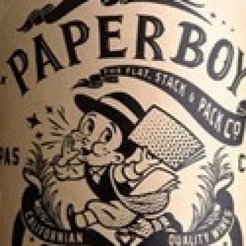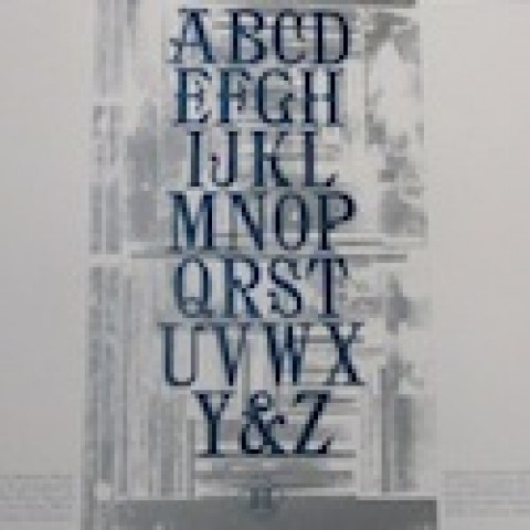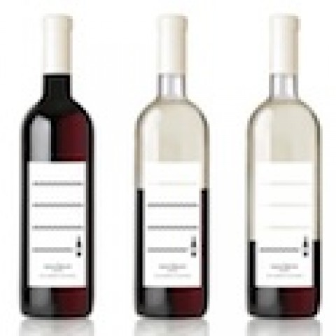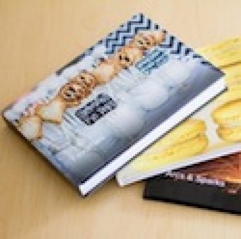
It’s a challenge papermaker Fedrigoni put to 16 designers for its book, “16/1,” which features 16 paper stocks in 16 sections – 16 pages each – in two volumes.
Designed by Thomas Manss & Co., “16/1” is a cornucopia of stories, games and photographs that explore the meeting place between design and paper, highlighting each paper’s brightness, opacity, light-refraction and more. Studio Joost Grootens, Frédéric Teschner, Rainer Groothuis and Kameel Hawa were just some of the designers involved.
Fedrigoni’s stated goal was “to question the assumption that some papers are old fashioned. Who uses laid paper nowadays? ‘Bible’ publishers? Academic publishers for philosophy texts? We felt we needed to play with papers as if we had seen them for the first time.”

