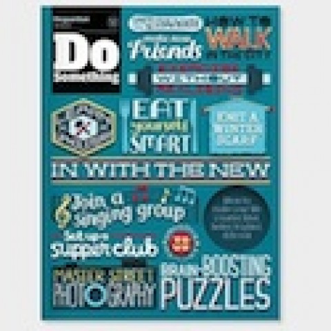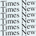
For example, most typefaces can be classified as elegant, friendly or direct. In a 2004 study, Times New Roman emerged as the most formal and professional according to participants; Courier New the least friendly. Poor old Helvetica was considered the least dramatic and artistic, while Comic Sans predictably was rated the least formal, dismissed as “too childish.”
In another study published that same year, 30 out of 40 participants chose the box of chocolate truffles whose name was rendered in the ornate script Signet Roundhand, rather than the one in Salem, an aggressive, bold type. Whether the box in question was called Temptation or Indulgence appeared to be immaterial, strongly suggesting that type may carry as much of an importance – if not a greater importance – than the naming of a product.


