If you were one of the many designers floored by the program for last year’s Brand New Conference, you won’t want to miss this PaperSpecs and Neenah video. UnderConsideration’s Armin Vit gives you a behind-the-scenes peek at how a badge, guide and tote bag became three of the most coveted design pieces of 2014.
Watch Armin Vit from UnderConsideration talk about the project in this video from our In The Design Studio series.
[youtube=http://youtu.be/JEo_2uBgbV0]
Love this piece?
Like it and share with your friends below.
I’d like to make a quip about UnderConsideration being under pressure to come up with standout identity for a conference on branding, but this talented group never seems to have any trouble.
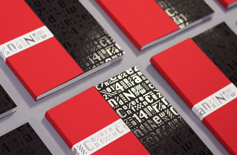
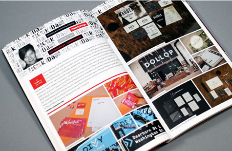
A modular pattern created from two versions of the Chicago typeface (bitmap 1984 and smooth 1991) and some “wiggles” form the logo and moves across all elements (program cover, program pages, badges, tote bags, T-shirts, signage, scenery and website) as fluidly as the ticker in Times Square (small plug for next year’s conference location).
The palette of five shades of gray and red (from the musical “Chicago”) and a readable yet quirky Burlingame typeface for the text complete the big picture. But as with any great design, it’s about the details (often handwork) that boost a good design into the realm of greatness.
For me, it’s the hand-applied tape that’s placed in various vertical positions on a red half cover (one of two covers) to line up to finish the line of type from the black full cover. The feel of Plike is wonderful. Four hits of spot gloss varnish give the pattern pop and shine against the matte black surface.
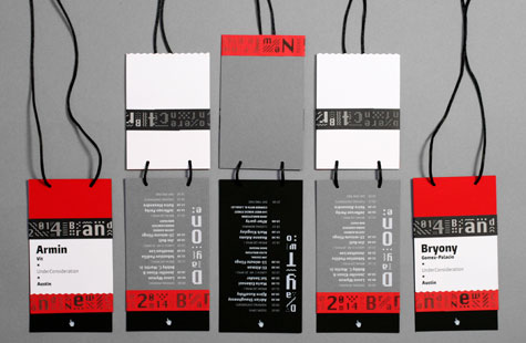
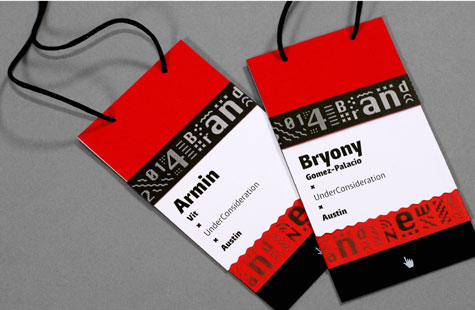
Then again, there’s that silk cord and even more logo tape on the badges; how the logo pattern can be configured in almost any shape, but still remain consistent for use on any element (or even animated as it is on the website). Perfection.

