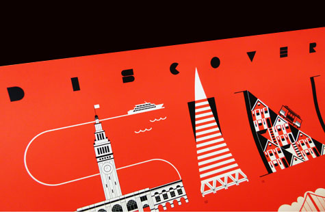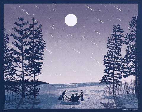
As one of five designers asked by Neenah Paper to create a poster for distribution at HOW Design Live 2013, Gee + Chung Design designed a very memorable and inspiring keepsake – no doubt still hanging in many of your studios and offices.
Their strategy was to create an image that would introduce out-of towners to San Francisco’s scenic wonders in a way that encouraged participation and engagement.
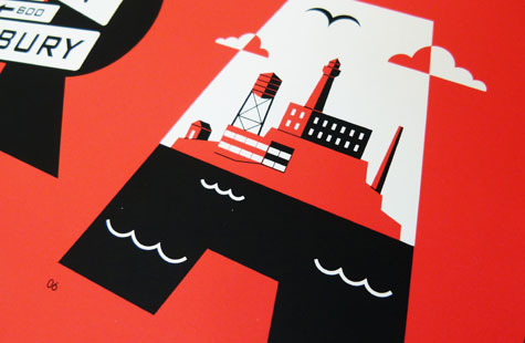
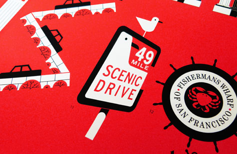
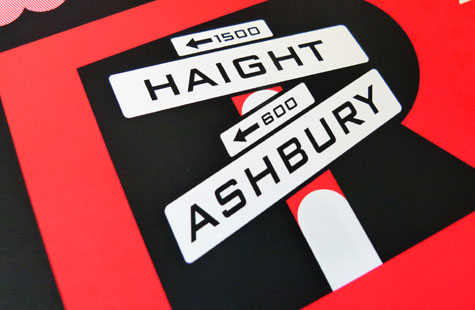
The design team accomplished this with an unusual juxtaposition of typography and illustrations of San Francisco’s world famous landmarks that took the viewer on a scenic tour of the city. Each landmark is keyed to descriptive text at the bottom of the poster that enabled viewers to discover useful facts and figures about the city by the bay.
The silkscreen printing was beautifully clean and crisp even in the gradated fog behind the Golden Gate Bridge. The orangey red PMS and black on Neenah Classic Crest make for a wonderfully tactile poster and a warm, rich visual experience.

