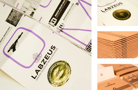
If you steer toward this design thinking, you’ll sail waters that are friendly and professional, unassuming and arresting, entertaining and helpful, simple and wow! This fellow knows how to throw everything into the kitchen sink (hand embossing, letterpress, foil, giclée printing, diecutting, perfing, and a map fold) without getting the drain clogged.
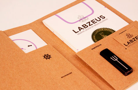
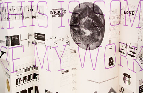
You can hear the designer’s friendly voice in the copy and see it in the elements that comprise the portfolio. There’s that essential Curriculum Vitae (sans archaic Latin); a bookmark (how thoughtful of you) with the company name and logo; a flash drive containing his work (smart and handy); and my favorite, a poster, with examples of work, personal tidbits and fun images.
A maritime theme produces the most memorable design highlights: naval commander stripes that repeat on the notecards as well as the pocket folder that holds all the pieces of the portfolio and icons (Poseidon’s fork, anchors and boat wheel) that are scattered throughout.
The raw chipboard keeps it from getting all stuffy, gives us that tactile feel we love, and pairs beautifully with the Classic Crest Text used on the resumé and map.
Love this piece?
Like it and share with your friends below.


