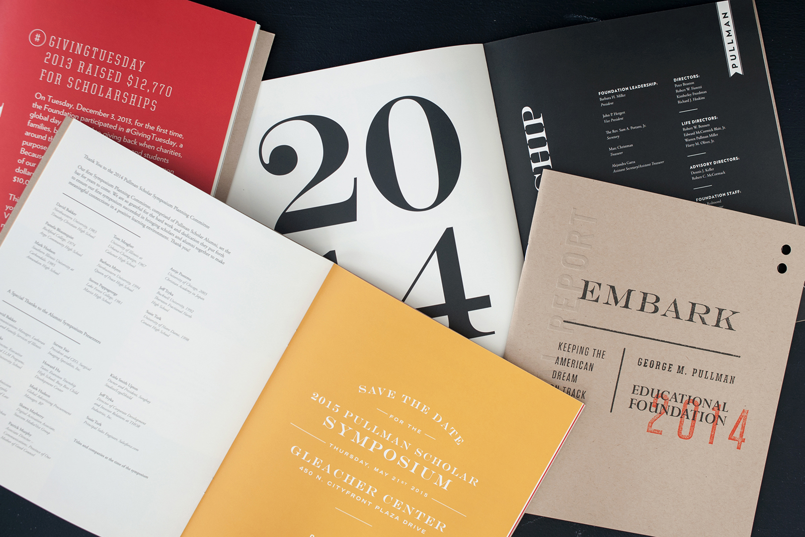
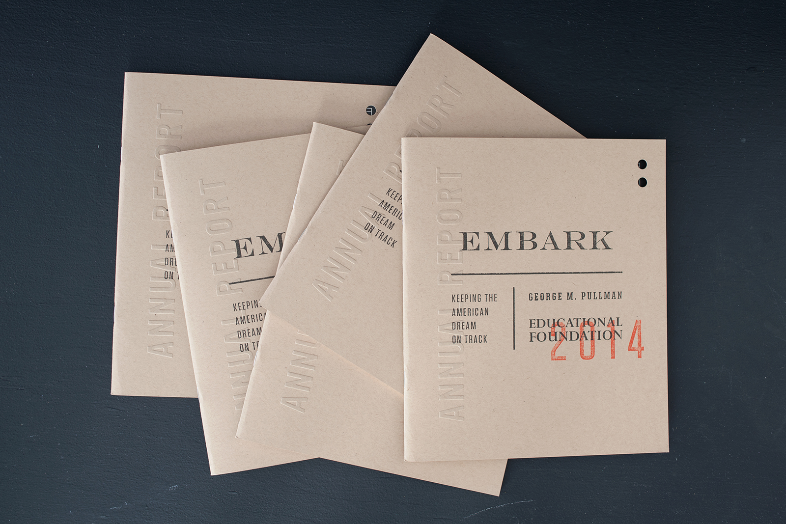
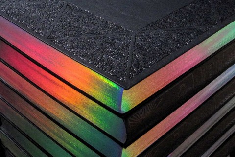
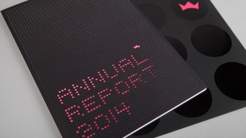
We wanted the recipients of the annual [report] to have something interesting to look through and something that caught their eye and stuck out from the stack of annuals they may receive each year. That is why we chose to blind emboss the cover to give it more visual interest from the very first glance.
– Nicole McQuade, Co-designer
Many are united by a feeling that a greatness has passed from the earth; a smaller subset that this greatness was the romantic era of the train journey. It was this nostalgia that the McQuades deftly played to in their 2014 annual report for the George M. Pullman Foundation. The institution provides college scholarships to Chicago students, funded by the Pullman Palace Car Co. founder’s estate – hence the theme. The report’s title is “Embark: Keeping the American Dream on Track” should anyone miss the subtle allusion.
Offset printed by Classic Color on French Paper Speckletone Kraft 140 lb. Cover, the cover is blind embossed with the words “annual report”; two holes diecut in the upper right corner complete the low-key-but-attention-grabbing effect. Says McQuade, “They give the annual an unexpected interest that directly references the printing techniques of old train tickets.”
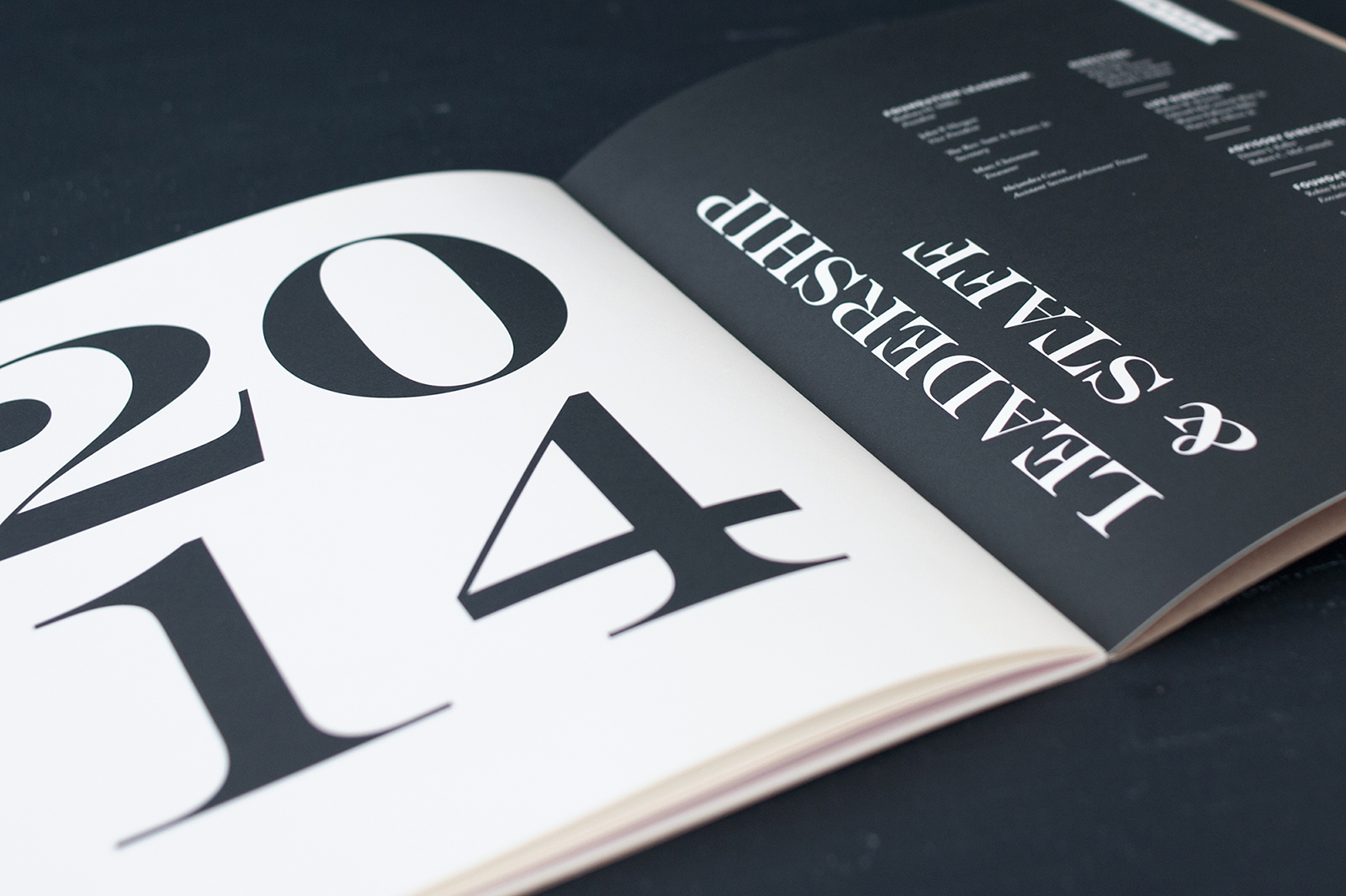
The inside is 4-color printed on Domtar Cougar Smooth Opaque 80 lb. Text, an excellent choice for its cornea-searing 98 brightness, guaranteed to rouse anyone nodding off – it is an annual report, after all.
“We pulled inspiration from old railroad tickets, signage and other typographic elements for the annual,” says McQuade. “We wanted to nod to the history of the company without making the annual feel old or dated….It uses a very controlled color palette and, although it uses quite a few typefaces, they work together well and don’t feel busy.”
Like any printing job, the McQuades learned the hard way that the devil is in the details. “The production time was pretty quick on this project so we weren’t able to attend the press check,” she says. “We originally wanted the emboss on the cover to be a blind DEBOSS instead but forgot to specify that detail. The end product looks great but we learned to make sure to specify every single detail clearly.”
All aboard the “D’oh” train…



The Pullman Foundation Annual Report is beautifully done. May I get a pdf of this document?
Hi Barbara. You can contact the designers directly at studio(at)themcquades.com. Hope that helps 🙂