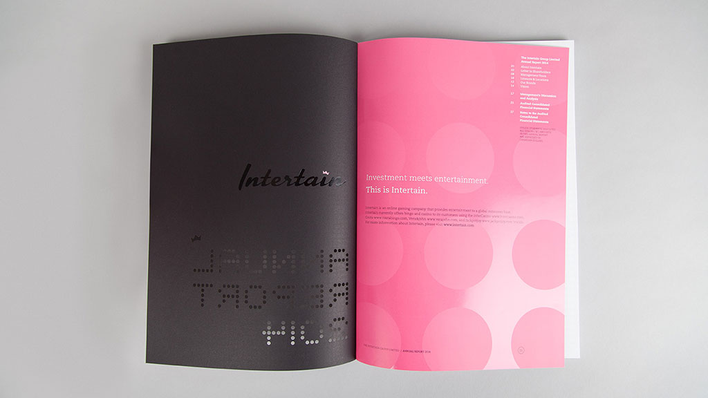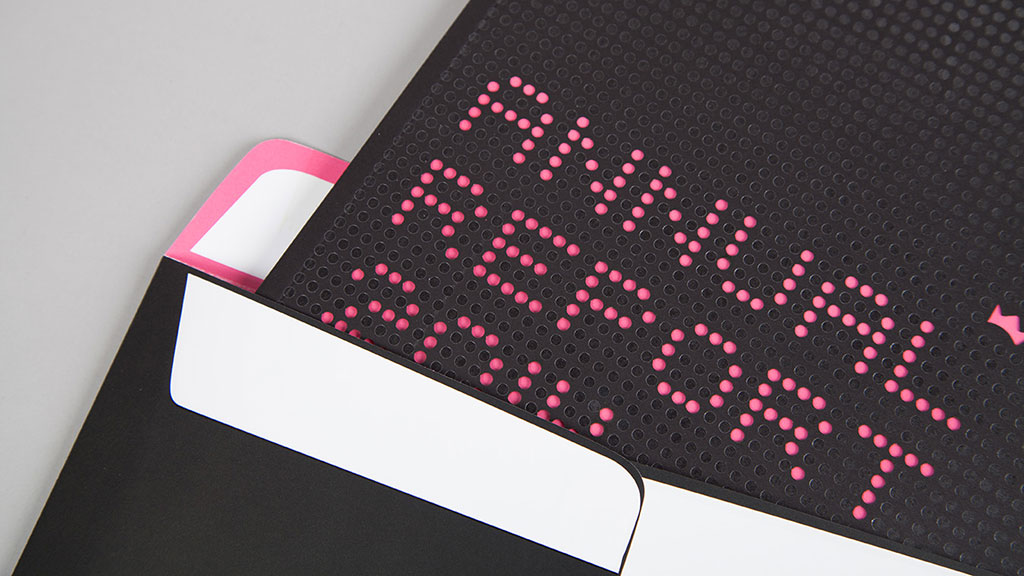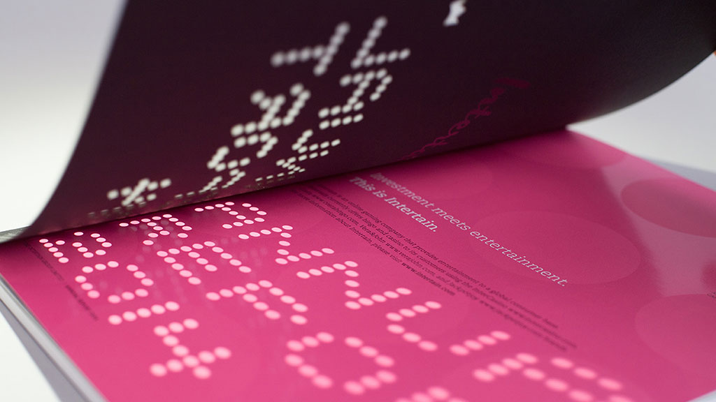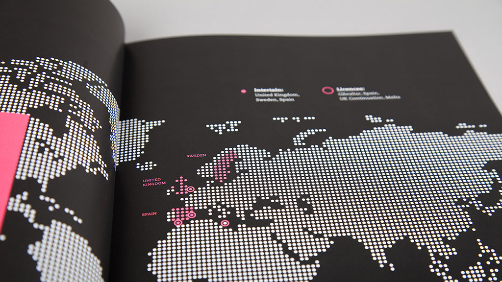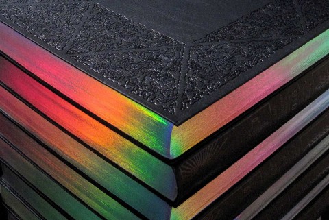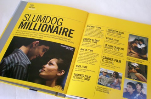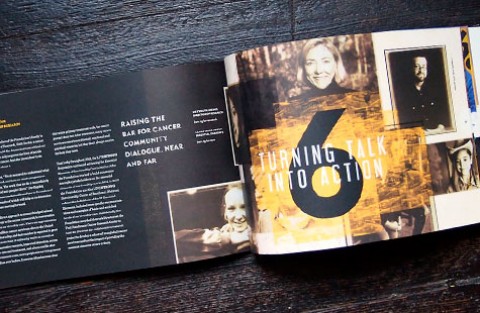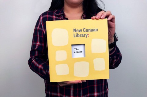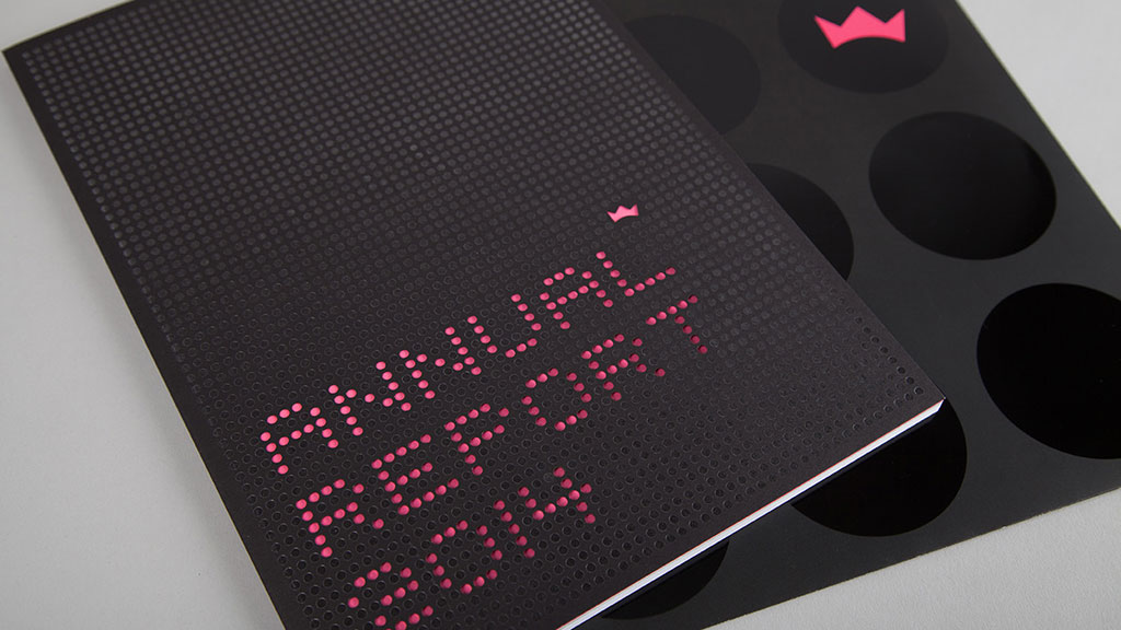
Sometimes foil stamping and spot varnishing can provide unpredictable results. Quite a few rounds of testing were involved in achieving the right look.
– Colin Payson, Premise
Branding and design agency Premise chose to create a printed piece for The Intertain Group’s 2014 report because “beautiful annual reports such as these are a dying breed, and should be treated with great respect at every opportunity to create one,” says Premise’s Colin Payson.
Old school stock tickers and bingo dabbers served as the inspiration for the 64-page report centered around an online gaming holding company that provides wagering-focused entertainment to a global consumer base.
Premise used the dot pattern motif at various scales and intensities throughout whenever possible. That plus the very liberal use of just two bold colors — pink and black (with the exception of a few items) — really made this piece stand out.
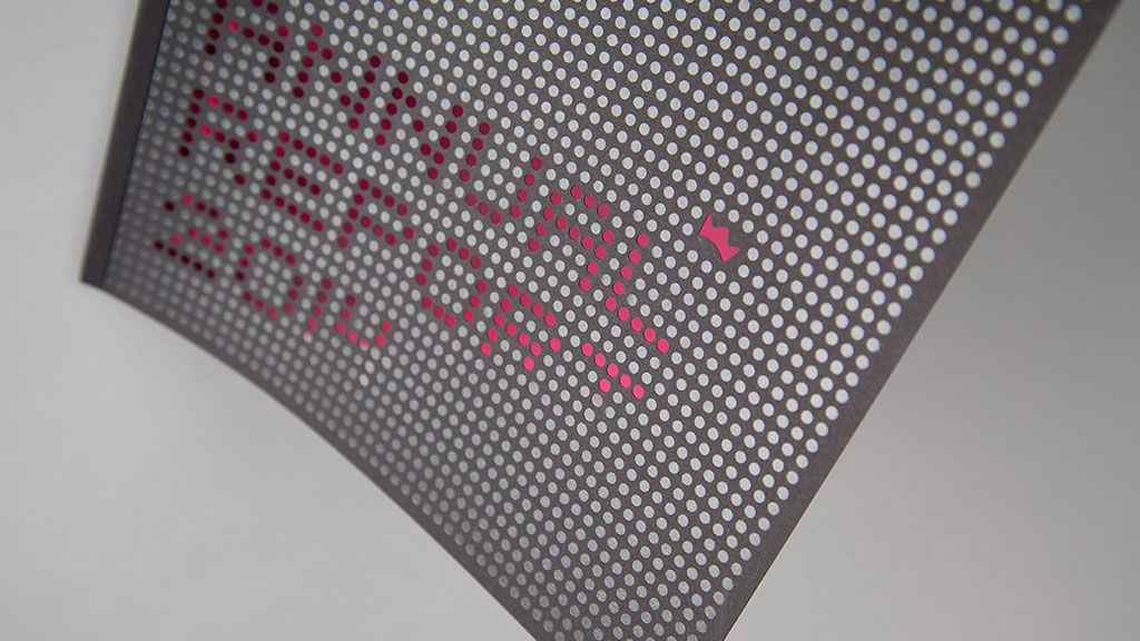
“The design in itself was quite simple and restrictive,” Payson says. “It was really about the finishes in print that brought it all to life.” Those finishes included laser cutting, foil stamping, spot varnish and perfect binding using three different paper stocks: Neenah Royal Sundance Eclipse Black 110 lb. Cover; Sappi HannoArt Gloss 100 lb. Text; and Domtar Cougar 100 lb. Text.
For instance, the laser-cut dots adjacent to the foil stamping created a striking effect on the cover. And the super glossy spot varnish dot patterns on the inside make everything pop.
Love this piece? Like it, share it and add your comments below.

