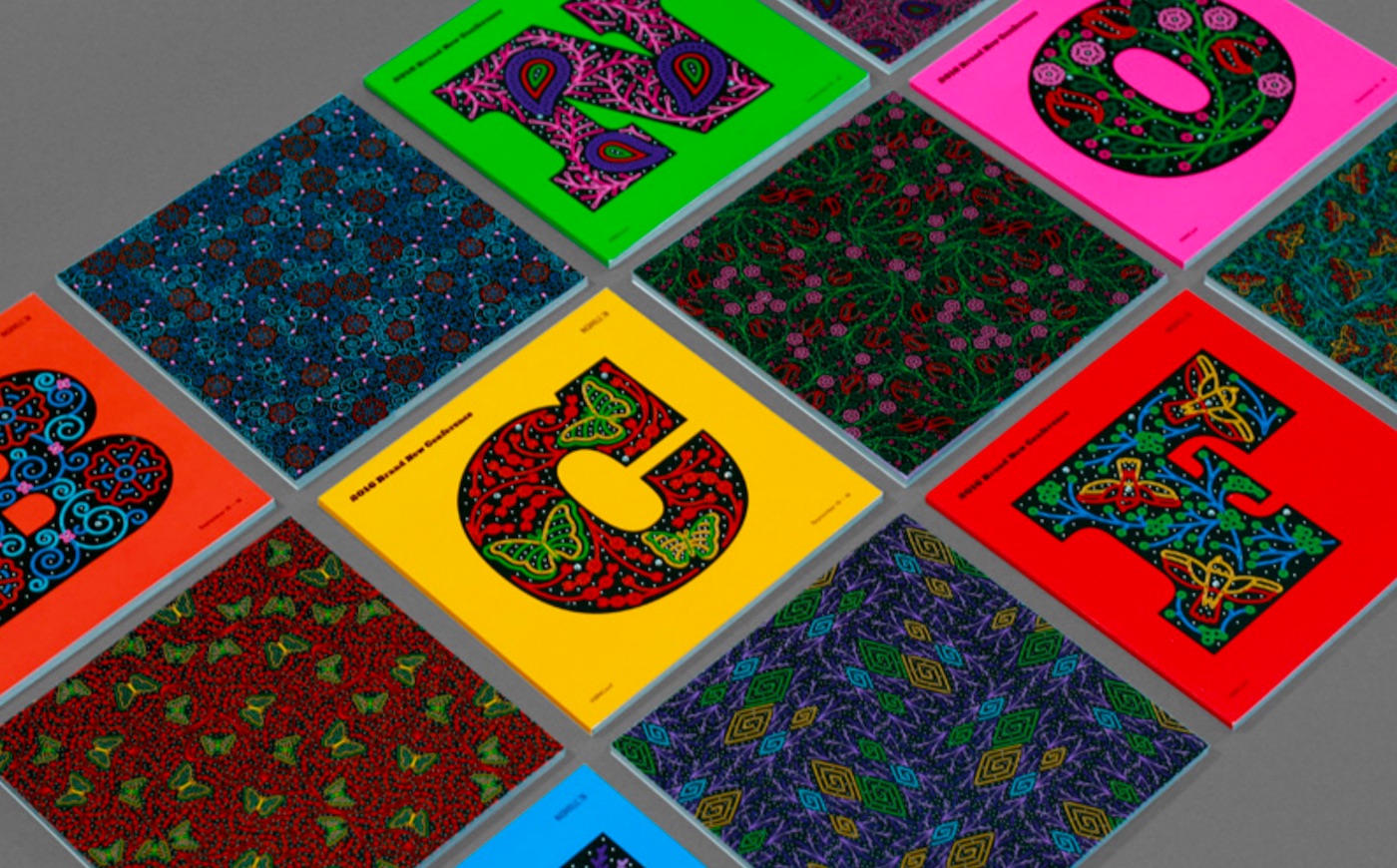
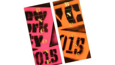
UnderConsideration’s program for their Brand New Conference this year is a funky, multi-colored flag for every designer who’s ever been chided by a client for using “too much white space” – you won’t find so much as a centimeter’s worth inside or out. Says UnderConsideration’s Armin Vit, “The idea was to have a program full of rich, tightly-cropped graphics.”
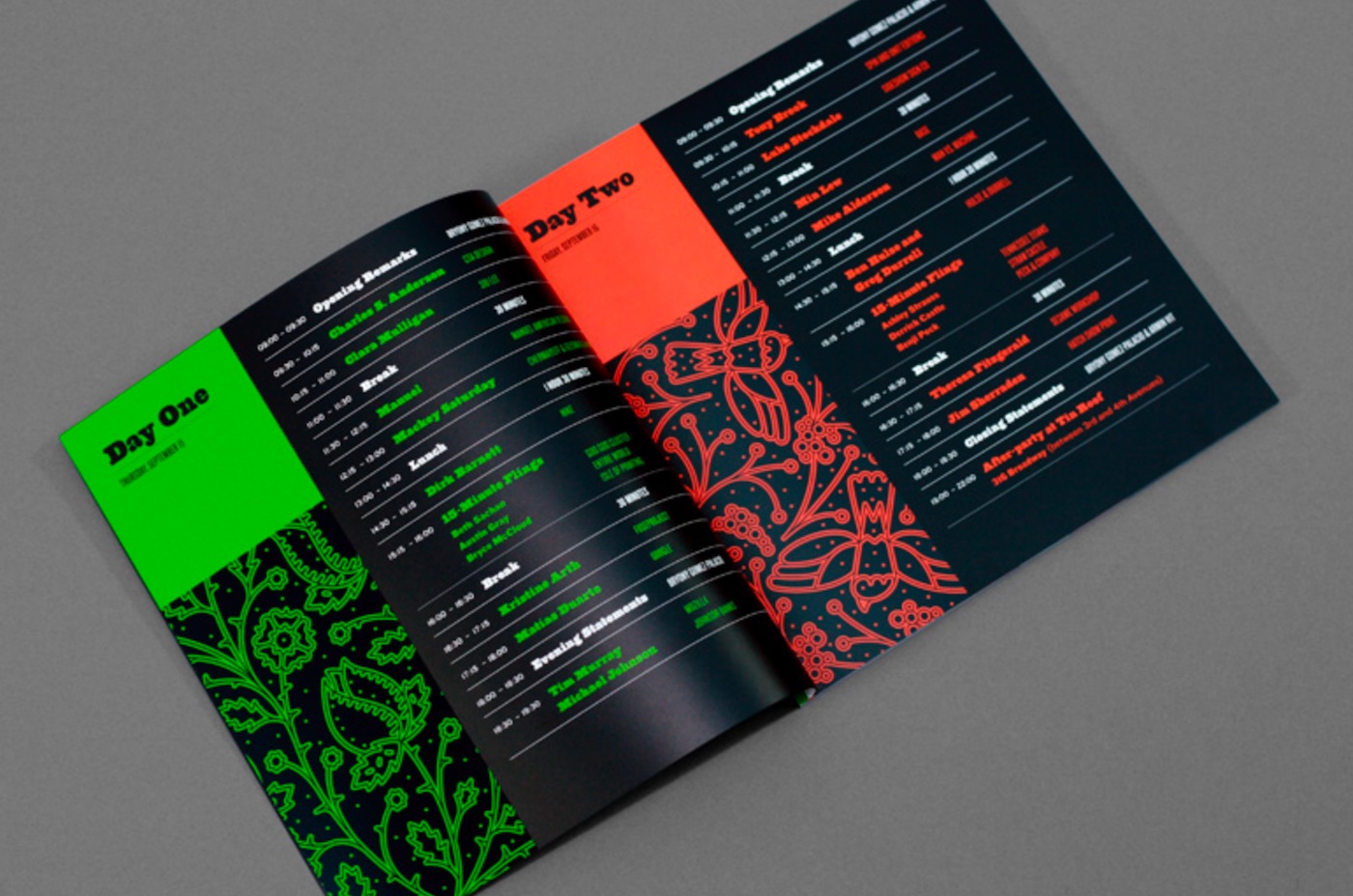
Of course this being a conference program, there are some very specific challenges that it had to meet – telling you when and where each event would be taking place for a start. As you can see, this was done simply but effectively. Not only are we spared the usual black-and-white nightmare list that we’ve been grappling with at trade shows for 30 years at least, the color coding makes it far easier to keep track of which day you should be looking at when.
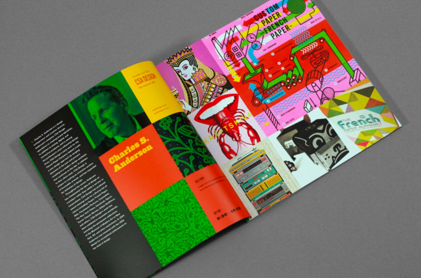
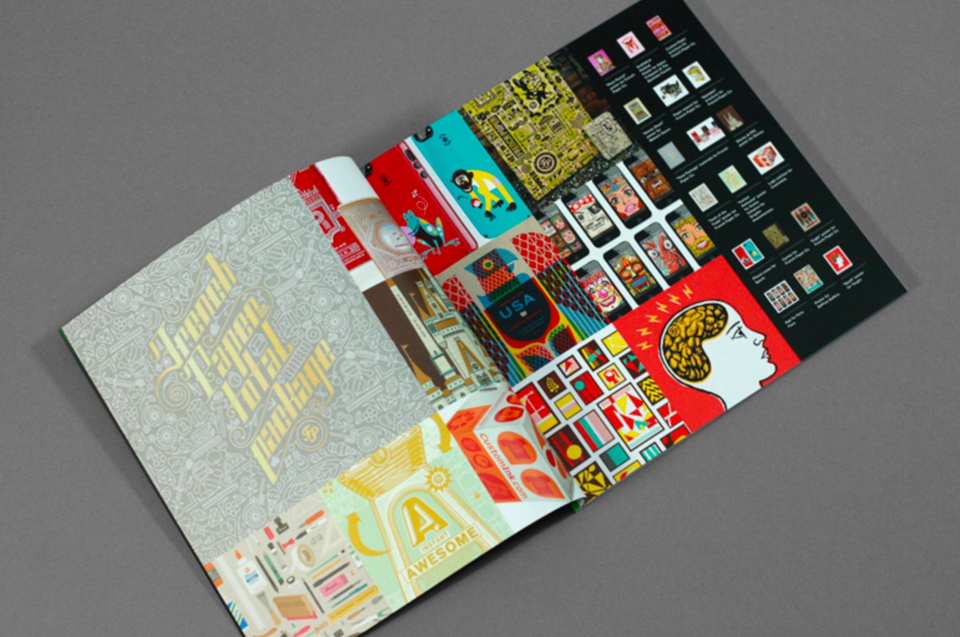
However, it’s with the presentation of speaker bios that this program really sets a new standard. A mugshot actually large enough to see (fancy that) and a decent length biography are cool enough, but the full page collage of the speaker’s work is fabulous addition. Unless you follow our industry with the dedication of a sports fan, chances are you recognize about a dozen designers by name before things start getting fuzzy, yet you just might recognize their work – and there it is!
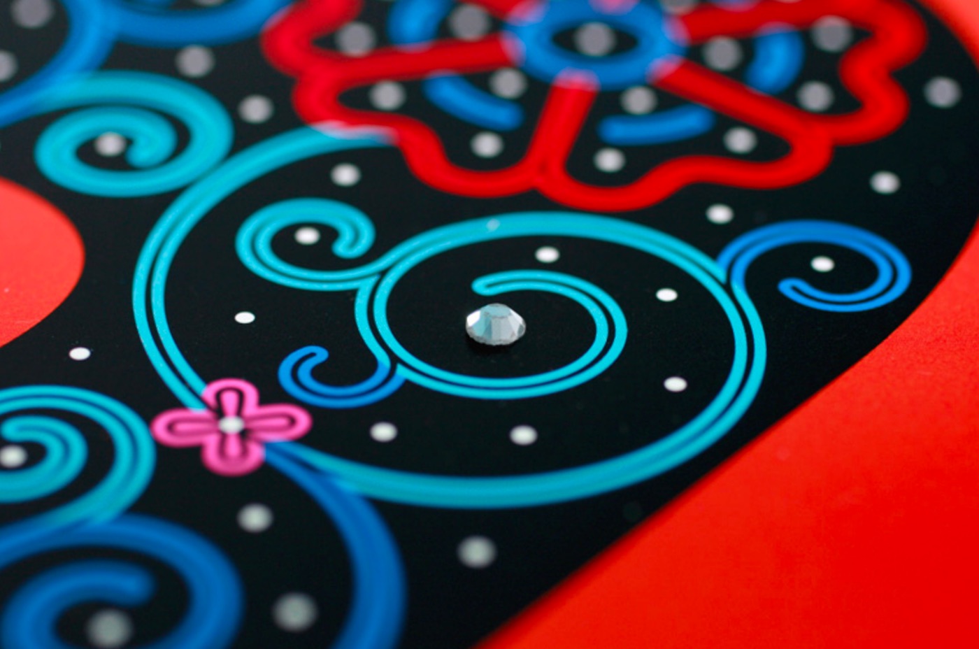
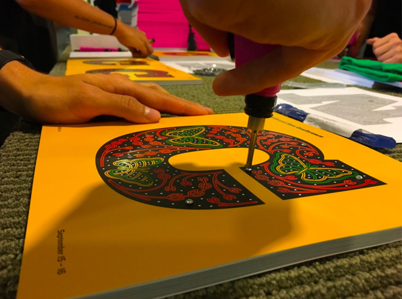
Finally, we’d be remiss if we didn’t mention two of the most noteworthy aspects of this program (both easily glimpsed in the image above). First, the cover of each program features seven rhinestones hand-applied by volunteers. Says Armin, “When we originally planned it we figured it would take 3-4 hours, instead of the nearly 8 with almost all hands on deck. But, in the end, the programs had literal bling!”
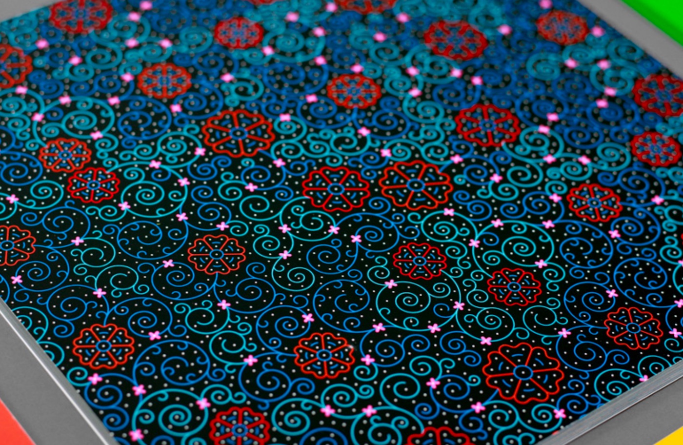
And then there’s that second accomplishment: The programs were printed with 8 colors! “I was very worried about the registration of all the colors,” he admits, “especially with this being split into an 8-color process instead of the usual 4 … but [Classic Color] are wizards and there is no single bulging overlap or weird white sliver.”
And most importantly of all – this one’s for you, picky clients – not a pica of white space anywhere!
Love this piece? Like it, share it and add your comments below.

