It is designed to be an evolving adventure. Each step of opening the package reveals a new detail.
– David Bennett, Bennett Graphics
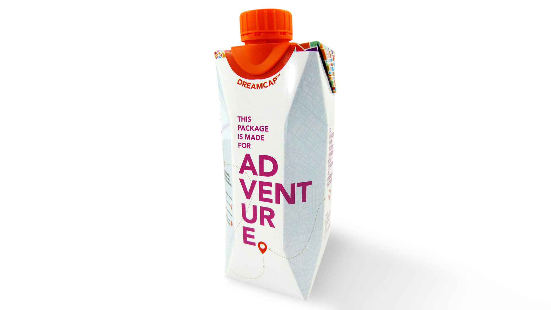
Few companies have as tight a lock on their industry as Tetra Pak. Picture a milk carton. Picture a juice carton. Chances are you’re picturing a Tetra Pak product. Dependable? Yes. Reliable? Absolutely. Unfortunately, neither of these qualities screams exciting, which is unfortunate as Tetra Pak recently came up with a redesigned package and closure – Dreamcap – that it was excited about, and naturally wanted to get potential clients excited about it, too.
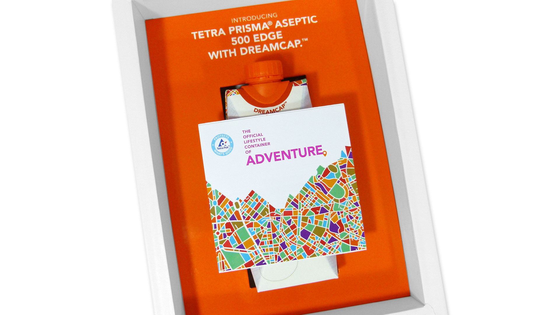
Realizing the best way to whip up some enthusiasm was to actually get the new package in the hands of decision makers, Bennett Graphics crafted a dimensional mailer that played up Dreamcap’s portability and easy-open features by choosing “adventure” as its theme.
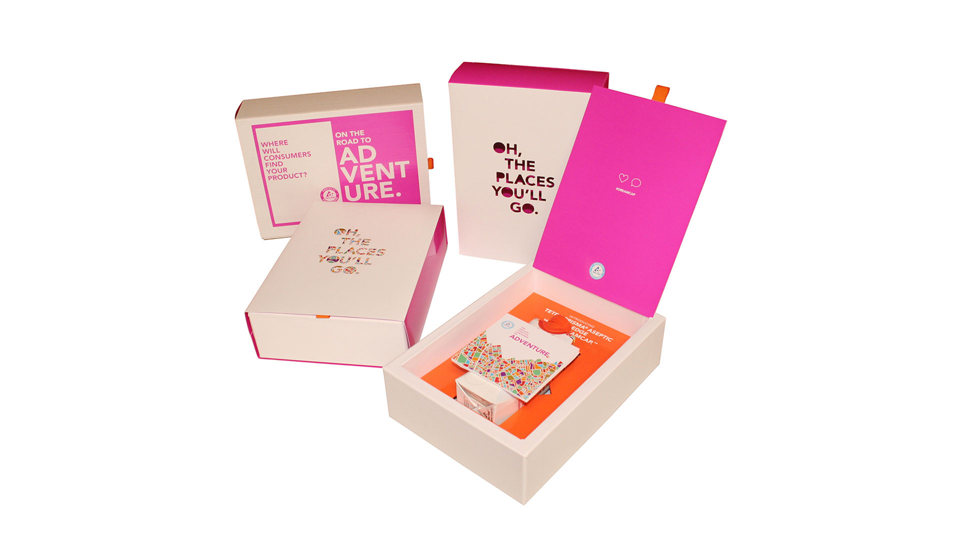
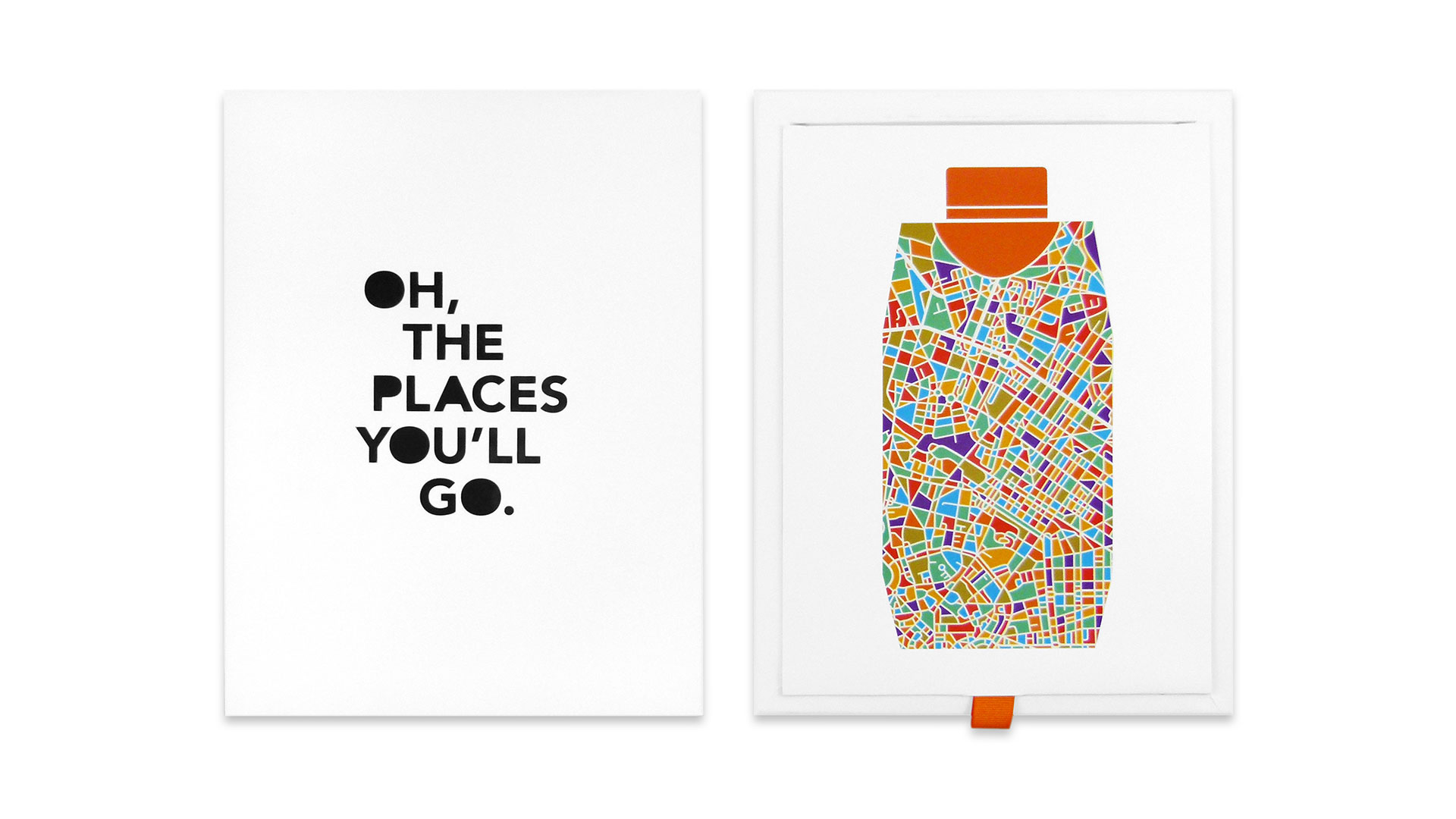
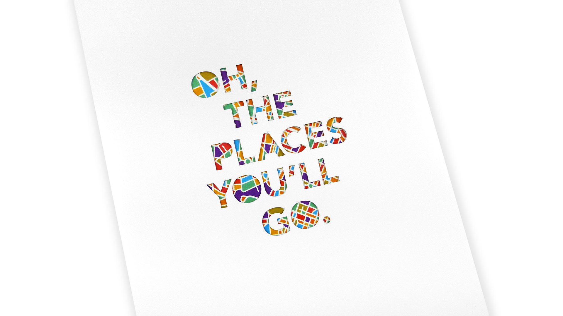
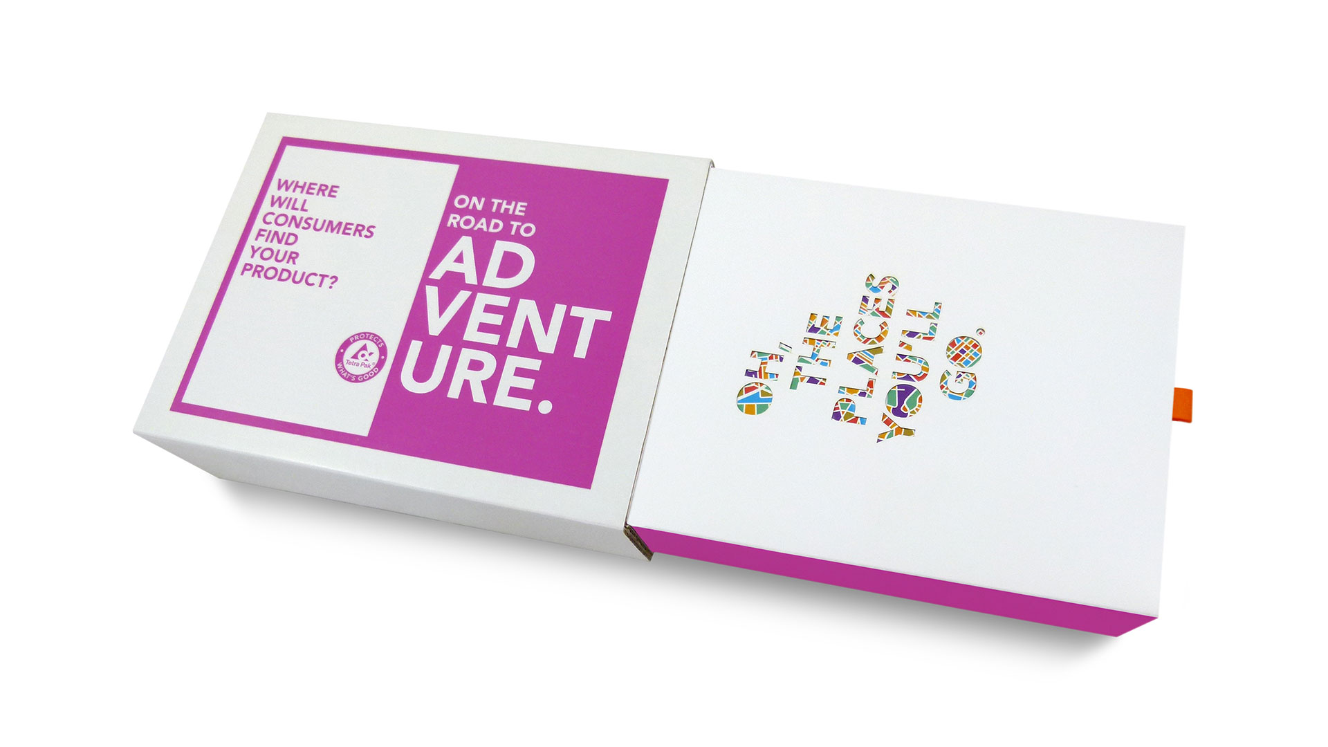
The mailer arrived in a box tucked inside a protective corrugated sleeve emblazoned with the twin phrases “Where will consumers find your product?” and “On the road to adventure.” Sliding the box out of its sleeve reveals the actual box tucked inside another sleeve box boasting the laser cut phrase “Oh, the places you’ll go,” highlighted by a multitude of colors peeking through the cuts. Removing that sleeve reveals that the colors are part of a map-like rendering in the shape of the brand new Dreamcap packaging. And finally after lifting the lid of this box, at long last, is the actual Dreamcap in all its glory.
All together now: “But wait, there’s more…”
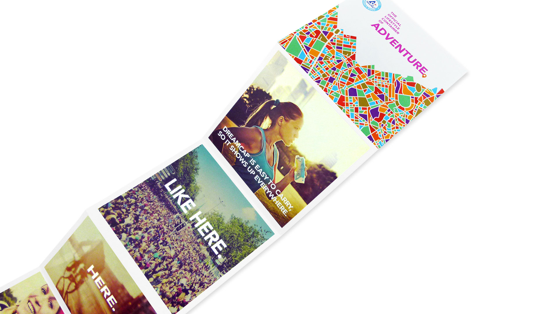
The “more” in question is an accordion brochure that folds out vertically, each panel an Instagram-like image illustrating the different situations in which people might use the new package while engaged in adventures of their own. Here: a sporty young woman quenching her thirst in the great outdoors, there: somebody speeding away on a bike.
“The project was intended to be an adventure in a box,” explains Bennett Graphics’ David Bennett, confirming that, indeed, “it is designed to be similar to an Instagram experience. The receiver is walked through all the possible places they might enjoy this package.”
It is a compliment to the project as a whole to say that this impressive brochure is actually the least impressive part of a package that includes laser cutting, wrapping and hand collating. For designers, at least, how much more “adventure” could you ask for than that?

