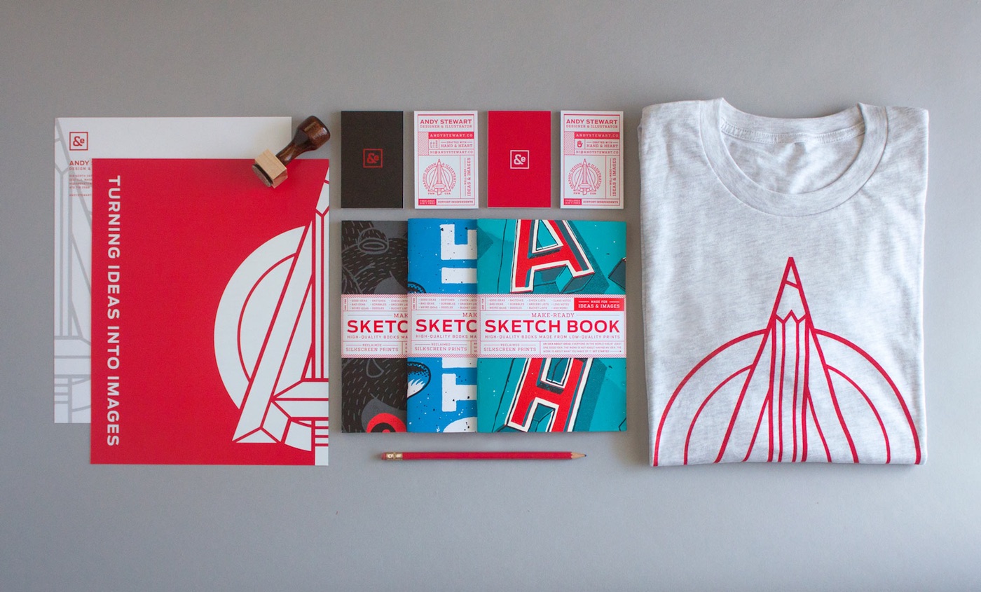
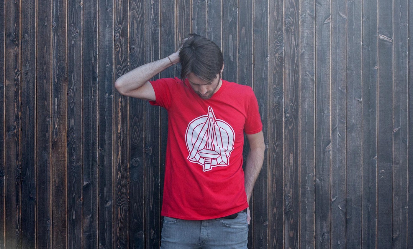
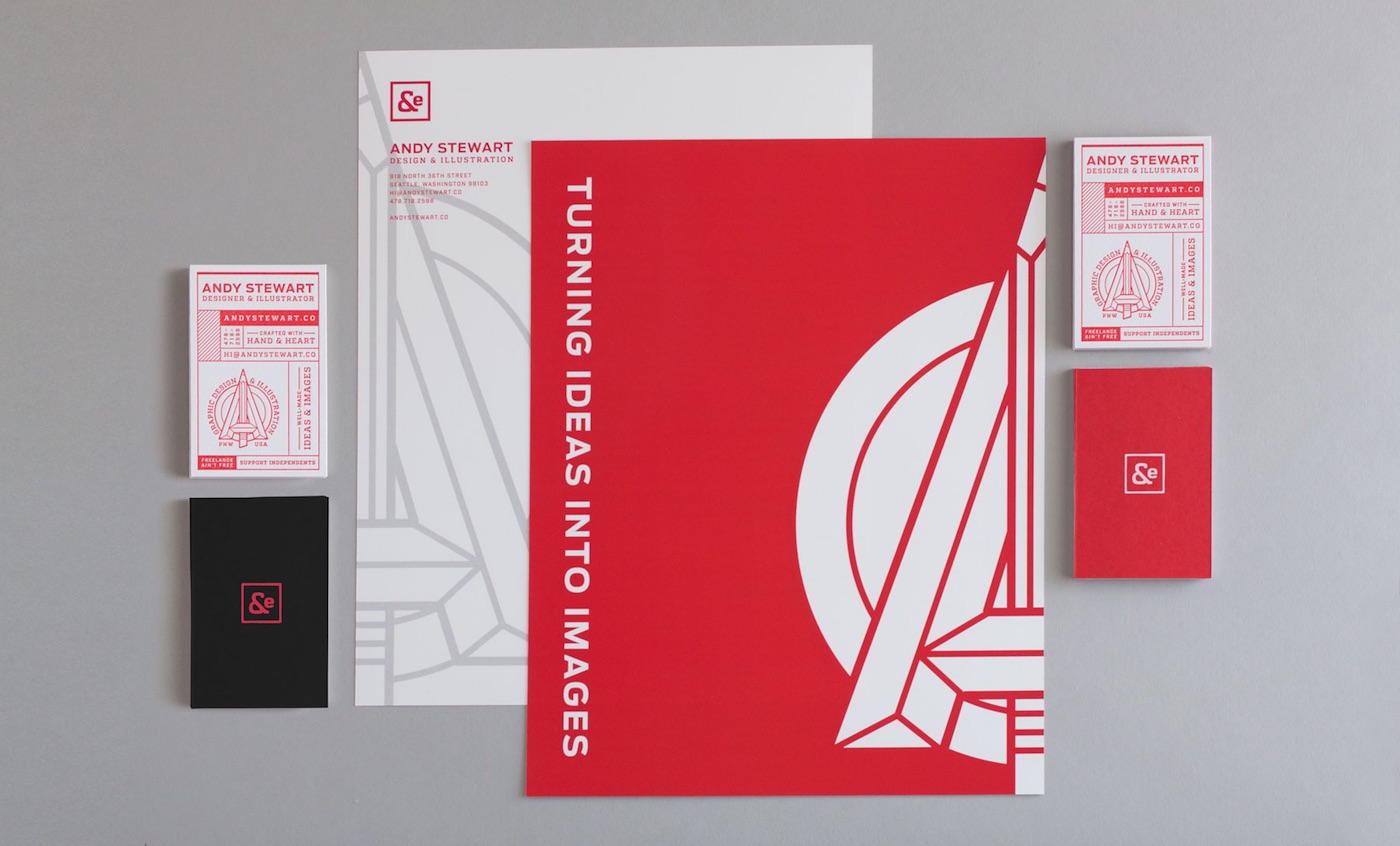
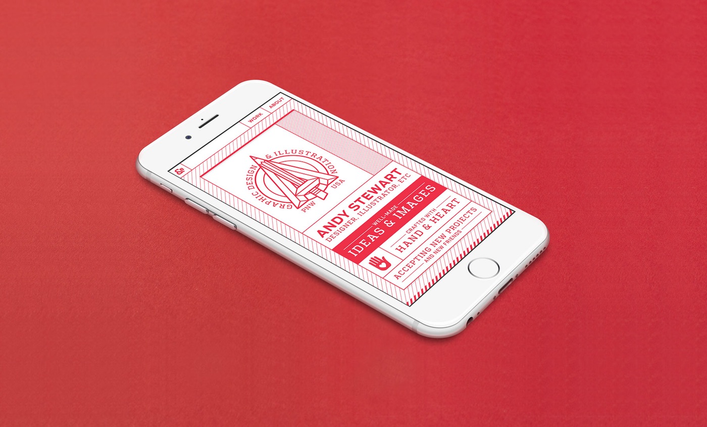
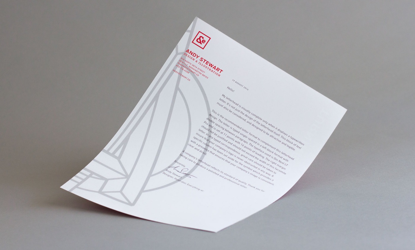
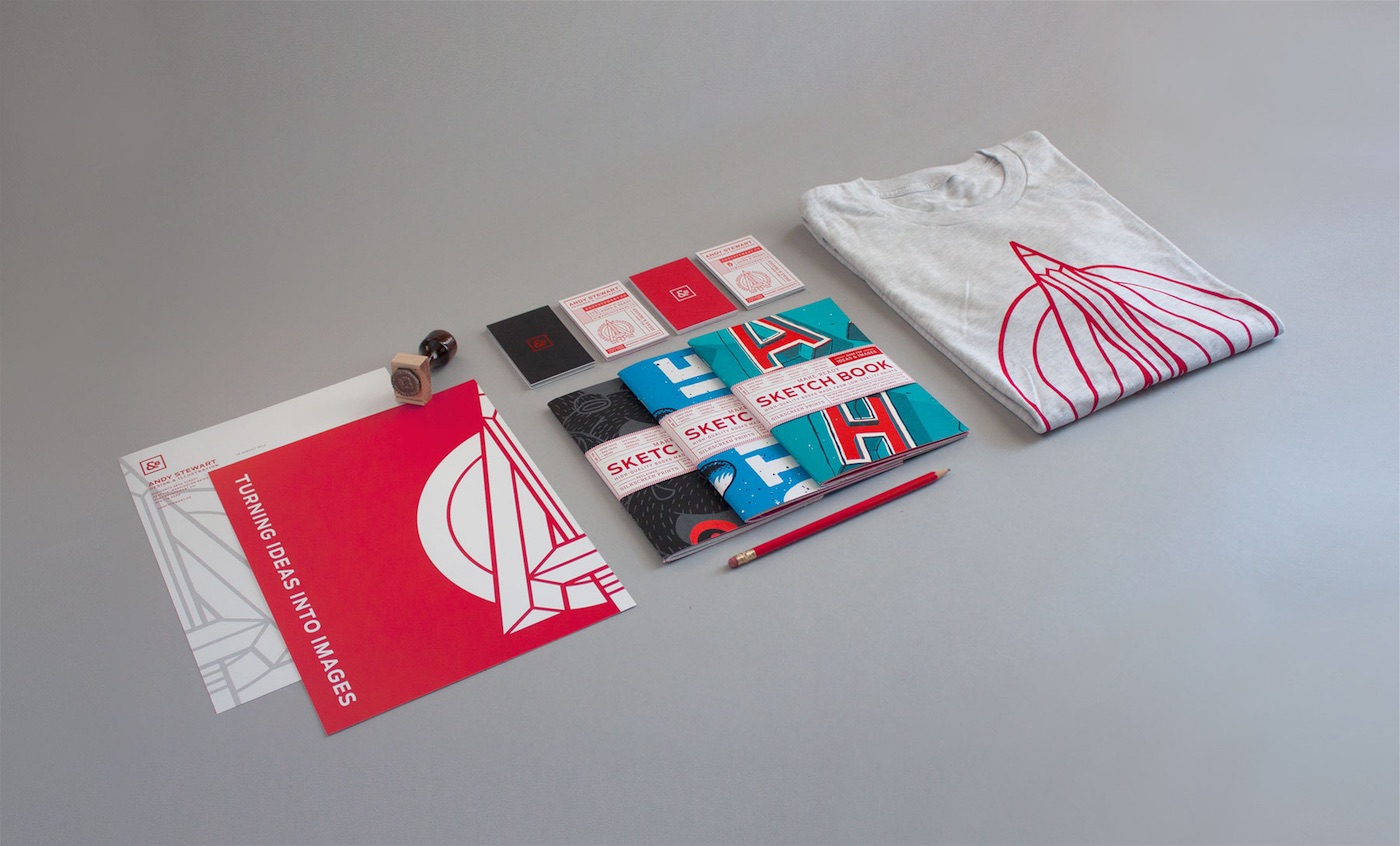
Branding your own design firm is right up there with giving yourself injections in terms of difficulty – both instances leave you feeling, at least initially, that you’re far too close to things for comfort. It’s a problem that Andy Stewart doesn’t seem to have wrestled with as you can see from this wide range of identity materials that nicely walk the fine line between bold and edgy.
“As I stepped into full-time freelancing, I knew it was important for me, as anyone, to take an honest look at who I am and what I do, and how I can better express that,” says Andy. “I designed my visual identity to showcase my range of skills and interests — my passion for developing ideas and strategies, my love of design and aesthetics, my dedication to craft in production. First and foremost, though, I wanted to develop a voice and visual style that’s honest and characteristic of my work — bold, simple, modern, thoughtful — without leaning on or aping my usual styles or techniques.”
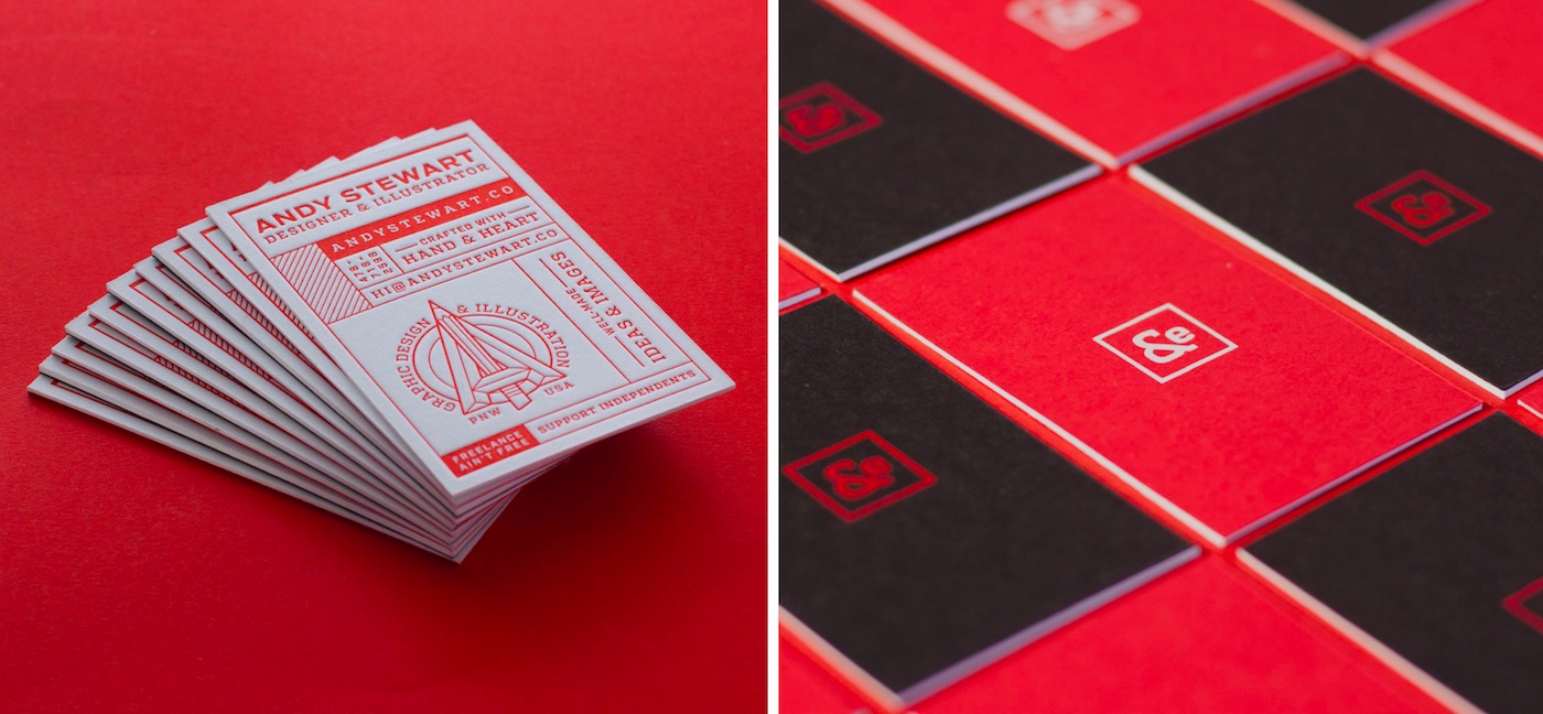
There’s so much to love here, starting with those begging-to-be-touched business cards (note the “Freelance ain’t free” bit in red at the bottom). In short they are a celebration of paper and the craft of printing all on their own. That’s because they include not one but two different printing styles. Explains Andy, “The Reich Savoy is the white (letterpress) side of the business cards. The French Pop-Tone is the red (silkscreen) side. I duplexed the two sheets together, printed, and trimmed them all by hand. Between duplexing and printing, production of the business cards took about two weeks to complete.”
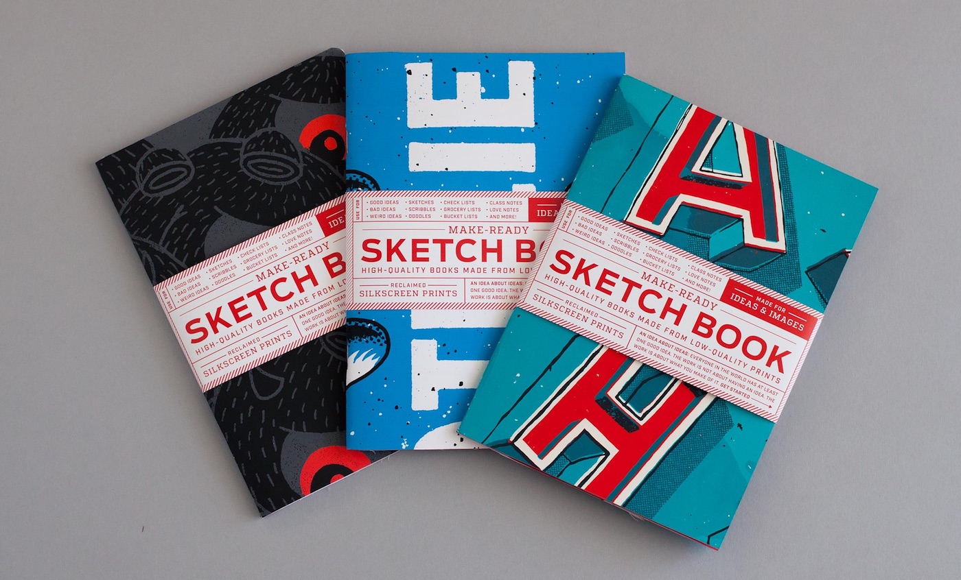
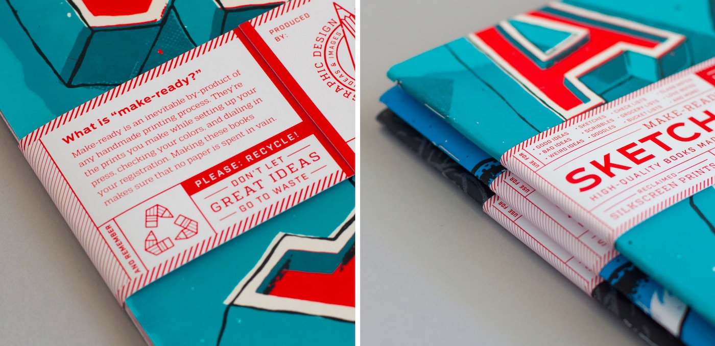
Next, Andy created sure-to-be-used sketchbooks from a truly “renewable” source. “The sketchbook project started as a way to get rid of the growing pile of makeready and misprints I had accumulated over the last couple of years,” he says. “I’m not a printer by training or trade, but it’s always been important to me to maintain a physical connection to my creative output. So, to balance out my more-digital focused freelance work, I design and screenprint gig posters. And with every poster I complete [on Domtar Cougar], I usually have 4-5 prints that aren’t usable — because the color or the registration is off, or I messed up when pulling the print — and I end up culling them before delivery. Simply throwing them out or recycling them wasn’t an option because it felt needlessly wasteful, so I began cutting them up and binding them into sketchbooks. I’ve probably made around 35-40 at this point, all of which I’ve given away as gifts.
“The project was highly iterative and has been through a number of phases in the year-plus since I began working on it, and if I’m honest, it’s still being refined and pushed forward to this day. The largest chunk of that time — over a year from start to finish — was spent designing and building my website from scratch, which I used as a challenge to learn HTML and CSS.”
Andy takes the same hands-on approach to his print work, having made everything you see here himself. “On the side, I teach (and print) letterpress at the School of Visual Concepts and silkscreen at the Vera Project. They both provide excellent facilities, and are amazing resources for creatives in Seattle. So yes, I did all of the printing myself, but I use the community equipment at SVC and Vera, as it’s prohibitively expensive and/or space-intensive to have my own. And also it’s just more fun to be a part of those communities.”

