Good branding, just like good food, is all about executing the basics well and building from there. That’s why we liked the approach the designers took with their clients on this identity system.
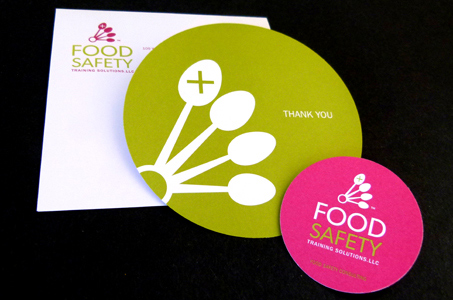
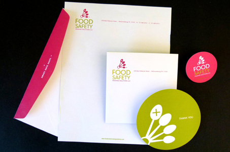
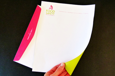
They started with a unique and recognizable logo based on measuring spoons, which serves to anchor the suite of letterhead, envelopes, business cards and note cards – any company’s first impression to their prospective clients.
This system, designed for a business that specializes in training people who touch food served to the public, distinguishes itself by the diecut circle shape (plate of food anyone?) used on the business card and a thank you card.
The color palette of spring green and raspberry red evokes images of fresh and delicious fruits and veggies. We say “Yum!” to the whole package.

