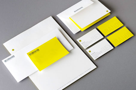
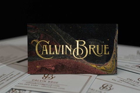
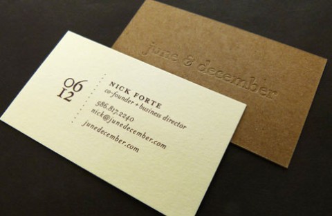
Distinctive color palette, clear foil and letterpress are perfectly mixed together in a modern and unexpected way by (and for!) this award-winning design and branding agency.
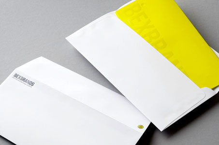
An acidic yellow sets your eyes buzzing, but is strategically placed on only one side of all pieces to keep the visual impact balanced. A calm, cool grey further stabilizes the energy of the yellow.
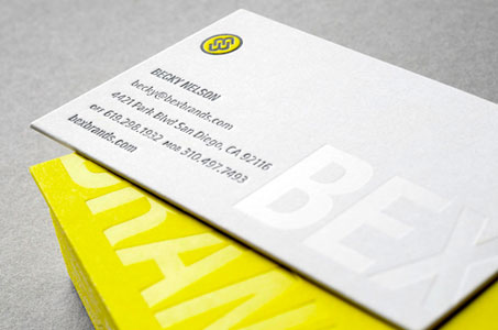
The logo is a true standout thanks to the expert letterpress printing that beautifully renders the intricacies of this small-scale mark. Choosing letterpress also provides the tactile stimulus we all love. (Touch me!)
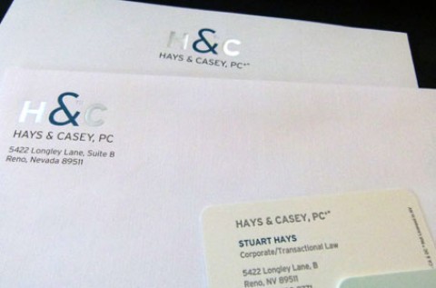
The company name is subtly rendered with clear foil, which adds interest and a bit of shine to the silky finish of the bright paper (Smooth Classic Crest in Solar White).
Two extra details I love: a letterhead design that shows users precisely how to fold it (Yeah!) and the circle stickers that have many practical, fun uses (I know I’d get in trouble for using too many of them!)

