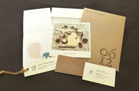
From the business cards and product tags to the stationery items and pillows, June & December, a business that designs and sells paper and fabric goods, uses a variety of paper weights and printing processes to impart handmade charm and coherent warmth to its unique branding.
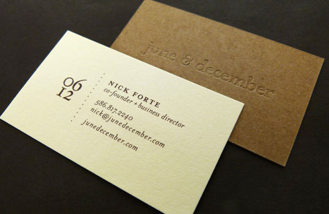
The company name was inspired by the birth months of the owners’ children – the visual contrast of those two months is beautifully translated on their business cards. One side is kraft paper (the name spelled out in a blind emboss) and duplexed to a cream-colored cotton paper, the numeric logo “06 12” and the vital contact info printed in ink.
To remind buyers of the couple’s made-in-the-USA manufacturing values, you’ll find Michigan-shaped graphics on the product tags and hello/thank you cards that accompany orders. A fondness for antique vellum paper finish and thick, rough twine add texture to these pieces as well. Muted, earthy colors bring home a welcoming, friendly aesthetic that infuses each collection.

