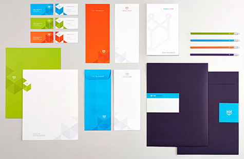
I would bet my ETA that there aren’t too many logistics companies with a brand identity as fresh and inventive as the one Fame Retail created for King Solutions. And I’m just going to say it … Sorry Brown, I prefer this visually vibrant color palette any day of the week.
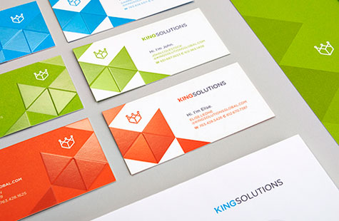
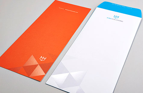
The crown logo is apropos given the company name, but the way it’s executed with clear foil stamping and that emboss/deboss technique gives it modern appeal and a sense of movement and dimension. Also notable on the business cards is a really simple idea that had a very humanizing effect: one line that reads Hi. I’m [Insert Name]. It’s such a courteous touch.
I have to say my other favorite piece in this suite is the capabilities brochure with pocket folder cover. The black-and-white photos print beautifully on the sleek feeling Cougar Opaque Smooth. The copy here is crisp and displays a sense of humor that conveys an approachable and friendly culture. And once again, that triumvirate of eye-popping colors keeps you moving through the pages.

