I’m not a signature color kind of person. While yellow is bright and positive and clearly reflects the sunshine of my soul, I can’t even begin to imagine wearing it every day … or having a yellow-only decor. Give me color choice or give me death! (No offense Patrick Henry.) This identity package from Bunch Design has its own unique slant on color.
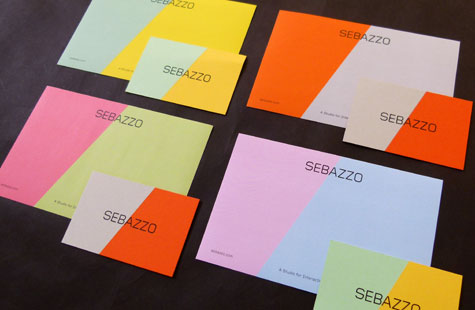
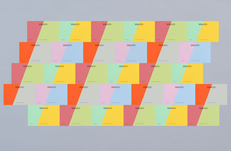
The design team uses Pop’Set Grey, Flame Orange, Spring Green, and Sunshine Yellow. It’s a mix-and-match concept that not only applies to the palette of each piece (letterhead, business card, compliment slip and label), but to their function as well. Feel like a grey and orange business card paired with a green and yellow letterhead today? Go for it!
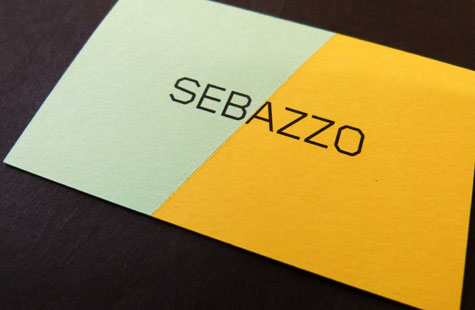
To illustrate the partnership structure of the business, the logo is neatly split in two. A diagonal line cuts between selected portions of the partners’ names (Seb and Azzo) for a clean delineation and unifying whole. The sans-serif Gridnik sports 45-degree corners that echo this geometry.
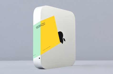
While the letterhead and label are printed with the diagonal color blocks, the business cards accomplish it thanks to an amazing job of duplexing the stock. The diagonal cut across the logo’s “A” is perfectly precise.

