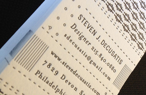
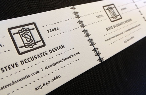
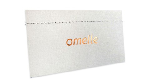
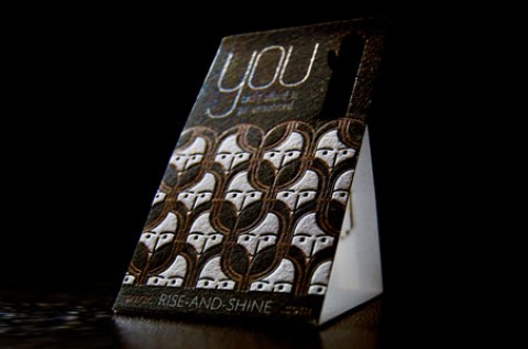
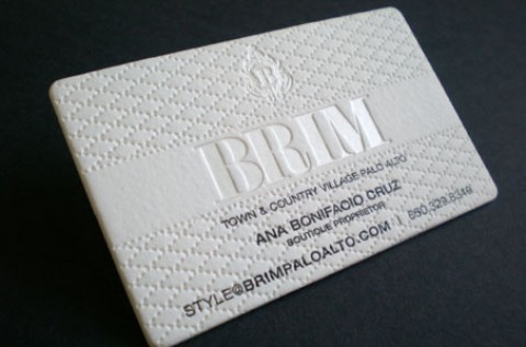
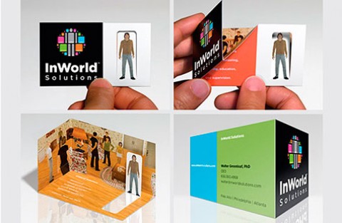
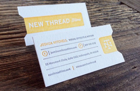
Mixing it up, experimenting, testing new ideas – isn’t this what creativity is all about? But sometimes, especially when it comes to that sacred identity, it can be the last thing we’re willing to change. The business cards Steve DeCusatis created for his design studio show just how to successfully re-invent an image without losing the consistency so important to any brand.
Letterpress printing smaller quantities allows the designer to change the concept as often as he wishes. For the fine examples we have here, he first plays with weight on the Crane’s Lettra – 110 lb. and 220 lb. (Lighter weight for conferences where you’ll be handing out a lot of cards, and heavier weight for client meetings, perhaps?)
Next, the stock color and ink color get changed – Fluorescent White and Pearl White. A subtle difference, but the black only version works great on the brighter white. The creamy Lettra looks beautiful with the silver and black ink.
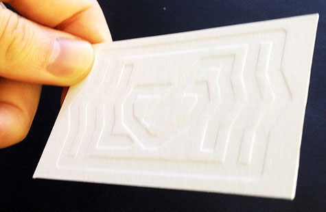
The logo serves as true north in the design. It appears consistently across the versions, but is rendered in different ways – straight logo, decorative repeated pattern, blind emboss.

