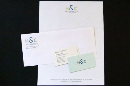
My favorite part of this identity system was the color palette along with an open and fresh feel to how all the elements came together.
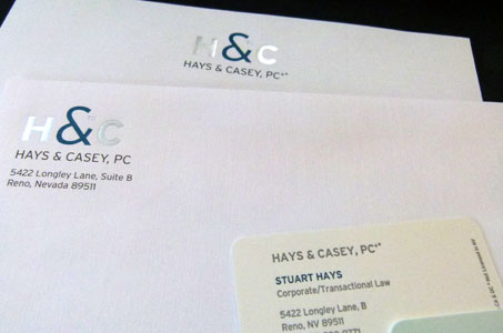
The stationery was produced for an intellectual property and transactional law firm and conveys a business-like quality with the choice of the muted blue and gray tones.
There’s also a sense of modernity in its touches of silver foil and oversized ampersand in the logo. The letterhead also communicates strength and stability through the paper choice (Classic Crest Linen) as well as the selected typeface.
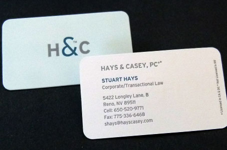
The business card was letterpress printed on Crane’s Lettra Pearl White Cover and round cornered for a classy extra touch. The full bleed on the back side of the business card really adds a bit of excitement to an otherwise very calm design.

