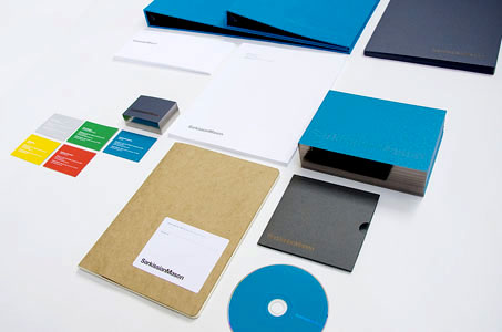
Letterhead, business cards, thank you notes, folders, binders, DVD sleeves, envelopes, mailing labels – how do you get them all to play well together in an identity package? The designers for this entry give some valuable pointers.
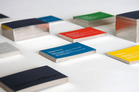
There are six colors all tolled on this package – five PMS and one custom mix – so a lot going on here. First, I’ll say Yes! (imagine a little fist pump here as well) that they choose spot colors, considering the solid ink coverage.
Next, the palette itself is contemporary and vibrant without being obnoxious. The royal blue and slate grey lend consistency across the pieces while the canary yellow, tangerine red, grass green and mist grey on the back side of the business cards allow everyone to have a bit of unique personality – at least we hope they got to choose their own colors.
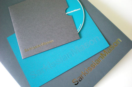
The mark of distinction, though, has to be the gilding work done on the client’s logo – worth its weight in … well, you know!

