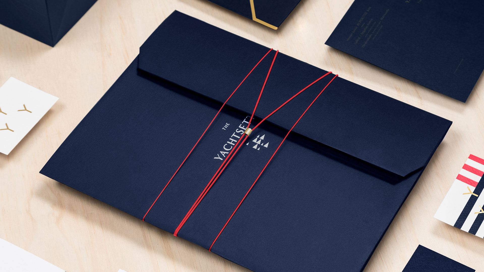
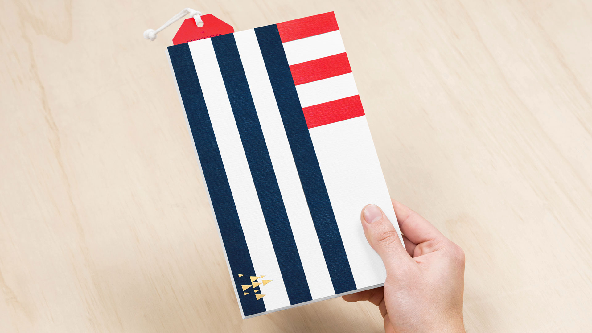
Sometimes the most intriguing design is the one that places you on a knife edge between two competing attitudes. How else to understand the allure of these identity materials for The Yachtsetter? You can practically feel the tension between their use of classic design elements such as just a few primary colors and straight lines on the one hand, and on the other a subversive “anything goes” spirit that is more in keeping with this charter yacht business’ promise to be “the answer to all of your wildest fantasies.”
“The signaling communication representative of ships, as well as the shields, medals and flags that are used in regattas inspired our design,” explains Roby Arriaga of the materials’ designer, Anagrama. “The logo draws from the formations and landscapes that occur from regattas, while the brand’s color palette results from the contrast found in the colors present in these boat competitions and maritime signal flags.”
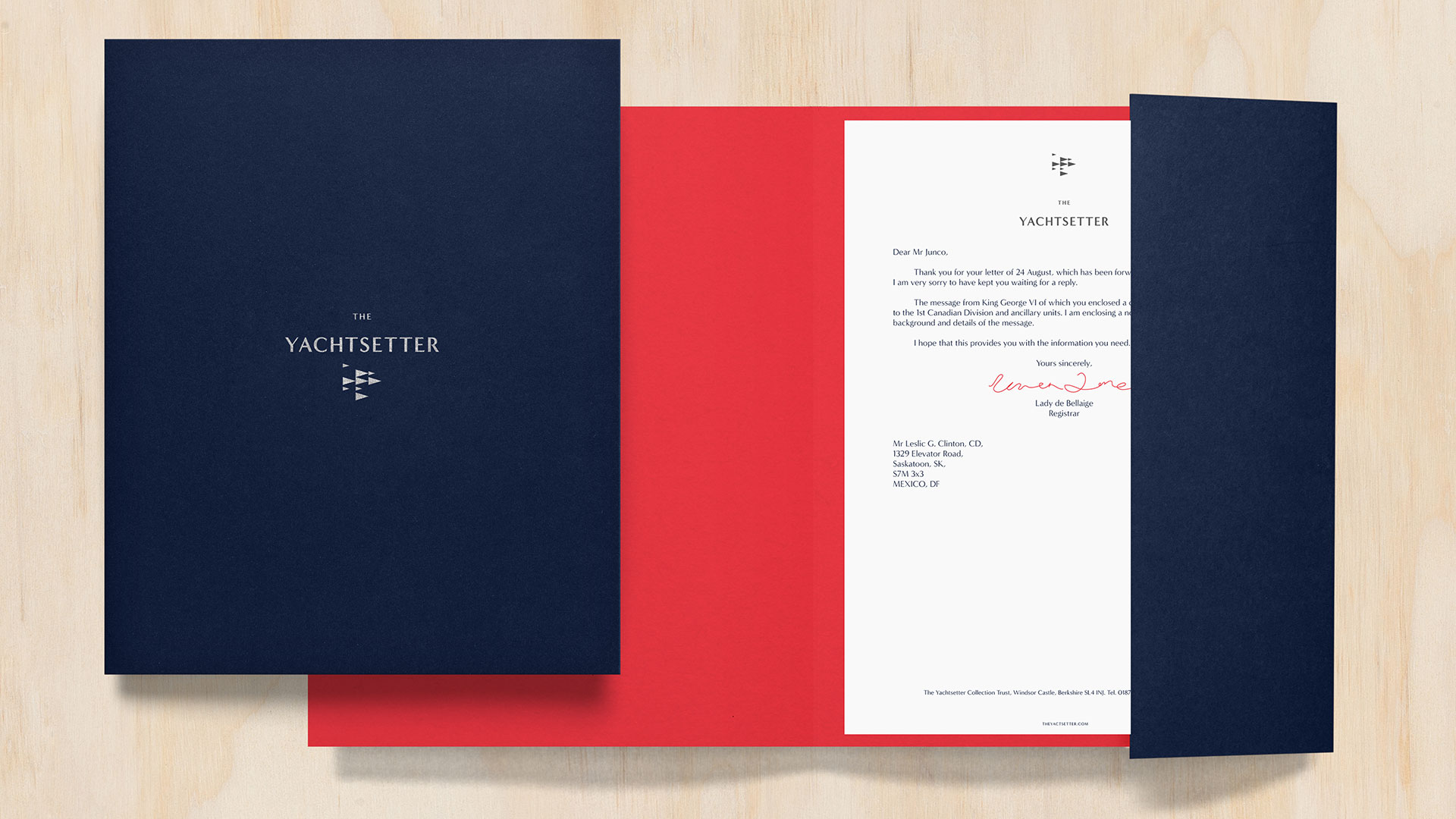
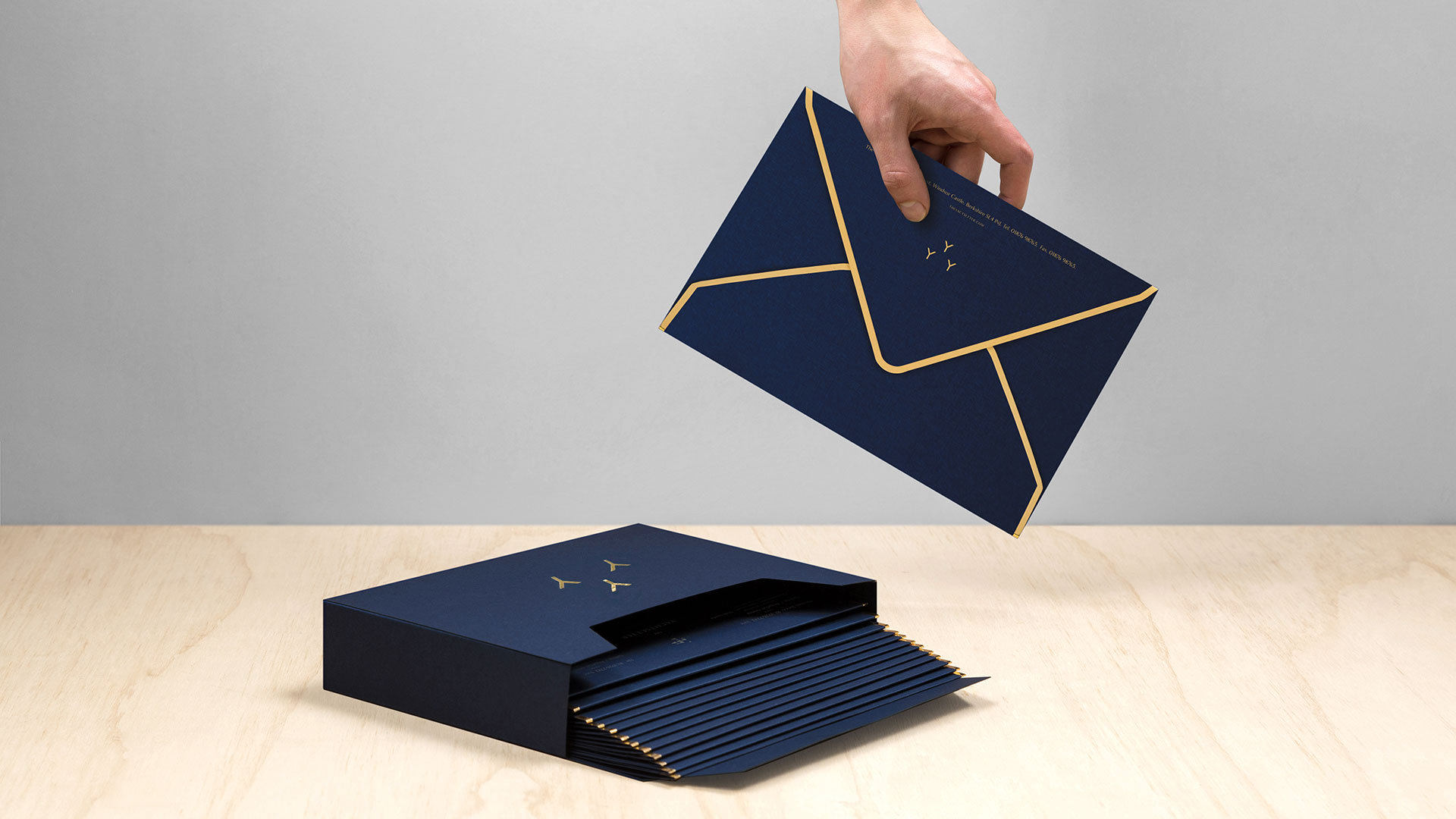
As a brief look at past Anagrama projects will show, the Mexican branding agency loves to produce work with a certain understated charm: the elegant red elastic chord securing the blue portfolio folder here is a perfect example. As Roby says of The Yachtsetter suite, “The paper stock, colors, and gold foil are combined to give a high-end and sophisticated look.”
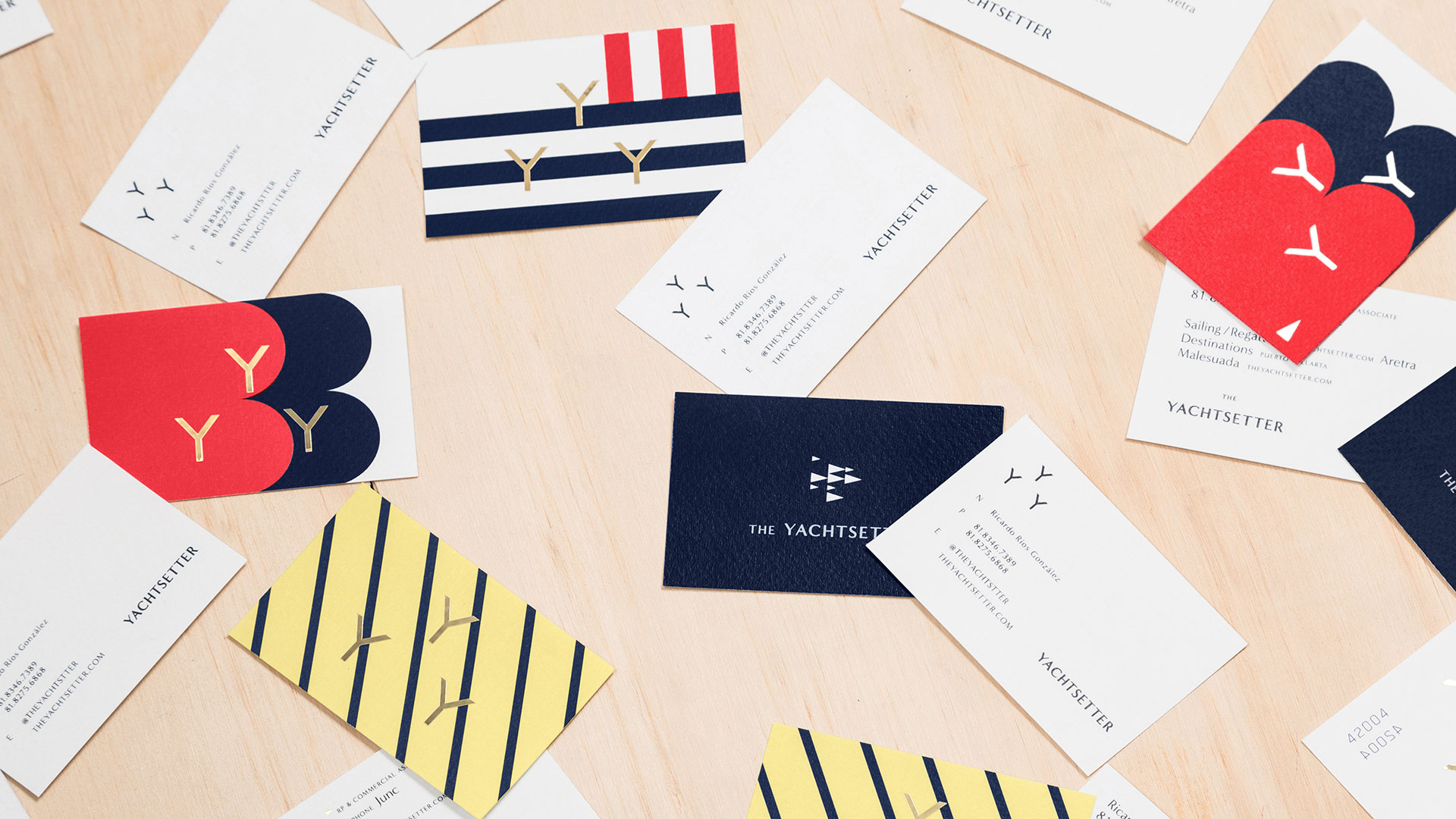
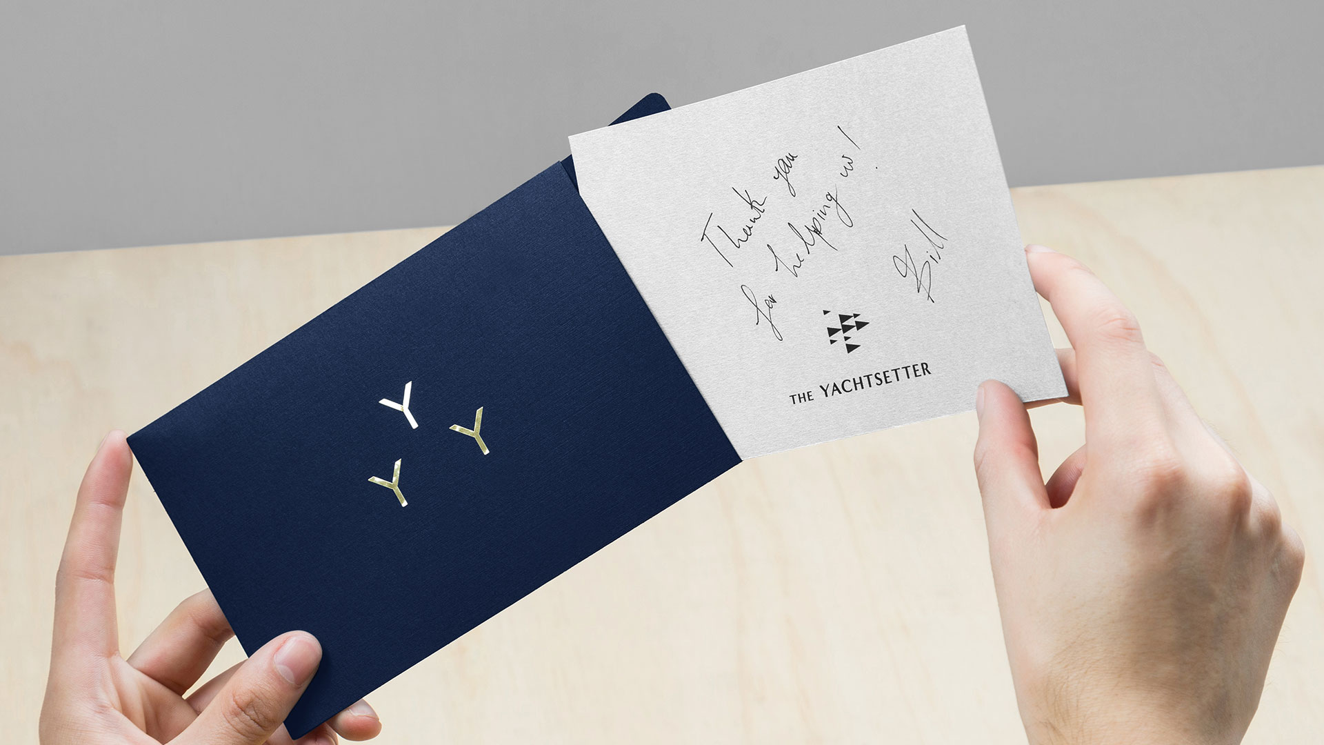
Ah the gold foil. Whether on Yachtsetter business cards, brochures or envelopes (especially those envelopes!), foil is used the way foil should be used – as an accent to the whole design.
While I’m a bit iffy on the use of two different logos to represent one company, it kind of works here. While the regatta flag might be recognizable to diehard yacht enthusiasts, it’s a little too abstract to represent the brand on its own; the trio of foil “Y’s” pick up the slack. I especially love their use on the yellow back of the business card.
As you can see, perusal of this suite of materials quickly devolves into something resembling a visit to the zoo: “Look over there, and there, and there!” Hmmm, a print design petting zoo… Never mind yachting, I think I just found my own new perfect getaway 😉





Awesome design work