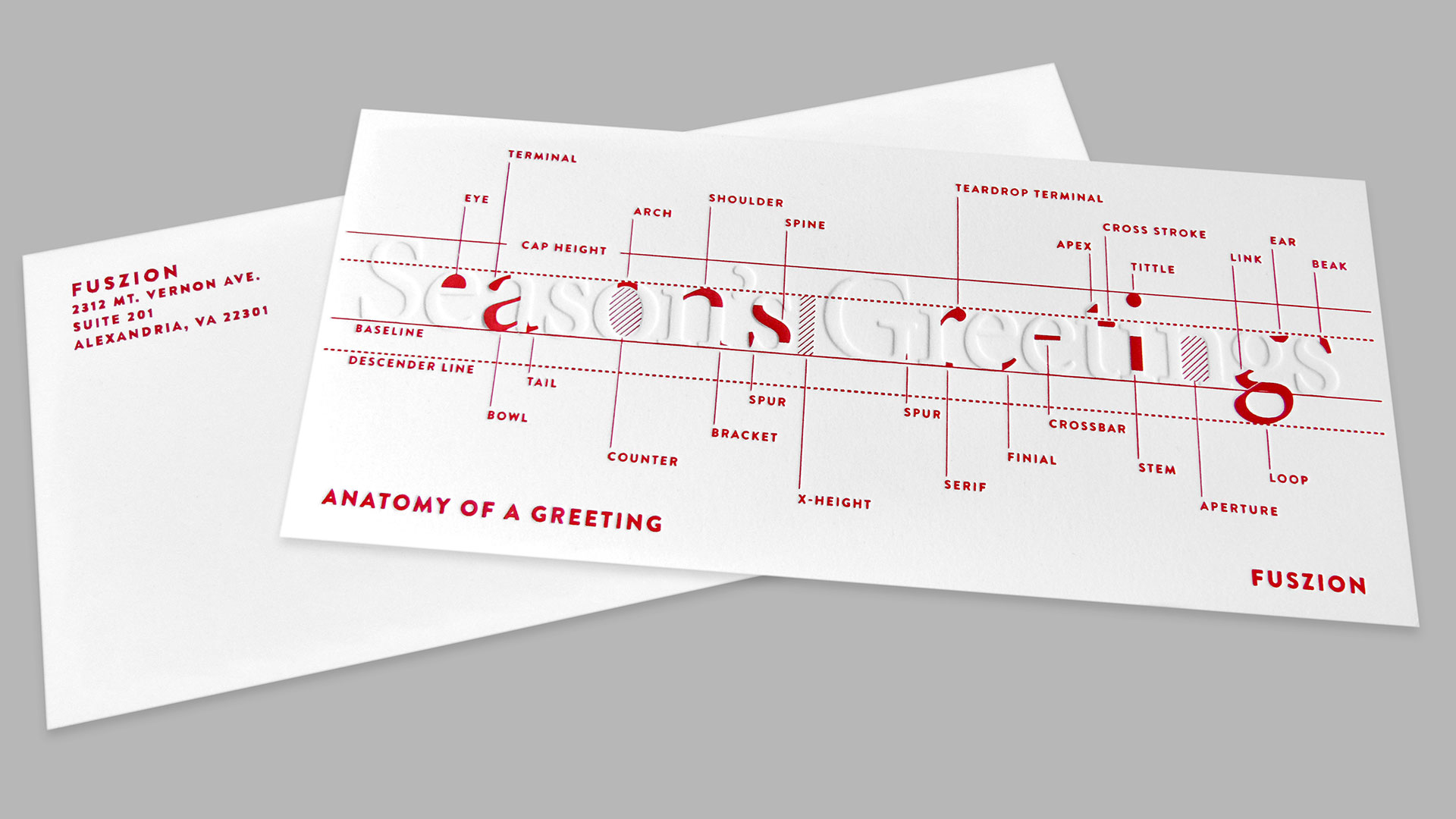
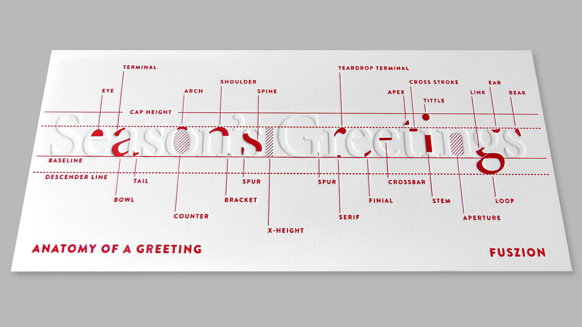
When it came to wishing clients seasons greetings, design studio Fuszion made their list and checked it twice: no Santas, no fir trees, no snowflakes. Instead, they wanted their holiday card to be something that was handcrafted, elegant, and a treat for the fingertips. That meant two things that make every designer’s heart beat just a little bit faster: nice typography and letterpress printing.
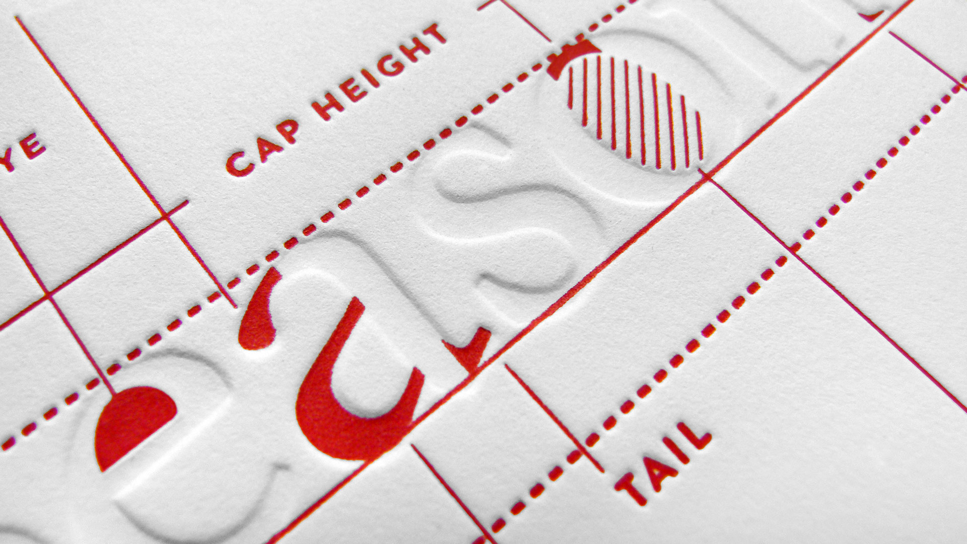
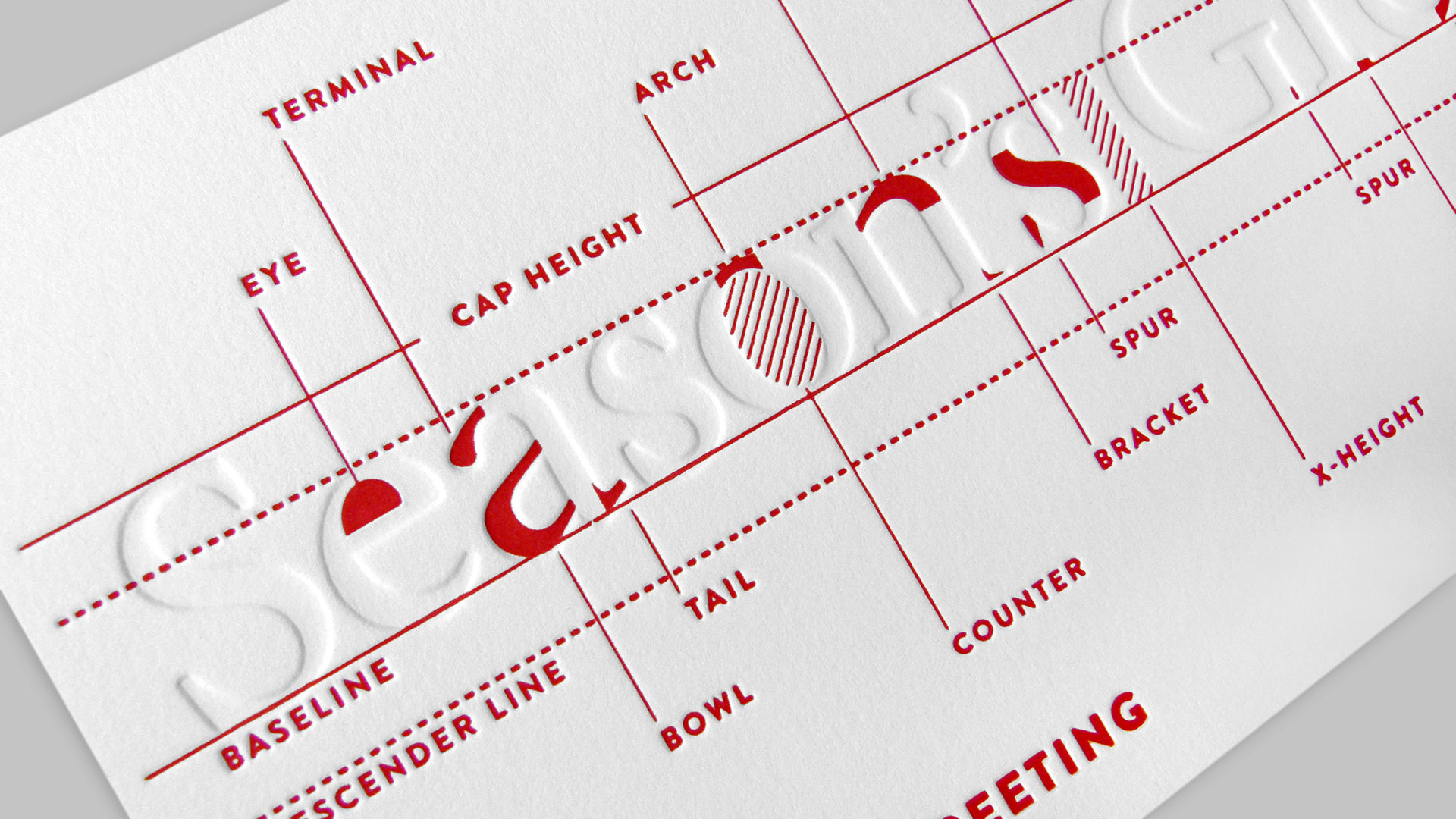
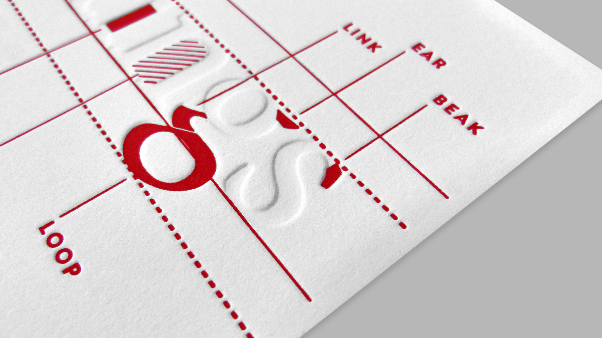
They also took this opportunity to share some of their love and knowledge of typography with their clients: here a baseline, there a serif. Here a cross bar, there an X-height – you get the idea.
All printed on a 1950s Vandercook letterpress on soft and sumptuous Reich Savoy, [Get Swatchbook] this card only has one color prominently printed. Yet it required two passes through the press: a blind run, meaning no color but just the plate was used to get that nice deep impression, and a second one for the red highlights.
Wanting to be involved every step of the way, the Fuszion team not only watched the plates being made and the ink applied to the rollers, but they also tried to help load the paper. They were so hands on, in fact, that they finally got kicked out of the press room. Now these are my kind of creatives 😉
If you want to find out more about the ins and outs of letterpress printing, I’ve put together some special tips for our PRO members: check them out here.
Love this piece? Like it, share it and add your comments below.

