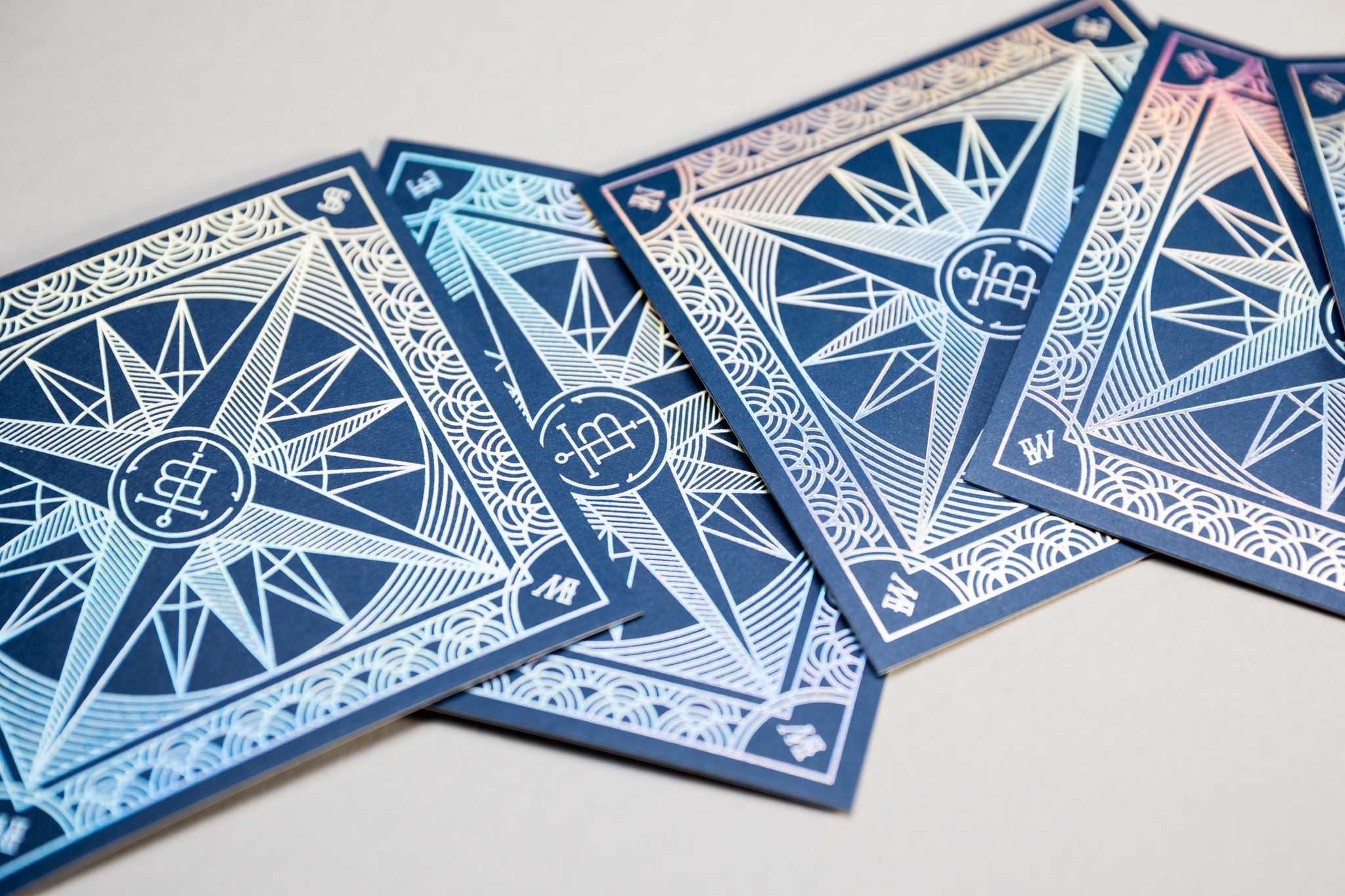
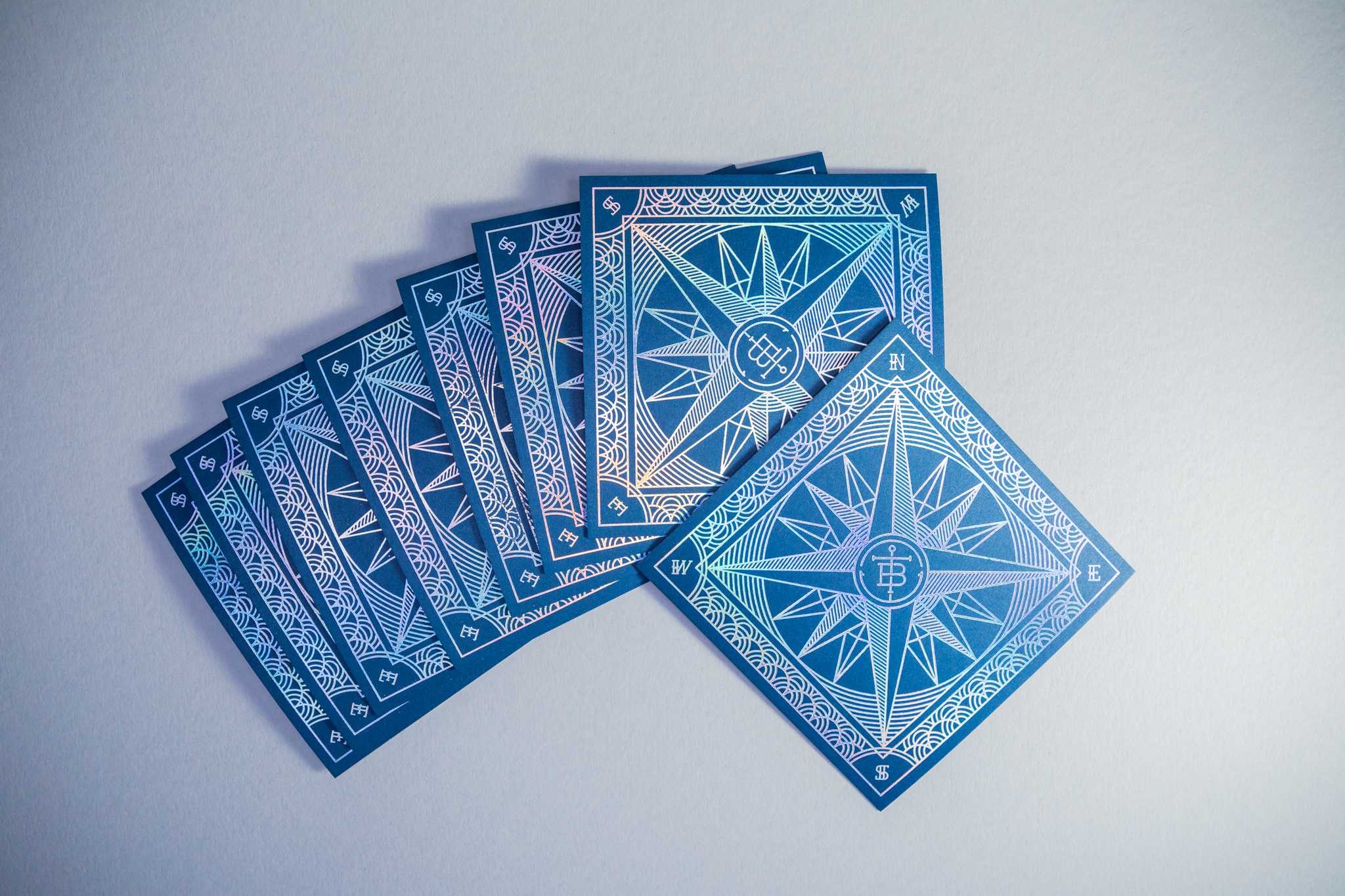
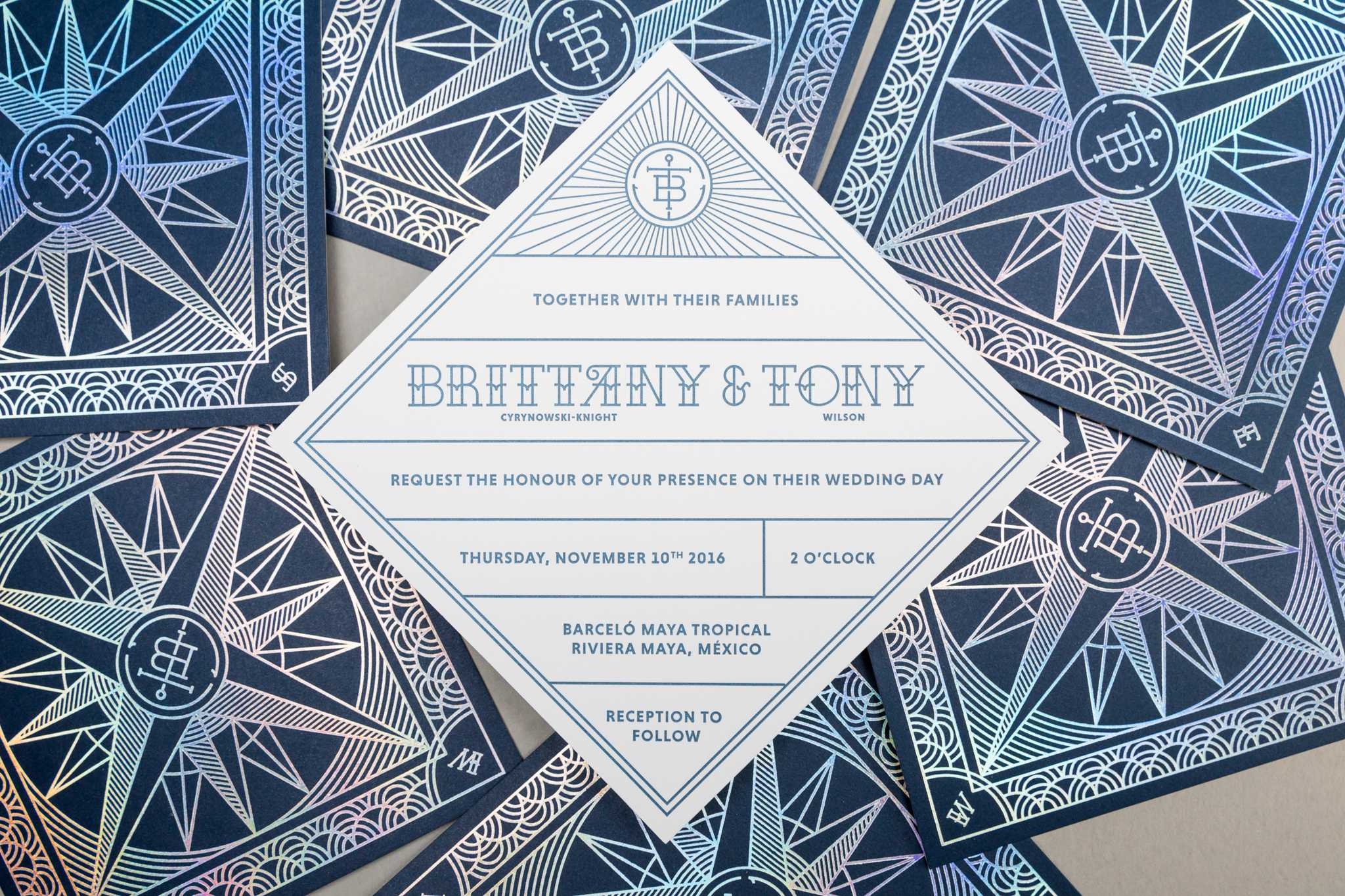
What is a marriage if not two souls uniting to navigate life’s stormy seas together? As this smart and stylish invitation to witness the “tying of the knot” between Brittany and Tony reminds us, there are quite a few nautical themes to be found in this sacred institution. Proving himself a good friend indeed, designer Justin Kowalczuk took the theme and ran with it and, as he will be the first to admit, ran wild with the foil, too.
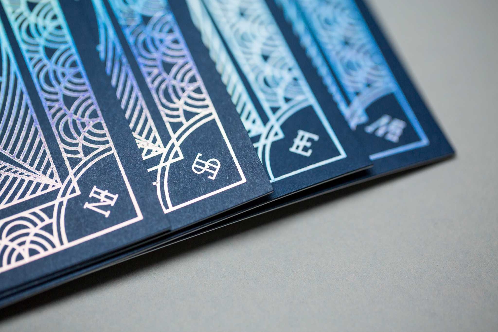
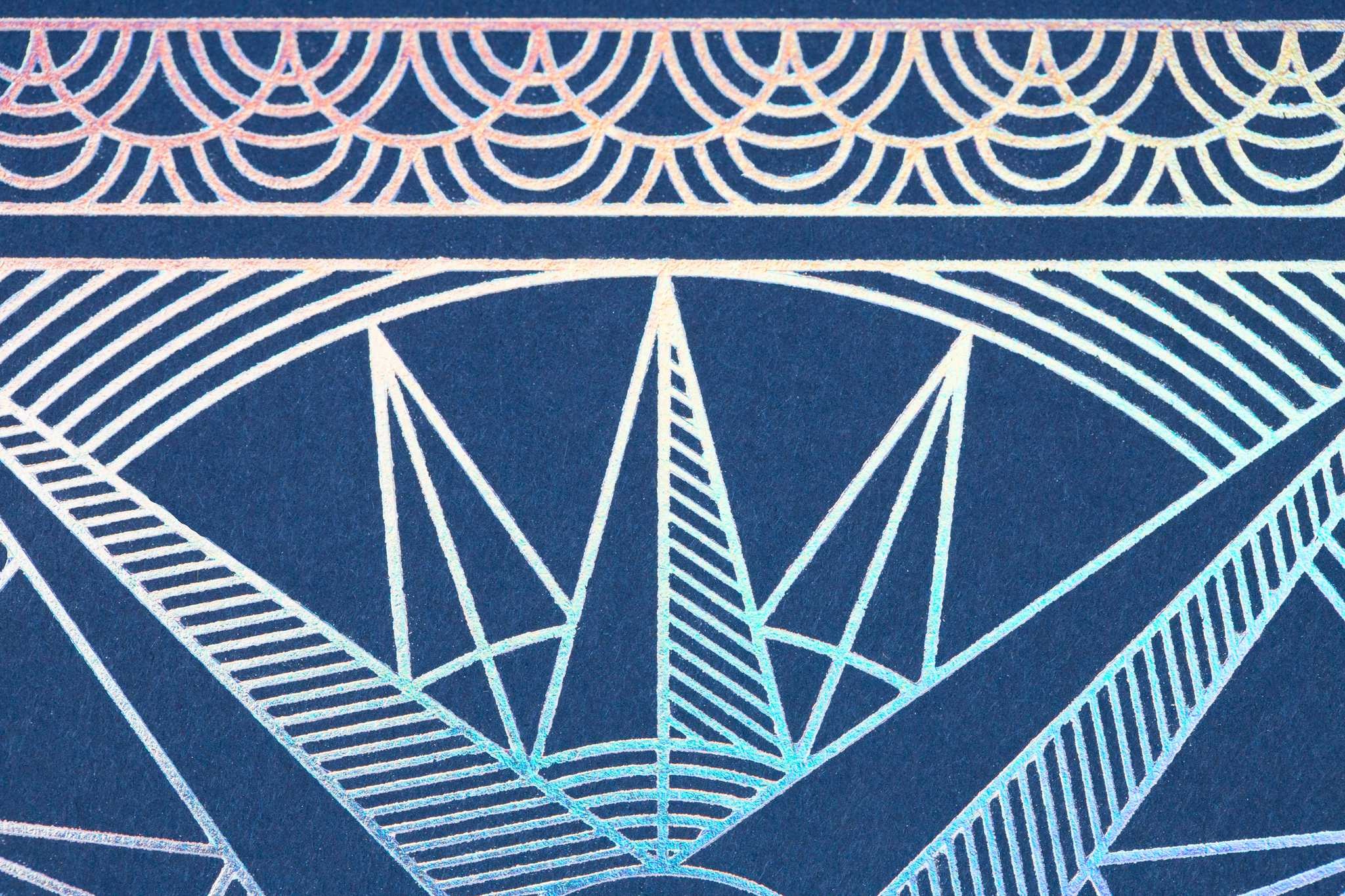
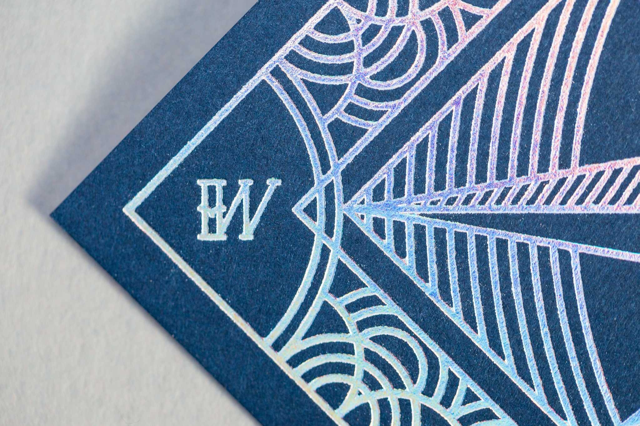
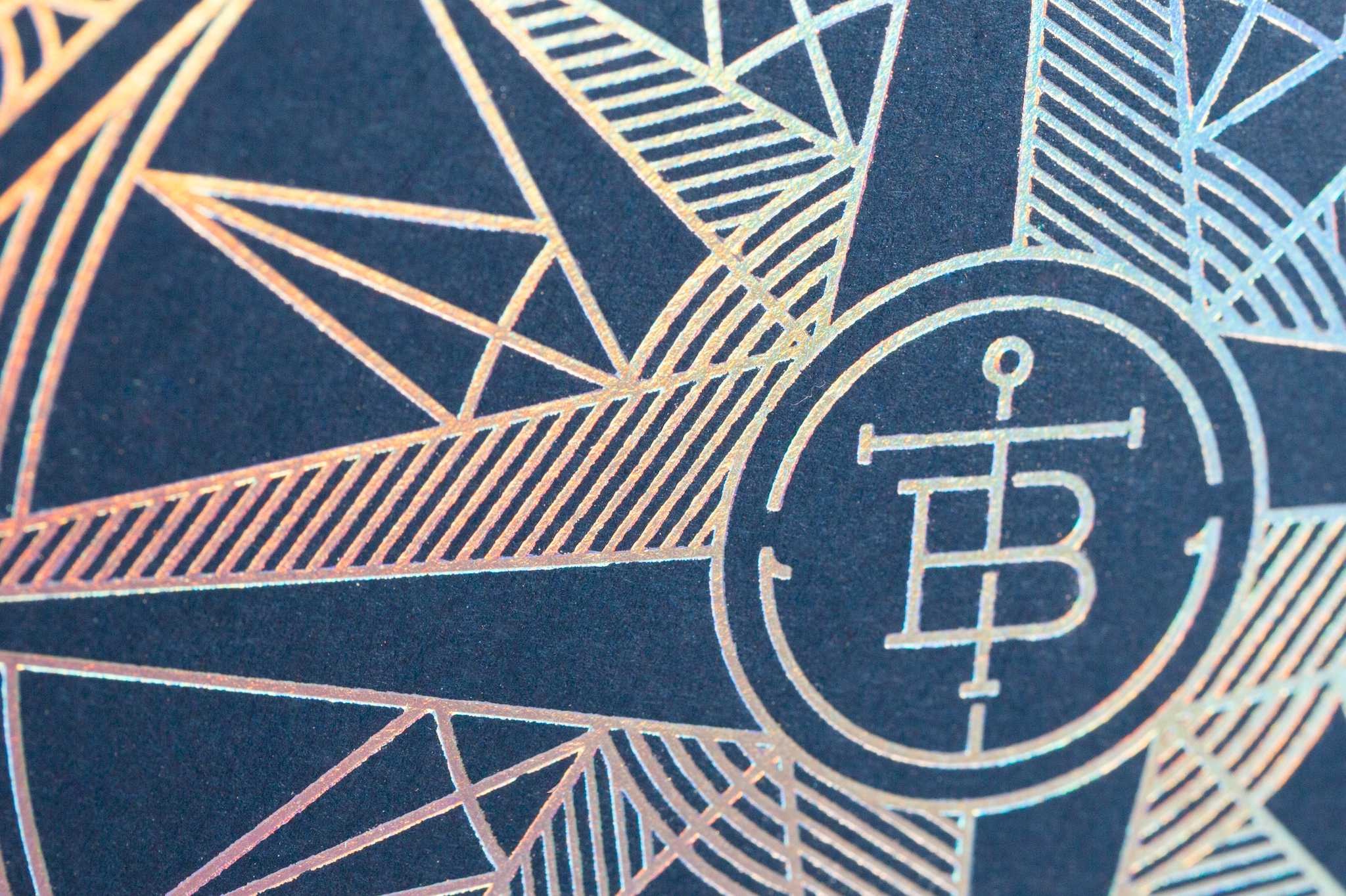
“When I was asked to design my friend’s wedding invite, I took it as an opportunity to go absolutely nuts with holographic foil (and I knew Mama’s Sauce would be fully capable to handle the complexity),” he told that venerable print shop. “With the foil and nautical theme in mind, the front of the invite draws inspiration from classic compass elements with a modern mono-line aesthetic. As a designer with a focus on custom typography, I was also able to create a custom “sailor jerry-esque” typeface and paired it with Niveau Grotesk.”
Most designers would’ve called it quits after turning in such a clever “sea worthy” logo – the ship’s anchor theme is positively inspired. But Justin saw the theme through, adding other little details sure to bring to mind the beckoning sea. Art Deco-style loops around the edges remind us of the patterns left by rain drops on the water, while the directional initials (N,S,W,E) complete the promise of the compass rose at the invitation’s center.
The reverse side – the Neenah Classic Crest Smooth Solar of this two-paper duplexing – gets even more mileage out of that logo by applying it to a background evocative of a sunrise.
Whether you’re a wide-eyed romantic or simply someone with a love of good, effective design, chances are that this wedding invitation has already set sail with your heart.

