For the uninitiated, opera might seem a stale, stodgy affair better suited to some bygone era. But those who frequent and support the Houston Grand Opera know better. From its choice of operas to the way they are staged, it never fails to surprise. How apt, then, that the invitation for its 2016 Opera Ball fundraiser that was slipped unassumingly into select letterboxes throughout the city, opened to reveal something that sprang gloriously and unexpectedly to life.
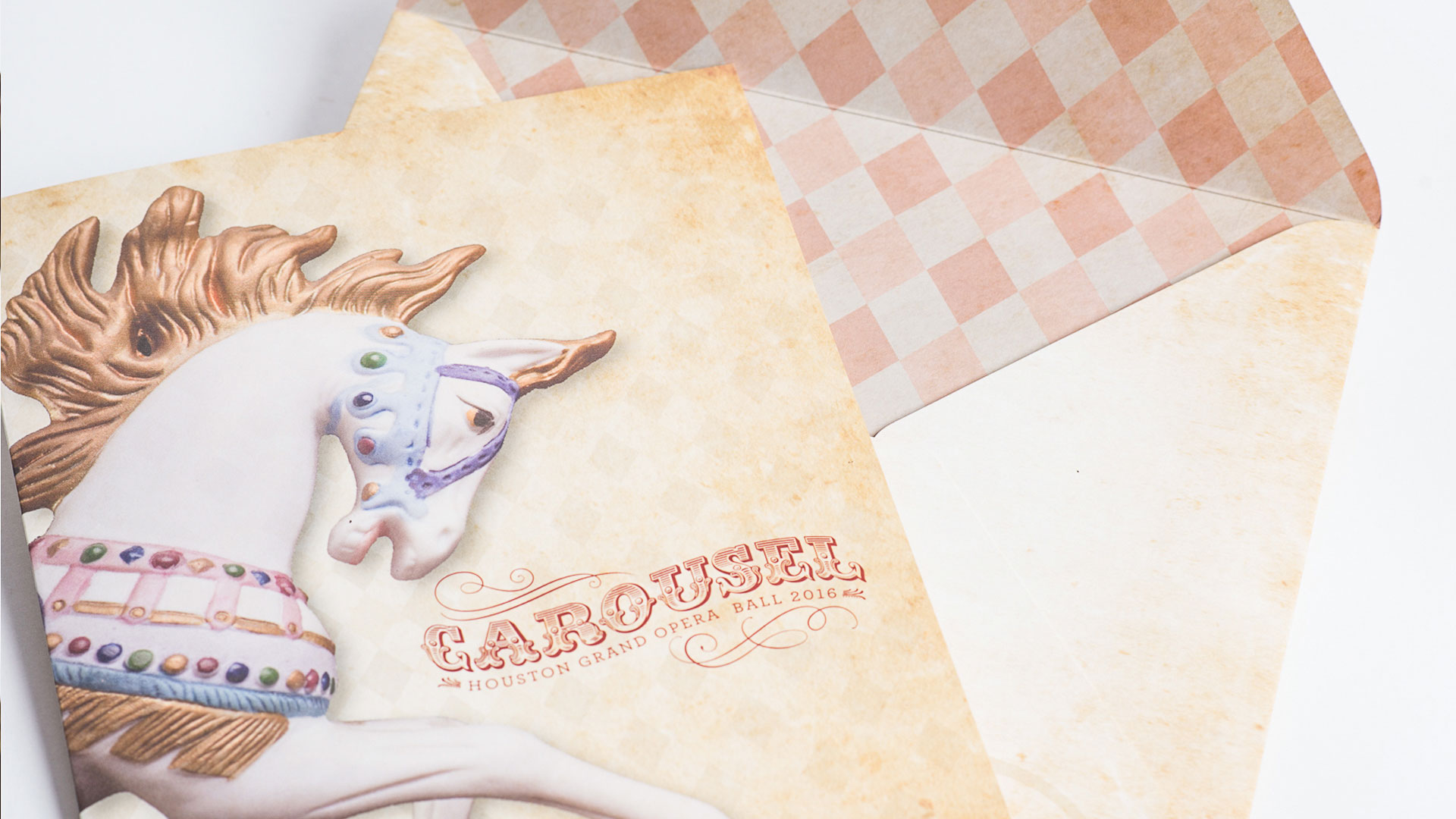
Crafted by Lavandula Design, the piece arrived in a distinctive oversize envelope boasting a parchment-like pattern and strikingly designed logo for the ball’s theme that year: “Carousel.” Upon opening it recipients were greeted with a delightful image of a merry-go-round horse on the cover of the invitation. Look closely and you’ll find that the subtle, diamond-like pattern behind the horse is repeated more forcefully on the inside of the envelope. Already you can feel the pulse quicken a little – these are people who sweat the details. All right, enough of this delayed-gratification stuff – it’s time to open this puppy, er, horsey up.
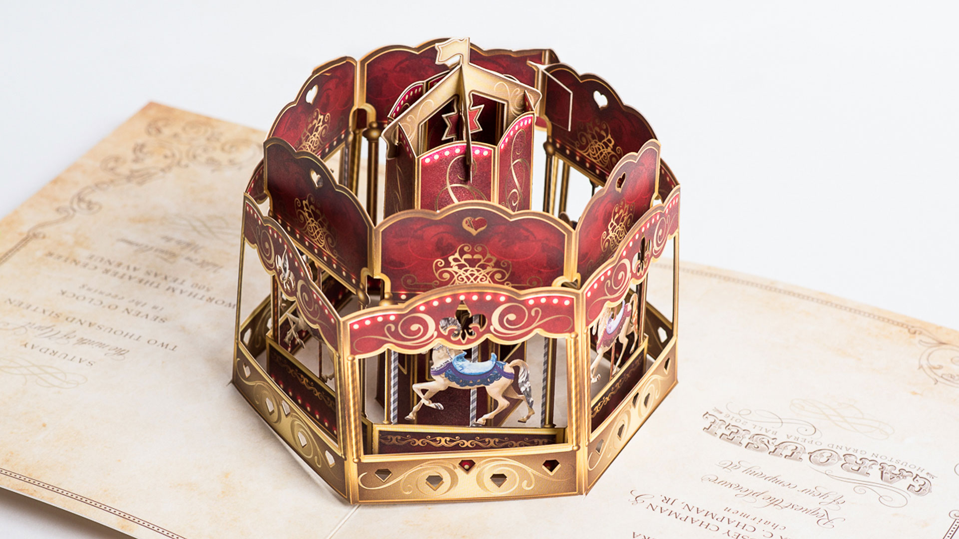
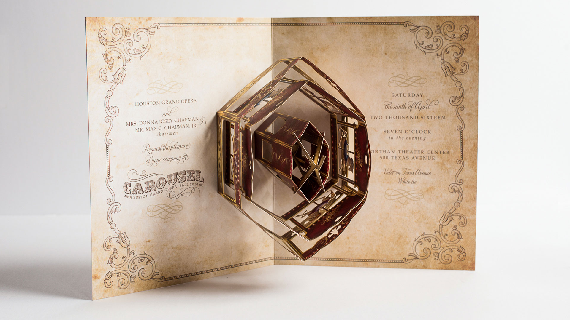
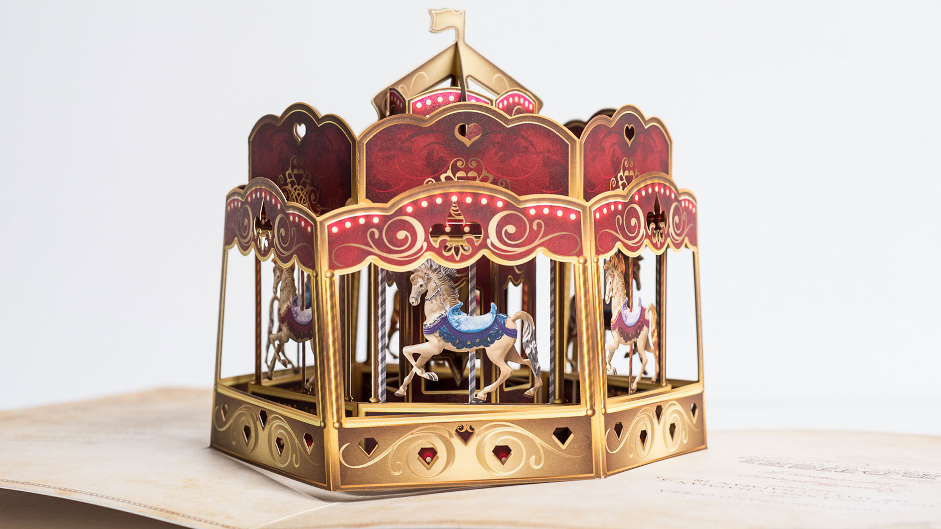
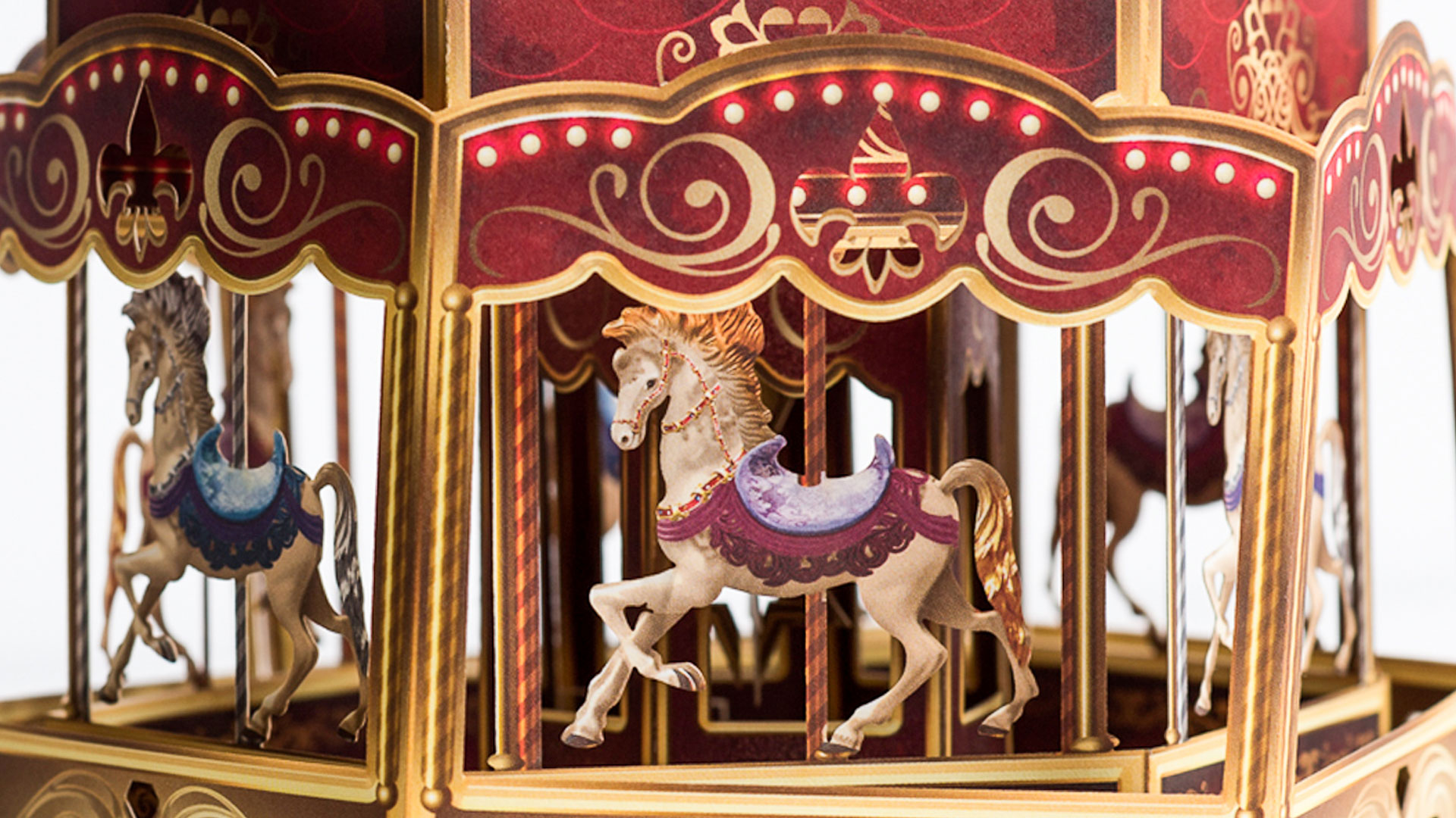
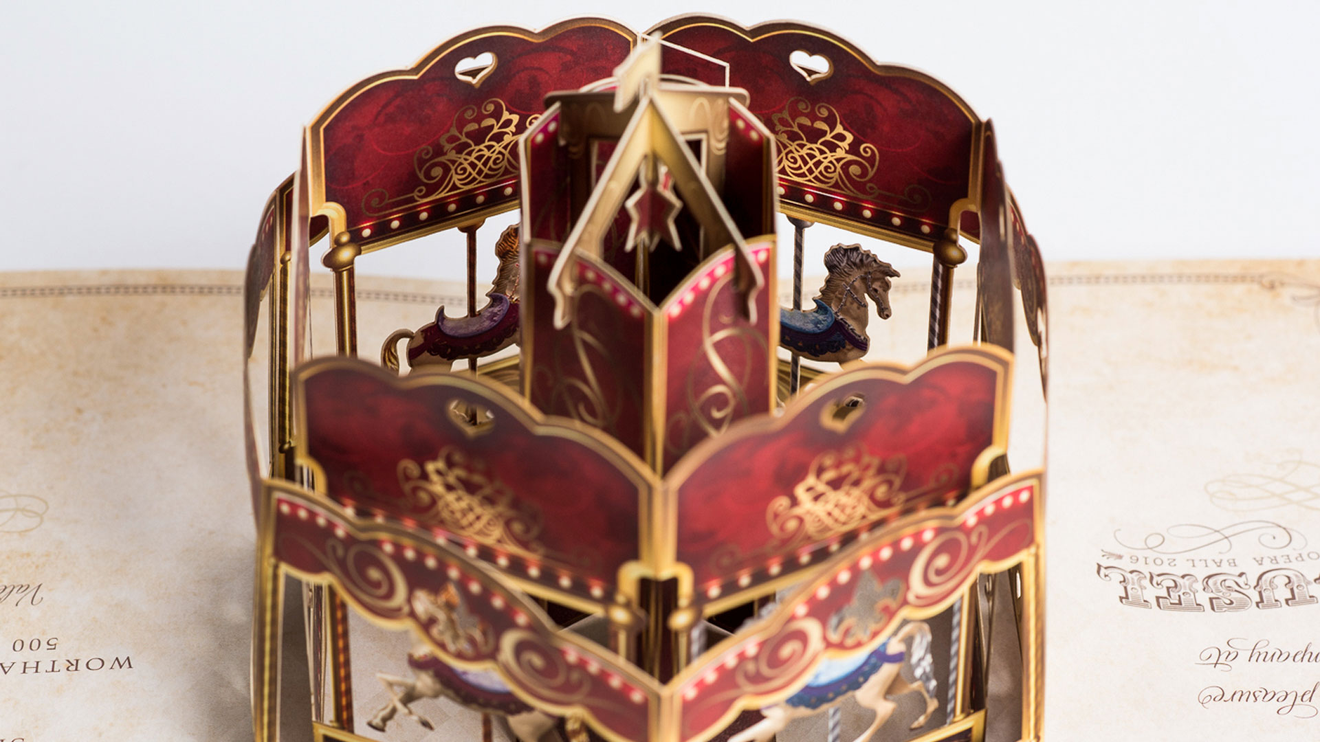
I was expecting a nice layout of images from Houston Grand Opera productions past, maybe the clichéd horned helmet or two. What I wasn’t expecting was the invitation to transform itself into a gorgeous, three-dimensional carousel!
Printed on International Paper’s 120 lb. Accent Opaque Smooth Cover [Get Swatchbook], the carousel is a masterpiece of folding, scoring and laser die cutting. Quite frankly it is the type of project that I started making these videos for in the first place. That’s because the only way to fully appreciate the level of detail that went into it is to see it actually opened in real time. I don’t just mean the perfect way that it opens to create the carousel or the hyper-realistic look of the horses captured mid-prance. I mean details like the tiny carnival lights and fleurs-de-lis patterns that run around the periphery, and the way the bottoms of the carousel pieces were inserted through slits in the facing sheet and glued in place to the back sheet, obscured from prying eyes. A special tip of the cap to Houston’s Elation Press for the finishing and hand work on this one. They tackled 1,200 of these beauties!
Spending time with this intricate piece has led me to realize that while I may not know my Puccini arias from my Wagner leitmotifs, I know a grand pop-up epic when I see one.
PRO members: If you’re eager to attempt a pop-up piece of your own, you’ll find inspiration and insights aplenty in this recording of our recent webinar with renowned paper artist Peter Dahmen.
Love this piece? Like it, share it and add your comments below.






We had a blast printing this piece! We all remember the design really well.
It was amazing and made lasting impressions. Great article love seeing good stuff like this.
Thank you, Bradley – fantastic work!